A part of every web designer’s functions is to find new methods for improving the way things are made, this includes finding ways of reducing file sizes, cleaning messy code, optimizing images and testing the site’s performance
As web designers, we’re always looking for new tools and gadgets to make our lives easier and be able to work faster and more effectively. These tools can be helpful in many different ways, including image editors, code formatters, SEO analyzers and more; we have gathered more than 250 web design tools that will help you save time and concentrate in the most relevant aspects in web design instead of figuring out how to optimize a CSS, boost your site’s traffic or reduce a JPEG size.

Web Editors and Generators
For the first category we have web editors and generators. These tools fulfill a role similar to the one provided by programs such as Dreamweaver with the advantage of being usually free and lightweight. We have divided this category in three essential subcategories, the first one showcases exclusive web editors that can help you design and develop websites and/or applications with ease, the second category is frameworks, essential tools designed for very specifical purposes and, finally, the third section of this category is destined to useful web form tools.
Editors
Web editors are software or online applications designed for help people create web pages. Although it’s true that you can use any text editor (e.g. Notepad) for creating a website, specialized web editors give you additional functions and easier ways of previewing sites. On this section we cover all those web editors that have no focus in CSS but on general web design instead.
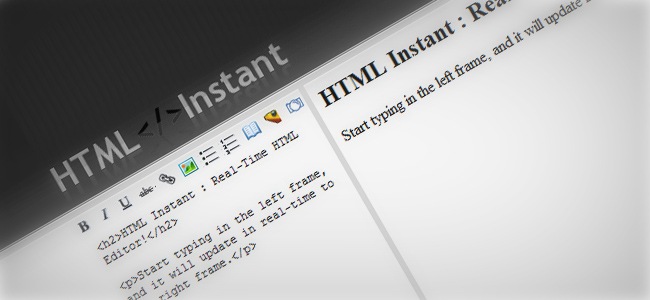
HTML Instant is a simple and easy to use real-time code editor. The interface is unobtrusive as it simply features a left section where you type down the code and a right section where you get instant results. This tool is definitely great for working on your HTML skills, it allows you to embed pictures from Photobucket and Imageshack, the editor also includes undo/redo/reset and select buttons, supports HTML, CSS and JavaScript.

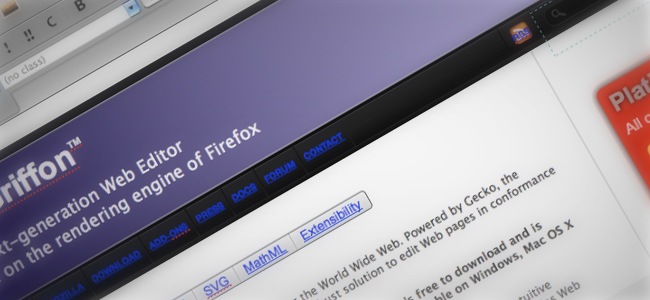
BlueGriffon is a great WYSIWYG web content editor powered by Gecko, the same rendering engine of Firefox 4. The editor is a modern and robust solution to edit web pages while playing along with the latest web standards. You can download BlueGriffon for free in several languages, including English, German, Spanish and more.

The program offers support for the latest programming languages, including HTML5 and CSS3. BlueGriffon can be utilized for optimizing sites that have not been created with it.
JS BIN is an user-friendly web editor developed by Remy Sharp, the editor is specially designed for working with JavaScript and CSS and it helps developers to perform tests and debug the code collaboratively, which means that any changes can be shared through an URL with your peers so they can give you feedback and help you improve your work.

Rendera is a very helpful web editor designed to ease the learning process of new programmers and web developers. For start, you can enter your HTML and/or CSS code and see how it gets instantly rendered every time you hit the Enter key, this results can be saved from the export tab.

The editor also includes some neat HTML5 and CSS examples that you can play with, these examples can be accessed from the examples tab and can be rendered immediately. Regarding JavaScript, the tool gives you the chance of working with jQuery, jQuery tools and jQuery UI. One of the key features of Rendera is the fact that you can work with HAML and SASS languages and easily convert them into HTML and CSS.
One of the most popular tools among web designers and developers, Modernizr is an Open Source JavaScript library that harnesses the power of HTML5 and CSS3 to help people build powerful sites with ease. The great thing about Modernizr is that it uses these languages to help you create amazing sites that no matter the browser or device that the user is using will always render well.

Another interesting aspect of Modernizr is that it lets you combine feature detection with media queries and conditional resource loading, giving you all the essential tools for powering up and add flexibility to your websites. The tool has improved all the major flaws of the original version, making Modernizr 2 a truly powerful tool for start making awesome websites and applications
A great HTML5 tool, Aloha is a WYSIWYG rich text editor powered by JavaScript and with the support of xHTML5. Aloha can be integrated within your CMS, blog, wiki software and just any kind of project where you need to edit content using a web based tool. Aloha also lets you edit most DOM elements using a supersonic text area, though you must be careful with the configuration and storage.

Aloha works perfectly in all modern browsers thanks to HTML4!, the HTML5 editor that implements all functionality without compromising any of the HTML5 specifications. The final goal of Aloha is to generate highly compliant xHTML5 content without having to use specific HTML5 methods.
Maqetta is an Open Source tool that lets you edit HTML5 interfaces over a WYSIWYG editor. The tool itself is build upon HTML, which allows Maqetta to run in your browser without requiring additional plugins or extensions.

Most HTML pages created using Maqetta work perfectly in all modern browsers (IE included), though it’s important to state that this feature depends on your current JavaScript toolkit and coding details, anyhow, Maqetta works perfectly as long as you have the latest version of your browser to support all the HTML5 features.
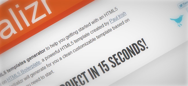
Another great tool for web designers / developers, Initializr is an HTML5 template generator that helps you begin any HTML5 project. The tool is built on HTML5 Boilerplate, the popular template developed by Paul Irish and Divya Manian, Initializr helps you instantly generate a clean and customizable template based on Boilerplate with everything you might need for begin your project.

Initializr lets you determine several aspects before creating your template, including activate / deactivate JavaScript, adjust jQuery power, set compatibility mode, server configuration and more.
Frameworks / Grid Systems
For this next section we have frameworks, which are special tools designed to support the development of dynamic sites, applications and services. Frameworks are created to ease the heavy load that many web development processes often carry by providing useful libraries such as database access, template development frameworks and session managers. We’ve found some very useful frameworks that as web designer, we consider that can be really helpful for you.
G5 is a powerful framework created with the objective of accelerating workflows, support good coding practices and work as a starter file for new web pages. The framework has been constantly updated, resulting in a lightweight tool with non useless elements included.

You can utilize G5 Framework for personal and commercial use as long as you keep the humans.txt file unaltered and in the index head. G5 comes in a single package that includes Modernizr 1.6, jQuery 1.5.2 with fallback, CSS3 Pie, IE6 PNG fix and more.
Blueprint is a CSS framework that helps developers increase their productivity by providing a strong base to start any project from, the base includes an easy to use grid, sensible typography, helpful plugins and even a printing stylesheet.

Some other features include a CSS reset, form styles for creating highly compelling user interfaces, print styles for setting any web page in print mode, useful plugins for tabs, sprites and buttons, Blueprint is definitely a great framework that you should check.
Yet Another Multicolumn Layout, or simply YALM, is an xHTML / CSS framework developed for creating modern and flexible floated layouts through a versatile structure and easily accessible for end users. The framework includes multiple extensions, design patterns for typography, forms, micro formats and a complete multilingual documentation.

An awesome HTML5 / CSS3 framework designed for making responsive, cross browser websites using beautiful typography. Gridless utilizes media queries to serve a progressively-enhanced responsive layout that ranges from small mobile devices to large desktop and tablets.

Some of the Gridless’ features include CSS normalization instead of CSS reset, optimized print styles, HTML5 and CSS3 ready, safe CSS hacks in replace of conditional class names / stylesheets and a well organized folder structure.

This neat grid navigation effects using jQuery shows you ten ways to navigate through a set of thumbnails. Take a look at some of the possibilities and how to apply the effect. You can use the mousewheel to navigate through the thumbnails.
Not Just a Grid is a flexible and modular CSS framework designed with the only purpose of helping designers / developers construct and develop websites with ease. The framework has been designed considering larger screen sizes and the use of CSS3 for progressive enhancement and richer user experiences.

The framework also includes separate stylesheets covering multi column layouts, typography, web forms, tables and user experience improvement. Not Just a Grid also includes a wide range of common images that can be used for both visual styling and user interface enhancement, these images can be changed to suit your needs with ease.
SDT is a powerful frameworks for web developers with many useful features, including cross browser editable, shareable data grids, it also includes filterable, searchable and paged tables, fully customizable PHP output and CSS and the awesome feature of drag and drop GUI.

Forms
As most of you already know, a web form is a section of a document that contains regular content, markup, controls (check boxes, menus and more) and labels on top of those controls. Forms are usually placed to be filled by the user by modifying its controls (typing down text, choosing menu items, etc.), before submitting the form for being processed.
HTML form is one of the easiest ways of building web forms, it allows you to create your own HTML form and download it as a ZIP file that can be easily installed in your website. These forms can be embedded in any web page, they also include a simple yet powerful database, an online data checking tool and a CSV / Excel exporting format.

You can install these forms with no further configuration nor additional programming, which means that you don’t have to worry about setting up databases. The site offers a free plan that works for most users and a premium package for those who want an even more powerful system. Another feature included lets you assign your forms the function of sending you and your visitors an email every time a new record is entered.

Ajax Autocomplete for jQuery allows you to easily create autocomplete/autosuggest boxes for text input fields. It is built with focus on performance. Results for every query are cached and pulled from local cache for the same repeating query.

An unbelievably easy way to add style and validation to your forms. Forms are everywhere and, usually, suck. Formly makes adding forms to your site a bit more exciting. Easily add style, validation, and a more impressive user interaction with a single function.
CSS tools
As every web designer knows, style sheets are build after a series of style rules that dictate the browser how to showcase a document. These rules can be linked to HTML in multiple ways, though the ‘style’ element is the most used. Although you can develop a site without paying attention to CSS, the truth is that mastering CSS will give you the weapons to turn a plain web page into a brilliant piece of design and interactivity. On this section we will show you some pretty cool tools that will help you improve your CSS developing skills.
CSS generators
This section covers all the tools that can help you reduce programming times by automating several processes that often take lots of time that should be spend in more pragmatic things, these next tools can definitely help you out with this and become a more efficient designer / developer.
The first CSS generator of the list is CSS3 Maker. As you know, CSS3 is the latest version of CSS and one of the major booms in web development of the present time, with CSS3 you’re now able to do things that were previously hard to achieve such as animations, designs and more!. The CSS3 Maker lets you create your own designs and styles without having to start from zero.

Among some of the elements that you can generate with CSS3 Maker we find Border Radius, gradients, CSS animations, RGBA, text shadows, box shadows and @font-face. Every design is displayed in a preview version, a code preview and a compatibility chart.
The CSS3 Generator is another awesome tool created by Randy Jensen for designers and developers. The tool lets you create your own CSS3 designs and grab the code instantly while previewing how your design is going to look like. Some of the aspects that you can work with are Border Radius, Text Shadow, RGBA, @font-face, multiple columns, gradients and more.

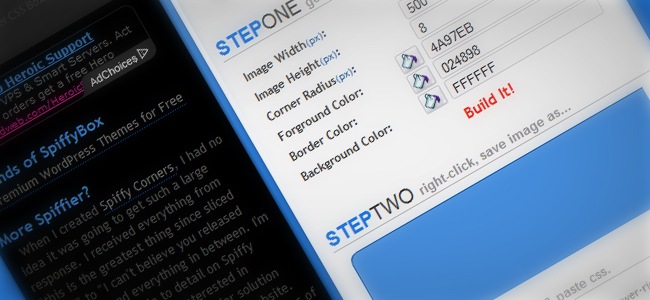
The Spiffy Box is an automated system to generate nice CSS designs with ease. First you adjust the controllers until you get the desired result, then you can save the result, copy the CSS / XHTML and enjoy your creation. The aspects that you can work with whilst using Spiffy Box are height, width, corner radius, foreground color, background and border color.

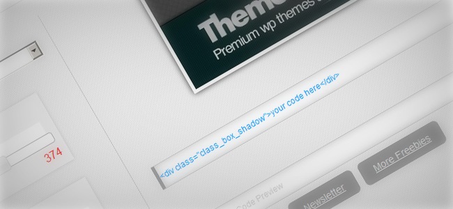
Although this is not a generator itself, it does provide some wonderful CSS boxes ready to be used, which is something that just like generators can help you save tons of time. Inspired on old school photo frames and web forms, our friends at ThemeShock designed this set of beautiful boxes using CSS3 only (no images).

The boxes work well in modern browsers, though a more compliant version is coming soon. To utilize these boxes you just have to paste a short line of code and you’re set. You can find a helpful tutorial explaining all the process behind the creation of this boxes in TutorialShock.
Another great addition from ThemeShock, this CSS shadow generator lets you experiment with most of CSS shadow properties, play with opacity, add blur and change position, all being updated in real-time inside the preview box.

As well as the image preview, the CSS code is also updated in real time, assuring that every time you make new changes, the code is updated to the last version. The tool gives you the chance to experiment with several shadow styles, including default, bottom, sideways and more.
Simple and elegant, this user-friendly CSS3 generator developed by Eric Hoffman and Peter Punk is helpful for those who want to generate simple designs using CSS, while exploring some of the basics. The aspects that you can change are: Border radius, box shadow, background gradient and opacity, all of these adjustments are displayed in real time and you can get the code at no cost, the tool also includes an option for IE users that helps you generate compliant designs.

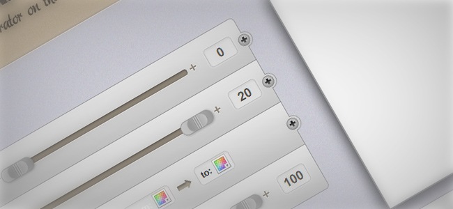
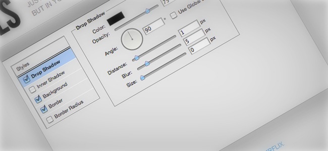
If you are a Photoshop fan, then you’re definitely going to love this tool. Layer Styles uses the same Photoshop Layer Styles’ window as interface to let the user play with different color and light properties, with the difference that this tool is entirely based on CSS.

The similarity with the real Photoshop panel is amazing, considering the fact that this is entirely built on CSS. You can adjust different parameters such as spread, distance, size and even set the light source checking the global light box. Although you cannot find all the options that the original Layer Styles window has, you can adjust things such as Drop Shadow, Inner Shadow, Background, Border and Border Radius.
An astounding CSS ribbon generator, not even Photoshop or Illustrator can pull together a more effective way of generating multiple ribbons by just changing a few numbers. Among some of the aspects that you can set in order to generate your ribbon we find front width, ribbon height, back left and back right width, overlap distance, bottom overlap height and more.

The results can be updated once you have the ribbon you want, the tool displays both a graphical version of the ribbon and the HTML / CSS code that you need to use on your site.
CSS color tools
Although CSS have always been able to work with color, it was a rough and basic feature. Now with the arrival of CSS3, wonderful things can be achieved regarding color using CSS only, we have found some helpful tools that will help you skip the whole Photoshop process.
As the first item of this section we find a nice color tool from Colorzilla. This CSS gradient generator takes advantage of CSS3 to generate beautiful gradients without using images, the tool requires for you to have the latest version of your browser in order to support all the features.

The CSS gradients generated by the tool are cross browser, which makes them suitable for all modern browsers and in case that you’re using Internet Explorer (IE), the tool will reduce the gradient to a simpler one. To generate your own gradients you can adjust the position, stop color, add color stops and more, also you have the chance of previewing the resulting gradient before copying the resulting CSS into your site.
Grad Color is an easy to use tool that helps you generate several gradients using CSS only. The generated gradients are not supported in older browsers, though some of them are able to adapt the gradients and showcase a simpler version of them.

By default, the tool adds a background color in case that the browser does not support CSS3 gradients, this problem happens more often in older Internet Explorer versions.
A tiny CSS-powered gradient editor, this tool developed by Bart Kelsey makes use of jQuery, jQuery UI and Farbtastic to deliver nice and simple gradients. You can generate as much color stops as you want and adjust their position only while opacity and other adjustment values become available, once you have the ideal gradient, just hit the ‘Show CSS’ button to copy the code on your site.

CSS Animation
The main reason behind the popular fight between Adobe Flash and CSS. Since the CSS3 release, web designers and developers are able to generate simple but yet attractive animations without having to appeal to codes like ActionScript, this turns out in a simplification of the whole web design process that has improved the performance of most web developers.
In case that you’ve worked with Mc. Tween, the popular Flash extension, then you’re going to love Ceaser. Using the power of CSS, this tool lets you choose between different easing types and test them out, but this isn’t just a testing tool, it actually lets you grab the resulting CSS code and use it on your site. Ceaser was created based on some of the most popular animations from Flash and jQuery.

Sencha is a nice desktop application designed to help you produce astonishing CSS3 animations for webkit browsers and touchscreen mobile devices. Using Sencha can help you make beautiful lightweight animations that can easily be implemented on any site, the tool gives you the chance to generate smooth transitions, animate text, images, buttons, generate gradients and even embed analytics tracking code.

CSS Buttons
In the past, making great web buttons was something that only skilled designers were able to do, but since CSS3 hit the scene, everything changed. Now you can create some amazing button designs without a single pixel involved, just CSS.
The Da Button Factory API lets you dynamically generate buttons, you can adjust several parameters, including typeface, font size, text shadow, style, rounded corners, background, size and even the output format. This tool is definitely something really helpful for those who prefer to stay away from graphic programs.


This is a simple, yet beautiful Sliding download button. First look like a Download Me buttons, but once you hover over it, the butto n slide a side and shows a new message under.
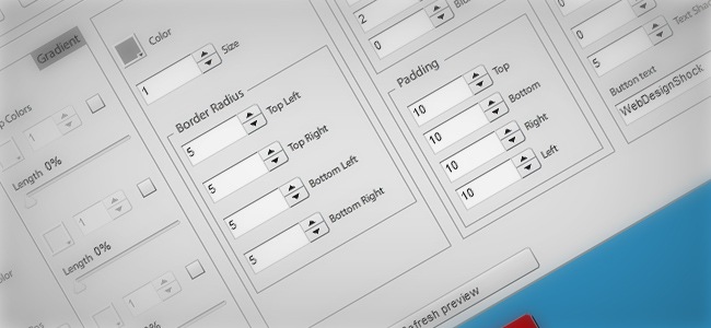
One of the most complete CSS3 button generators around, this tool lets you modify almost everything. First you have a gradient box where you can adjust the colors, set the position and add more stop colors, then you have the border box, here you can change the color, size and position. On the box section you can determine the color, alpha, blur and position, finally, on the text area, you can determine the font size, change the button text, the typeface and the color.

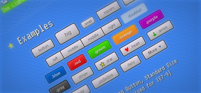
Definitely an user-friendly tool with some really cool features, Buttonize is a lightweight, flexible and instant button framework. Although the framework must be downloaded and implemented on your stylesheet, we really recommended it; one of the nicest things of the site is that every time you click over a button, the site gives you the name of that specific button as well as the fittest usage that you can give to it.

CSS Sprites
Using sprites is one of the most effective ways of reducing transfer times and optimizing websites. With sprites, you can combine as much images as you want into one, making easier for the website to load just specific parts of the image instead of having to parse multiple images.
Because dealing with sprites can be sometimes a little difficult, you can use this tool to make this process way easier than usual. First you need to choose the image files you want to use in your CSS sprite, then upload them and select ‘create CSS sprite’, then the tool will automatically join all the images into a single file and deliver the CSS / HTML along with a rollover effect in case you chose one.

Spritemapper is an application that combines multiple images into one and generates CSS positioning for the corresponding slices. With Spritemapper you can improve loading times by reducing the amount of times used on the site, the tool is really easy to use as it does not require any additional syntax to work, you just have to define the images you want to use and set the CSS background declaration.

As we said previously, CSS sprites help you reduce the number of requests that your site needs to perform to load several images by merging several images into a larger one, then you can manipulate the background position to display only the part you want.

On this site you’re going to find an useful tool that can help you generate CSS sprites with ease, just upload the pictures and adjust the settings (size, output, color, format, etc.) to obtain your own CSS sprite.
Spritebox is a WYSIWYG tool that helps you create CSS classes and ID’s from a single sprite image with ease. The tool utilizes the background position property to align areas of a sprite image into block elements of a web page. Spritebox has been developed using HTML5, CSS3 and jQuery, besides that, the tool can be used for free!.

Sprite Cow is a nice tool that helps you adjust the background position element along with height and width values of sprites, all this through a slight portion of CSS. The great thing about Sprite Cow is that it grants you complete control over the optimization and compression, which is something you cannot do manually.

CSS patterns
Now with CSS, you can even create your own patterns (without having to open Photoshop) and use it on your website, regarding this, we’ve found a couple of nice CSS pattern generators that may come handy for you.
An astounding collection of pure CSS3 patterns ready for be implemented on your site. Most patterns only work in modern browsers (older ones might render them inappropriately), the gallery itself is also viewable by modern browsers only. In case that you want your pattern to be included, make sure that you’re sharing a new design and not just an adaptation of another design.

The patterns themselves should work on Firefox 3.6+, Chrome, Safari 5.1, Opera 11.10+ and IE10+. However, implementation limitations might cause some of them to not be displayed correctly even on those browsers (for example at the time of writing, Opera doesn’t support radial gradients and Gecko is quite buggy with them).
This is definitely one of the most awesome tools of the article. Creating patterns was something that only Photoshop and similar programs were able to do in the past, now with the latest version of CSS this can be done without a single pixel involved in the process. Patternify helps you generate your own patterns or modify preset designs and then download them as PNG files or embed them in your page, though these patterns are not properly made in CSS, the interface is easy to use and indeed faster than going through the whole designing process in PS.

CSS menu generators
Building goo looking menus is something that without the proper tools could easily take a while. On this section we like to share a really helpful tool that will make the whole process of creating CSS menus a piece of cake.
The CSS Menu Builder is a nice tool that lets you select between 300+ different horizontal and 700+ vertical menu combinations to create the best menu for your site. The site also features more than 200 combinations for creating breadcrumb menus, giving this a total that goes beyond 1000 combinations. Thanks to the user-friendly interface, you can easily customize your own menu and export it to your site.

CSS format
When you’re starting to learn CSS, it usually happens that you’re coding structure is not the best, maybe you’re overusing some classes, adding more spaces than necessary or just typing lots of lines to solve something that can be easily fixed in a couple of lines. On this section you will find some neat tools that can help you format your CSS and make it look appropriately.
The first tool we have is CSS Lint, an online tool built to help you detect problems in your CSS coding. The tool does basic syntax assessing as well as applying a set of rules to the code that look for problematic patterns or signs of inefficiency. These rules can be manually deactivated so you can easily write your own rules or omit the ones you don’t want to be applied during the overhaul.

From CSS Drive we have CSS Compressor, a helpful utility that helps you compress your CSS to increase loading speed and optimize your site. The tool allows you to choose between three compression levels, depending on the legibility / compression relation, you can also switch to advanced mode to set even more parameters.

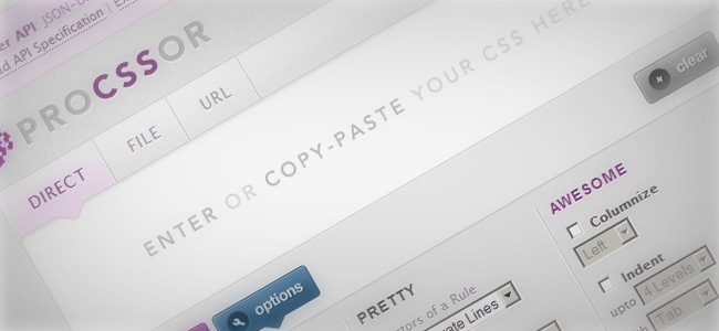
ProCSSor is a great free tool that helps you add format to your CSS code in the way you want, while enhancing your CSS to make it more lightweight and easier to read. The tool is easy to use, just adjust the different parameters and the tool will automatically process your CSS.

An awesome tool that helps you generate CSS coder with great easiness and without having to be an expert in CSS or programming because the tool was built to do things for you. The tool updates every change you make in real time, these changes include color, shape and measures. You can download the resulting easy and implement it on your site.

Styleneat is a CSS processor that organizes and standardizes all your CSS selectors, sub-selectors and properties in a single structure that makes easier to establish page areas and see how they relate to each other. The tool has been tested in several sites with excellent results, though you can always reach them if you find any bugs or malfunctions.

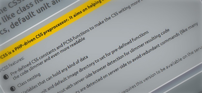
PCSS is a PHP 5-driven CSS formatter that helps developers to write better CSS code. Some of the tool features include class nesting, server-side browser specifics, default units and variables. PCSS also detects specific server-side shortcuts such as “-moz”, you can also work with @font-face and let the formatter help you adjust all the resulting code.

Normalize is a customizable CSS file that makes browsers render all elements more consistently while playing along with modern standards. The tool evaluates the main differences between the main browsers in order to detect the exact elements that need to be normalized.

With CSS Pivot you can add CSS styles to any website and share the result with a short link so others can se the improvements of your website

To continue our research of useful CSS formatters we have PrefixMyCSS. This nice tool is easy to use and will save you lots of writing time; first you’ll need to write the code, then paste the CSS and prefix!. It’s important to clarify that the tool is currently in alpha version, so minor bugs might eventually show up.

There’s no much to say about CSS Prefixer besides the fact that it can help you add format to your CSS with ease, just paste the code you want to enhance and voilà.

Grid and layout systems
This is one of the most important sections in case that you’re a web designer or you’re considering becoming one. Grids are two-dimensional structures usually made by intersecting vertical and horizontal lines, the purpose of grids is help designers place the content, in web design this term has been getting more popular recently due the diversification of browsing devices (smartphones, tablets, etc.).
Along with grids we find the concept of layouts. These elements are preset versions of a web page, a magazine or any graphic piece that can be used by the designer to build his design on top of that structure. Unlike grids, layouts have already determined the position of most elements, which is something very useful in case that you don’t want to start diagramming from zero.
Tiny Fluid Grid is a simple and useful webpage build by the Girlfriend team. You can generate basic grids and download them so you can use them in your sites, this can be specially useful for cases when you’ll be using the same grid over and over again.

Gridulator is one of the nicest grid generators around. Created by David Sleight after seeing that most grid generators are usually created for printing purposes only and that Adobe Photoshop has a very basic grid manipulation system, Gridulator is definitely a great solution for any web designer.

To start using Gridulator you need to start by determining the number of columns you want and the tool will instantly tell you all the possible grids you can use that have round integers. The tool also features inline previews by taking advantage of the canvas element; once you have your grid ready, the tool will give you full size PNG files ready for download and utilize in your CSS, Photoshop docs and just everything you might need.
This tool arrives by the hand of the Yahoo team, the YUI grid builder is a nice and simple grid generator that can help you create your own CSS grids with ease, you can assign the number of columns, total width, sidebars and even check the reading order. Once you have the grid set, all you have to do is copy the code and paste it on your website.

Specially designed for those who own humongous monitors, the 1140 grids helps you fit your content in a 1280 monitor with ease, while becoming fluid and readapting in case that you’re using smaller screen resolutions. In case that you’re using a mobile device, the grid makes use of media queries to support this resolution, which means that it stacks all columns on top of each other to keep the information logical and easy to read.

Probably the most popular grid system among web designers and developers, the 960 Grid System is an attempt to set a standard for most web pages by establishing a width value of 960 pixels with two possible variants, 12 and/or 16 columns. The 12 column system divides the grid into 60 pixels wide sections, while the 16 column system reduces this width down to 40 pixels, it’s important to state that every column has a 10 pixel margin from the left and the right, which means a total of 20 pixels destined to margins only.

Columnal is a CSS grid system based on some previous grid generators and with some extra features added. With this tool you can make responsive web designs with ease, the system goes up to 1140 pixels wide but thanks to its fluid property, it can easily readapt to small resolutions and even display a mobile-friendly layout.

Flexie offers cross browser support for the Flexible Box Mode. For those who are not familiarized with the term, the Flexible Box Mode describes a CSS box model optimized for interface design. It provides an additional layout system alongside the ones already in CSS. In this new box model, the children of a box are laid out either horizontally or vertically, and unused space can be assigned to a particular child or distributed among the children by assignment of “flex” to the children that should expand.


Is a jQuery plugin allowing you to easily specify direction, fade-in, fade-out, and a host of other options to a grouping of elements, is great for inventory or anything with a large amount of items ordered in a grid.
StackLayout is a flexible width, component based CSS layout system. Using StackLayout can help your mockup process get easier thanks to its default class names and shifting to semantic class names when you deploy, that way you’ll never have to leave your markup messed up with non-semantic class names.

Another relevant aspect is that the default StackLayout is a fluid-based layout on percentage widths so you can mockup your design quickly, this guarantees that you will always be able to work for different screen resolutions.
Cross browsing
One of the terms that has become more popular in the past couple of years is cross browsing, which is a term that makes reference to the ability of any website, application or similar to support all web browsers, a website that has cross browsing capabilities can be properly rendered by all browsers, guarantee a quality experience for all users. On this section we’re going to list some really helpful tools that will help you check the cross browsing properties of an element and learn how to properly build cross browsing sites and applications.
Screen size tools
One of the aspects concerning cross browsing is making your site / app able to readapt its structure at different screen sizes without losing any content, here’s a short list of some useful tools that can help you out with this goal.
Developed by Chen Luo, ResizeMyBrowser is an online application that lets you test different screen resolutions with ease, the tool is able to set the browser size by both Inner window and Outer window. When resizing the browser manually, the tool will automatically display the current size in real time, the tool works best on Safari and Firefox because Chrome and Opera have poor support for the ResizeTo event.

TestSize is a nice and simple website that lets you explore different screen sizes to see how a specific website looks like. You can go from small mobile to large desktop sizes to see how your website behaves on different screen resolutions.

Useful online application that allows you to check how your website looks in the most popular screen resolution formats. ViewLikeUs is powered by Ajax and PHP so you don’t need to download anything!, just type your URL in the box and start checking how your site looks.

Mobilizer is a nice mobile/desktop app that allows you to check mobile websites, design mockups and local HTML on your Mac and/or PC devices, the application also supports previewing on iPhone 4, Palm Pre, HTC Evo and Blackberry Storm. Some other features include drag and drop support and check a single site on multiple devices, finally, you can export PNG versions of the different views to use in your portfolio or presentations.

Simple and effective, Browize is an online browser resizer that lets you experience different screen resolutions without even closing your browser, the program is currently supported by all modern browsers except for Google Chrome.

Website analysis
Checking how well your website is doing in terms of compatibility and support is something that you should check every once in a while. On this section we like to share an useful tool that will let you assess your site’s performance.
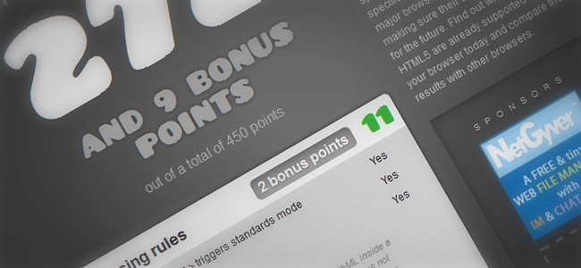
The HTML5 test score is a nice website that parses how well your browser supports the upcoming HTML5 standard and related specifications. Even though these specifications are currently in a developing phase, all major browser manufacturers are making sure their browsers are ready for the future. With this great tool you’ll be able to find out which parts of HTML5 are already supported by your browser today and compare the results with other browsers.

Compatibility check and enhance
This section gathers a few helpful tools that can help you check how well is your site being rendered on different browsers and how to make this better by updating the code or adding some additional features and functionalities to your site.
The first tool we find is Browsera, an automated browser compatibility tester. To use Browsera, first you have to select the browsers to be tested and the URLs that will be examined, once this is done, Browsera will be able to check multiple pages with ease and render them on the browsers that you have specified previously. Once this part is done, Browsera will collect all the errors that should be fixed and it will show them to you, another great thing about this tool is that it takes screenshots of every page that has been rendered, allowing you to compare results after the test has been completed.

From CSS3 Info we got this great CSS3 Selectors Test. To use this tool, first you need to run the test suite, which will automatically run a large number of small tests that will help the tool to determine if your browser is compliant with most CSS selectors, once the test has been completed, the tool will show you the results for each selector along with a small example and explanation for every test.

Because it’s technically not possible to simulate certain user interactions, the test is limited to selectors that don’t depend of user interactions, therefore this test does not include tests for the following selectors: :hover, :active, :focus and :selection.
Augment enables the use of modern JavaScript by augmenting built in objects with the latest JavaScript methods. The tool never overrides any native implementations, it only adds what is missing. To use Augment, first you need to include the augment.js source file before any JavaScript in which you wish to use modern JavaScript methods, then you just have to make sure that everything stays in order and you’re done.

Browsershots is an online (free Open Source) testing tool that makes screenshots of your web page in different operating systems and browsers. This tool is a great complement that provide developers a convenient way to test their website’s browser compatibility from a single place. When you submit your web address, it will be added to the job queue to later be rendered on different websites, then the application will make screenshots and upload them for you to check them.

Tables, Charts and Documentation
Although this next section will not provide any practical tools and applications to make your web design processes easier, it will give you a series of key documents and tables that if you always keep in your pocket will save you lots of time when beginning or going through a new web design project. Some of the objects included on this category feature compatibility charts, developing guidelines, HTML5 / CSS3 charts and more.
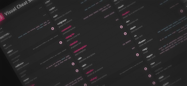
HTML 5 Visual Cheat Sheet is an useful cheat sheet for web designers and developers designed by Antonio Lupetti, the mastermind behind Woork. This cheat sheet is essentially a simple visual grid featuring a list of all the HTML tags and their related attributes supported by HTML versions 4.01 and/or 5. The simple visual style of this sheet allows you to easily find everything you are looking for.

An excellent article from internet guru Jakob Nielsen where he discusses everything about scrolling attention and how the user interacts when visiting a website. The article exposes tons of complete statistics and graphics that will give you a hint on how to design for the web and guarantee that all the vital information is going to be checked by the user.

On this site you will find one of the most complete tables about HTML5. The pages lists the new elements, forms, multimedia, offline, geolocation and all the aspects that you need to know about this new version of HTML5.

Punchcut is a complete set of tools that will help you design for different screen resolutions, ranging from small mobile devices to HD monitors and more. The package includes a complete set of Photoshop CS5 presets for the most common screen resolutions, you will also going to find fully layered PSD files for making your design presentations, finally, the package includes a reference chart for resolutions and devices.

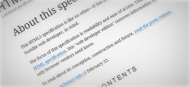
This HTML5 specification is an user-friendly guide with all the major HTML specifications that any web developer needs to know about, leaving aside all the blabber that other documentations use to have.

Although the official jQuery documentation is already there and has been doing a great job helping designers to understand this amazing framework, it seems that the document itself is quite extended and makes difficult to find specific topics with ease, usually taking several steps before reaching what the person is actually looking for. This documentation offers a complete jQuery documentation that is easy to explore and comprehend.

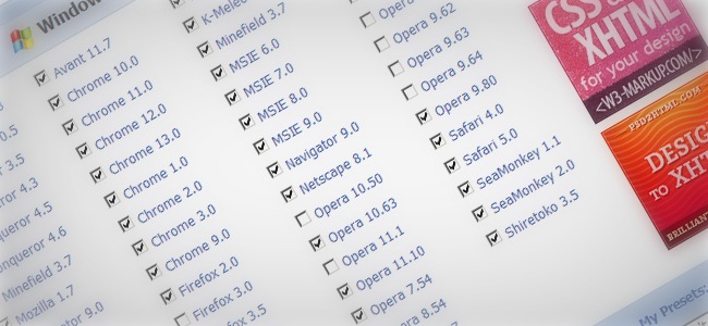
Probably the most complete HTML5 and CSS3 chart that you can find, the chart features a complete checklist that parses how modern browsers (Firefox 4+ haven’t been included yet) render most HTML5 and CSS3 properties, selectors, web applications and more. This chart is definitely a must-bookmark document that you can always check before starting any web design project.

Little but really helpful CSS3 click chart, just click on the property you want to check and you will be able to read all the aspects about it. This page is constantly being updated while new CSS3 properties are released, you can always send your thoughts and help the site grow.

Nice series of website layouts that use percentage widths and relative positioning, these layouts work with all modern browsers including Safari on the iPhone and iPod touch. The layouts are also ‘stackable’, so you can use multiple column types on a single page. This makes the number of possible layouts endless!.

Typography Tools
Until the last decade, working with typography was something severely limited due the multiple restrictions that all browsers used to have, there was a restricted list of web fonts that designers were allowed to use while keeping certain that the site was going to look perfect in all browsers and devices. With the release of CSS3 and awesome tools such as @font-face, a whole new world has opened for web designers, whom now are able to use almost any font they want and hence create beautiful web designs and applications. On this category you’re going to find some of the most helpful tools that will help you harness all the power of typography for the web, so let’s take a look at them.
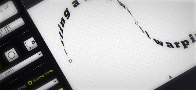
CSS3Warp is a nice text generator that evokes Illustrator’s warped text, which allows you to generate a text that follows an irregular path, the difference is that this generator works with CSS and HTML only. Currently the tool lets you modify parameters such as rotation, skew, transform-origin and more, you just have to enter the text to edit and the after adjusting all the parameters according to your preferences, the tool will instantly ‘warp’ the text.

You can modify the path’s angles or utilize a circle instead and once your text is ready, the tool will generate the CSS / HTML ready to be implemented on your site. Regarding fonts, you can utilize any of the Google Web Fonts typefaces or utilize a local font stored in you computer.
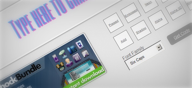
From our friends at Themeshock we receive this awesome CSS3 text shadow generator, a nice tool that helps you insert different shadow effects to your texts, you can use different typefaces and combine them with all the nice shadow effects, including 3D, acid, fire, alpha and more.

FitText makes font-sizes flexible. Use this plugin on your fluid or responsive layout to achieve scalable headlines that fill the width of a parent element. In other words, this is a jQuery plugin for inflating web type.

i2Style is a nice text style generator with tons of great features. You can adjust the font’s size, set text and background colors, add shadow effects, set border variations (rounded corners included) and even design your own CSS3 buttons and banners, the tool generates CSS / HTML instantly, so you can implement it on your site.

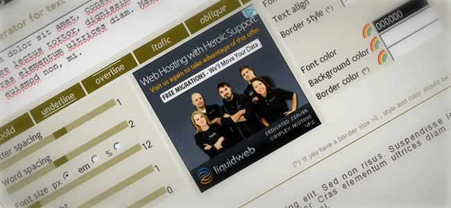
CSSTXT is a nice online tool that adds style to a text through a ‘p’ or ‘div’ tag. The idea of this tool is to generate a style sheet with all the options you might need, including font size, borders, line height and more great features that can help you stylize any text or paragraph. You can see a text preview to make sure of the result, then you’re able to copy the CSS / HTML code to implement it on your site.

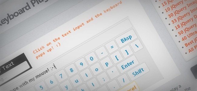
This is a pretty cool on-screen keyboard plugin which uses jQuery to display a keyboard on screen when the user clicks an input field. It is fully customisable where you can change the layout of keys and the color scheme. It´s really simple to use, all you have to do is: Download the plugin,, use the demo.js file as a base for creating your keyboard, tweak the settings to your keyboard layout and customise the CSS code to suit your website

This is a cool and unusual tool It makes a picture out of fonts. All you have to do is select some settings and click the “apply settings” buttons and watch the magi happen. An image will be immediately transform and made out of text. Accordingly to your request, font, color, size, etc. Definitely worth a try.

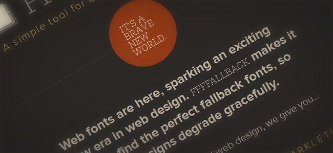
Ffffalback is a lightweight bookmarklet that helps you find the perfect fallback fonts. The bookmarklet performs a complete scan of the CSS in any page you want and identifies the web fonts that are being use, then it clones the page and lets you test and analyze how the site will look using different fallback choices. You can also adjust the font size, line-height and more.

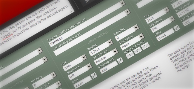
Typetester is an online application that helps designers / developers compare different fonts on a single page, this is specially useful to help you check how a single text is displayed using different fonts and be able to decide the best option for your site / app. To run Typetester you only need to have your JavaScript enabled.

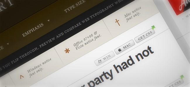
Typechart is an online tool that lets you preview and compare web fonts while changing things like size and style, you can also decide whether to check the fonts using Windows or Mac font render systems. The tool lets you download a CSS that can help you save a determined style to be used later on your designs.

FontFonter lets you replace a site’s font styles with web FontFonts by using custom CSS and advanced techniques. Although the tool has been designed for previewing only, it can be a really helpful tool for designers, the application is currently not supported in Opera and IE as well as some mobile browsers.

Definitely a must-bookmark website for any web designer / developer, What Font Is lets you discover a font’s name by checking a sample image of it. Although the tool is not as precise as you might want, it usually right-guesses the actual font, just keep in mind that fonts with special characters cannot be rendered and that the tool grabs the sample from a single line of text.

Website checking
This is an important section for web developers. When you’re launching or starting to manage a website, is important to have some tools to help you check if things are doing right in terms of speed, usability and performance; although you can perform multiple tests by yourself, having a toolbox next to you is something that can save you time and energy. On this part of the article we’re going to show you a few useful links that can help you keep your site optimized and fully updated.
Website Optimization
On the first subcategory of this post we find web optimization, which is a concept that involves a series of procedures and tests that can guarantee the correct performance and visualization of a website under different circumstances (devices, browsers, etc.). Now, here’s a short list featuring some great links that will help you keep your site on date and optimized.
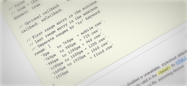
Adapt is a lightweight JavaScript tool that helps you determine which CSS file should be load before the browser renders a page and, in case that the browser tilts or is resized, the tool will check its width and only serves the correct CSS when needed.

Other methods include building separate sites for mobiles, use media queries to adjust layout and a polyfill for older browser support, the tool is also able to handle multiple image resolutions without adding file size.
Cloudfare is a powerful web service that increases speed and protection in any website by filtering traffic through an intelligent global network that automatically optimizes and filters the good from the bad, showing an increase on load times and performance, thus Cloudfare will not only speed up your site but also keep spammers away from your sight.

With GTmetrix you can improve your site’s speed and performance to provide a better experience to your users. GTmetrix makes use of Google Page Speed and Yahoo! YSlow to calculate your site’s performance and give you a complete analysis and recommendations on how to improve things like speed and performance within your site.

Mint is a popular web service that helps you keep your site update and as fast as possible. The tool itself is an extensible, self-hosted web site analytics program with a simplistic interface that any user can use. You can organize visits, referrers, popular pages and searches in a single page by using Mint’s flexible dashboard.

In terms of visits, Mint breaks down your site’s activity from the past day, week, month and year as total page views and unique visitors, regarding referrers, these are broken down by newest, unique, most recent and repeated referrers as well as grouped by domain. These and more great features make of Mint a valuable tool for anyone.
Speed tests
Another important aspect that can affect your site’s reputation is speed, so on the next list we have gathered a few links that can help you check your site’s velocity and see if your customers are having a good or bad experience when visiting your webpage.
The first toll we have is ScanmySpeed, an Internet connection tester that checks the actual browsing speed of your browser and internet connection. Your internet speed is tested by sending small packets of data across the network, which is something similar to the way data is browsed in a website. ScanmySpeed does not use any additional programs/add-ons to run these speed tests besides JavaScript.

For Spanish-speakers, this site helps you perform a quick speed test over your site to check if your bandwidth is being properly distributed and if not, then how can you fix this problem.

This speed test tool lets you examine different aspects, including service provider, IP address, current browser, download /upload speed, connections per minute and ping.

In case that your native language is German, we have this simple and yet great site where you can easily test your site’s speed and check if your bandwidth is doing well.

Another speed test tool, this one has an extra feature that adjust the analysis based on your location (home, work, other or public), it also gives you a brief introduction to the main concepts to keep in mind when checking a site’s speed.

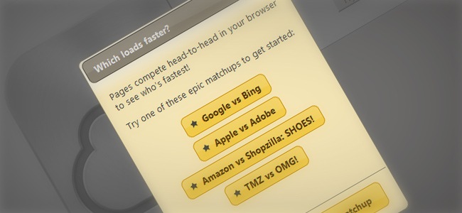
A fun tool conceived and written by Ryan Witt that lets you compare different sites in terms of speed and performance. Which Loads Faster is an Open Source tool based on HTML and JavaScript, the tool runs 100 % on client-side, so you can host your own site’s files and teak them according to your needs.

Speedtest.net is a complete speed and performance tester that helps you verify permanently if your Internet service provider is delivering the connection speed they promised. You can sign up for a free account to test multiple computers, create Speed Waves, manage your test history and more.

Ping / Server Monitoring
According to Wikipedia, Ping is a computer network administration utility used to test the reachability of a host on an Internet Protocol (IP) network and to measure the round-trip time for messages sent from the originating host to a destination computer, these next links will give you a hand when trying to perform a ping test as well as checking your server’s state.
This site allows you to ping a server to find out if it’s online or not. This ping utility sends ICMP packets to the destination address and gives an outside view of your server’s response time, which allows you to track down any possible issues.

Server Monitoring offers a complete test and analysis service that scans CPU, load, memory, bandwidth, disks and any aspect that might affect your site’s performance. The site runs via SSH, which means that you won’t have to install any additional software.

Validators (broken links, forms, etc.)
A validator is a small but powerful program used to check the validity or syntactical correctness of a fragment of code or document. The term is commonly used in the context of validating HTML, CSS, XML documents or RSS feeds, though it can be used for any defined format or language.
Fractal is a simple HTML and CSS Validator for email designers and marketers that lets you check exactly which lines of code are not supported in over 24 email clients.

jQuery.validity is an elegant and powerful jQuery plug-in you can use to setup client-side form validation. Instead of writing validation manually or balancing some unwieldy server-side framework, validity allows you to design client-side validation in a manner that feels natural and straightforward. It takes advantage of jQuery’s selector engine to perform validation on logical groupings of inputs, making it declarative and clean.

Holmes is stand-alone diagnostic CSS stylesheet that helps you highlight potentially invalid, inaccessible or erroneous HTML markups by adding one class. To use Holmes you just have to download a version of the CSS and include a stylesheet link to it on your page, then add the class ‘holmes-debug’ to either your BODY or HTML tag and you’re set to go.

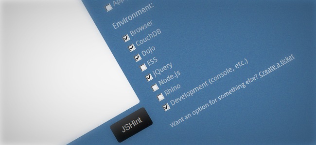
JSHint is an Open Source tool created to detect errors and potential problems in JavaScript code and to enforce your team’s coding conventions. It is very flexible so you can easily adjust it to your particular coding guidelines and the environment where your code is going to be executed.

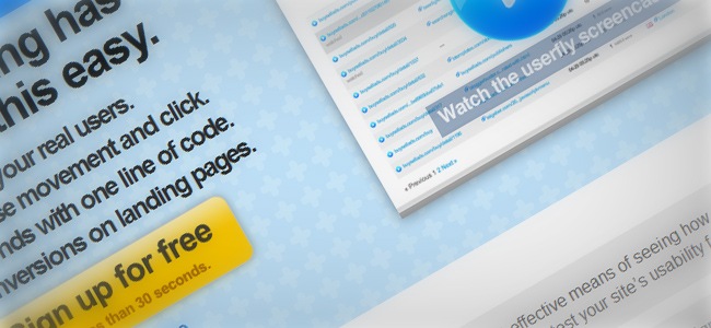
With Userfly you can watch videos of your real users, see every mouse movement and click, increase conversions on landing pages and more, just install the applications in a matter of seconds with a single line of code.

Are My Sites Up is a web service that helps you keep an eye on your site. The tool checks your site(s) at least 96 times per day and gives you unlimited email and SMS notifications so you can always know when and why your site was down by providing the HTML status error code when possible. The tool also provides an iPhone application, RSS feeds, Twitter integration, keyword search, premium-level support, email notifications to multiple addresses and more!.

Website security tools
OK, so now you know how to keep your site updated, cross-browser and with an optimal transfer speed, now you need to put your eyes over another aspect that can cause you many troubles if you don’t pay enough attention when necessary. These next tools are going to help you keep a good security level in all the different instances of your site, so let’s take a look at them. The most basic security measure that any decent website has is a login name and a password. These two values can be enough to keep most intruders away and with these next tools, you can make your login and password values something even more secure and hard to penetrate.
LastPass is a popular security service that will help you stop saving tons of logins and passwords for all your accounts and social sites, LastPass gives you a master pass that you can use in practically any page and by making a single click. The tool also customizes an auto fill service that can help you prevent your passwords from being stolen when you type them down, these and more other great features can be acquired by signing up for a free account, though you might one to try Last Pass premium, an exclusive service that will increase your security enormously.

This plugin grew from need to have an alternative to the traditional CAPTCHA solution found on most web forms. For not having the ugly and confusing scrambled letters at bottom of each form, but still having a way to prevent the site being inundated with spam, slideLock was born. This is by no means a security plugin; safe handling of the form and it’s information is your responsibility. slideLock merely provides a tool by which you can help prevent spam.

Logaway™ allows you to keep all of your login and password data in one place, while simultaneously giving you the best of the internet. By creating a free account, you will gain instant access to thousands of your online accounts from one easy-to-use start page. (YouTube, Facebook, Gmail and more!).

MotionCAPTCHA is a jQuery CAPTCHA plugin, based on the HTML5 Canvas Harmony procedural drawing tool by Mr Doob and the $1 Unistroke Gesture Regonizer algorithm (and the more recent Protractor algorithm improvement), requiring users to sketch the shape they see in the canvas in order to submit a form. Version 0.2 adds mobile-support, so if you’re on mobile, you can now play with the demo!

An amazing idea that can definitely encourage you to create stronger and better passwords because, the stronger the password is, the more clothes the pixel lady will take off. Naked password is extremely easy to use. All you need to do is attach nakedPassword(); to one or all of your password fields.

Error, bugs and feedback
On this section you’re going to find some additional security tools that can help you detect errors and improve your site’s performance by removing useless elements and simplifying several processes.
Bontq is an user-friendly issue tracking and project management cloud-hosted system. The service provides an easy way to manage projects, track bugs, add tasks and store documentation. Bontq’s integrated Desktop Client allows you to capture screenshots and record videos to show everything in details.

ErrorHelp aids people search for errors that other persons might have found and solved. The site was created by Miracle Labs and David Cole and since its release has become an important place where people can share questions and answers to several types of issues.

Security and monitoring
This section features a few links that can definitely come handy in case that you want to check your site’s status and upgrade the performance and security of the website itself.
Generate Privacy Policy is a great site where you can create professional privacy policies using the site’s user friendly tools. Privacy policy agreements are tailored specifically for your website, business and requirements.

Url Void is a free service developed by NoVirusThanks Company that allow users to scan a website address with multiple scanning engines such as Google Diagnostic, PcTools Browser Defender, Norton SafeWeb and MyWOT to ease the detection of possible dangerous websites. It’s important to state that even if a site is listed as clean by all scanning engines, it does not ensure the harmlessness of the website analyzed.

The reports are cached for 1 day to avoid the same website from being scanned too many times in the same day, which is something that can affect the site’s performance.
Log.io is a helpful online tool that offers real-time log monitoring in your browser, to understand how log.io works we can say that harvesters watch log files for changes, then send new log messages to the server which broadcasts them to web clients and finally, the users create stream and history screens to view and search log messages.

Code inspectors
Sometimes when you’re searching for inspiring ideas to build a new site, you end up finding amazing sites with functionalities that you cannot decipher with absolute certainty. To help you understand how a website was made, you can make use of code inspectors, which are simple but really helpful tools that go behind aesthetics and discover the ingredients behind a website, this is specially useful for web developers that want to check their working projects or understand other people’s work.
One of the most popular tools among web developers, Firebug integrates with Firefox and enhances its web development tools while you browse so you can edit, debug and monitor CSS, HTML and JavaScript on real time in any web page.

Firebug’s CSS tabs tell you everything you need to know about the styles in your web pages, and in case that you don’t like what you’re seeing, you can always make changes and see them take effect instantly, we definitely recommend this extension in case that Firefox is your browser choice.
In case that you want an even more powerful Firebug, you can download Firequery, a Firefox extension integrated with Firebug that enhances the debugging process by offering full support for jQuery elements. Now you can inject jQuery into any site and inspect it with ease.

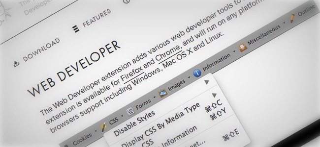
The Web Developer extension adds various web developer tools to your browser. The extension is currently available for Firefox and Chrome, besides it will run on any platform that these browsers support, including Windows, Mac OS X and Linux.

Greasemonkey is a Firefox extension that allows you to customize the way webpages look and behave using tiny pieces of JavaScript. Hundreds of scripts are already available for free to enhance the power of Greasemonkey, also if you’re really into development, you can also write your own.

Because data expressed as JSON (a nice system created to help developers with debugging) is often written without line breaks to save space, it becomes extremely difficult to actually read and make sense of it. This tool makes a grand effort in trying to solve the problem by formatting and validating JSON data so that it gets easy to read and debug by human beings.

JSLint takes JavaScript and scans it in order to detect errors, then it returns a message describing the problem and an approximate location within the source. The problem is not necessarily a syntax error, although it often is. JSLint browses through some style conventions as well as structural problems. Remember that JSLint cannot prove that your program is correct as it just provides another set of eyes to help spot problems.

Jash is a DHTML-based tool that gives you command-line JavaScript access to the current browser window. With this console you can quickly debug scripts, manipulate the DOM, view the current page’s objects, functions, and variables, execute arbitrary JavaScript, enter new CSS (in IE, Firefox, Opera, and Safari), and much more.

Usability
Talking about usability is making references to the process of making websites that are easy to use for an end-user, without needing the skills that only specialized training can provide. The user should be able to intuitively relate the actions he needs to perform on the web page and complete the entire navigation phase with no problems. The following tools can give you a hand at the moment of checking the usability level of a website.
Verify is the a fast and effective system developed by ZURB that allows you to collect and analyze user feedback on screens or mockups. If you’re launching a new site, Verify allows you to quickly test concepts with users to get immediate feedback.

Clue is a fun and easy way to test what people remember on your website, people takes a quick test over your site and then a report will establish how much did they actually remember about your site.

GhostRec is an awesome usability testing tool for your company’s website. See with your own eyes how design problems and mistakes make your website’s visitors leave in frustration or take longer than expected before finding what you want to share with them.

Readability is a simple and helpful tool that removes all distractions and annoying elements, leaving only the relevant content waiting for you to read it, the tool does not require for you to install additional complements or programs, just drag the bookmarklet to your toolbar and you’re set.

Fivesecondtest helps you enhance your landing pages and calls to action by analyzing the most prominent elements of your design, just upload a screenshot or mockup, write down the questions that you need answers about and wait for the feedback to roll in.

Mobile / App tools
If you want to make it big in the web design / development business nowadays, it’s primordial that you understand and design for mobile and alternative devices. 10 years ago you were able to play safe by producing a Windows software because almost every major operation was done via desktop computers. Now things have changed with the boom of mobiles and tablets, which has opened a whole new spectrum of possibilities for web designers that now need to design for more than standard 1024 x 768 resolutions. The next links will give you a hand once you decide that is time to go mobile.
Task Manager
In case that you’re running a major business and you have no time to sit in front of your desk to send emails and check how your employees are doing, then you might need a simpler and more portable method to keep your business running while you stay on the road. Mobile devices can help you stay connected at all time and save you lots of time that you cannot waste.
Flow is a Mac application that helps you keep your life and business organized in one place. With Flow you can create, delegate, and discuss tasks directly from your iPhone/iPod. Whether you’re writing a grocery list for your roommate or collaborating on some team project, thanks to Flow you can keep track of everything you need to get done. Flow saves your tasks in the cloud, so you’ll never have to worry about syncing.

Data transfer
Technology has gotten so advanced that now you won’t even a flash drive because your mobile can now receive complex information with just installing an app, so here’s a couple of useful links that will make your mobile the only thing you’ll ever need.
An useful tool for iOS devices that allows you to share files with mobile devices from your computer, just sign up for an account and you can start using the benefits of this app.

Sencha.io Sync is a multi-master cloud based synchronization service built for the HTML5 web. With powerful persistence capabilities, even if your mobile replica is lost, Sencha.io Sync can sync a full application data set back to where it was last, leaving your customers comfortable saving their critical data with your app.

Apps and plugins
On this section you’re going to find some neat and helpful mobile applications that as web designer will help you make your life easier by leveraging the power of your smartphone.
This website offers you all the tools to create your own iPhone apps, simply select the type of app you want to make, give it a name, add your content and app store information, then submit it under the site’s free or paid submission services that will take care of the development work for you as well as submitting the app to the App Store.

Dropbox is one of the most popular and useful ways for sharing large files with your peers and on this site you will find all the mobile applications that can take the Dropbox experience to your mobile.

This lightweight library allows you to obtain the wipe event on an iPhone, iPad or iPod Touch device, this event can be used e.g. to scroll through an image gallery. The tool also works with Android touchscreens.

PhotoSwipe is a free HTML/CSS/JavaScript based image gallery specifically designed for mobile devices. The tool is specially useful for developers and designers requiring an interactive image gallery on their mobile website with the look and feel of a native app.

Design and customization
Designing applications and interfaces for mobile devices can be sometimes a little tricky, with these next tools you will be able to make better mobile apps and websites in less time.
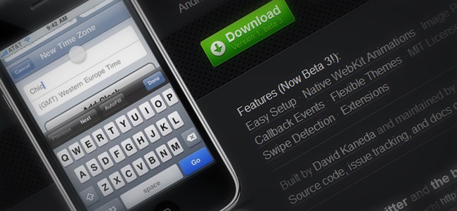
JQTouch is a jQuery plugin designed for mobile web development on iPhone, Android, iPod Touch, and other forward-thinking devices. The plugin can be downloaded for free and in case you’re working on a desktop computer, webkit browsers are able to render it.

A simple single level slidedown menu with CSS3 enhancements for browsers with support for corner radii, drop shadows and transitions. The animation will be seen in Firefox 4, Opera, Safari, Chrome, iPad, iPhone and iPod Touch. The iPad, iPhone and iPod Touch will show ‘Close X’ as the last item in the dropdown sub menu. This can be tapped to close the menu structure.

Another simple dropdown/flyout menu where all the sub menus are on screen at all times but hidden away under ‘parent’ elements. Again with animation for Firefox 4, Opera, Safari, Chrome, iPad, iPhone and iPod Touch. These browsers also have a delay on opening sub menus to stop the annoying dropdowns on accidentally hovering the top level links, and a short delay for closing open sub menus so that accidentally moving the mouse off the menu will not cause it to suddenly collapse.

A simple single level slidedown menu with CSS3 enhancements for browsers with support for corner radii, drop shadows and transitions. The animation will be seen in Firefox 4, Opera, Safari, Chrome, iPad, iPhone and iPod Touch. The iPad, iPhone and iPod Touch will show ‘Close X’ as the last item in the dropdown sub menu. This can be tapped to close the menu structure.

Laker is a large compendium of files, frameworks, styles and tips for designing digital publications in HTML5 specifically for mobile and tablet devices.

jQuery Mobile is an unified user interface system to work across all popular mobile device platforms, built on the rock-solid jQuery and jQuery UI foundation. Its lightweight code is built with progressive enhancement and has a flexible, easily themeable design.

This nice tool is an adapted version of the famous 960 grid for jQuery Mobile. It merges the flexibility of 960.gs and the ease of jQuery mobile to add more flexibility to jQuery mobile layouts and make them easier to run in mobile and tablet devices.

Boilerplates
Quoting Wikipedia, boilerplate is the term used to describe sections of code that must be included in many places with little or no alteration. It is more often used when referring to languages where the programmer must write a lot of code to do minimal jobs.
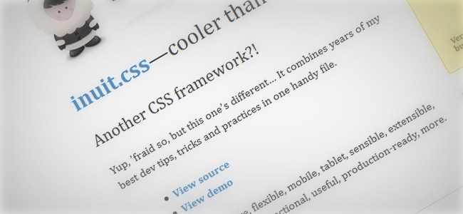
Inuit is a CSS framework built to work on smaller screens such as tablets and tiny screens such as smartphones straight out of the box with minimal effort. Inuit has basic support for new HTML5 elements, so in case you wish to use them you’ll need to adjust it manually.

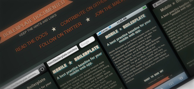
Mobile Boilerplate is a custom made template created for making rich and powerful web apps. The tool gives you cross-browser consistency among A-grade smartphones as well as fallback support for legacy Blackberry, Symbian, and IE Mobile. You get an offline caching setup for free, fast button clicks, a media query polyfill and many common mobile webkit optimizations. Mobile Boilerplate is definitely a neat tool to help you start your mobile website/app quickly and with ease.

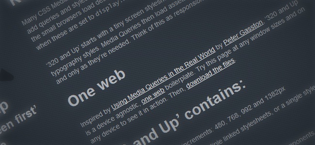
320 and Up starts with a tiny screen stylesheet that contains only reset, color and typography styles. Media Queries then load assets and layout styles progressively and only as they’re needed, this can be considered as an approximation to the concept of responsive design. The tool comes with four CSS3 Media Query increments: 480, 768, 992 and 1382px, the package also includes combined HTML5 Boilerplate and Mobile Boilerplate components

Automate tools
Saving time is something that has become one of the most important things on these days when everything seems to be moving faster than ever, leaving us no time for working in our own rhythm. Having this said, on this section we have listed a few automating tools that will help you cut-down times, leaving you a wider amount of time for focusing in what really matters (design, developing, etc).
Theme generator
Although there’s nothing better than making your own WordPress themes, from the design to the programming part, you may eventually require a tool that helps you automate this process in order to generate themes with ease and in less time than usual, so let’s see what these tools are about.
Lubith is a fancy WordPress theme generator with an intuitive interface, no code required so everyone can easily use it and best of all, faster than ever!.


With Jux you can create appealing fullscreen webpages with social widgets included and tons of many great features to help you boost your website.
Timesheets / Invoices
Building timesheets and invoices is a normal part of any major business that deals with clients and needs to keep an organized schedule. With the next tool, you can easily organize and keep control over your timesheets and invoices.

Timetrack is a tool aimed at simplifying the management of your timesheets and allowing you to create your invoices in only a few clicks. Whatever your business is, Timetrack will increase your productivity.
Forms / submit
One of the most effective ways of establishing communication with your followers is through web forms; these elements help people express their thoughts about your products or articles so you can realize how to improve your work and provide a better user experience to your audience. These next tools will help you create better web forms and improve the way your fans interact within your site. This section also includes a few helpful websites where you can submit your work to help you boost your site’s traffic and strengthen your online presence.

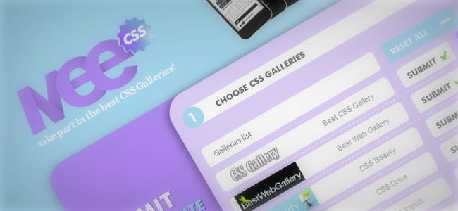
MeCSS was built to help you submit your site to the more important CSS galleries on the internet, making the submission process faster and easier. Through this site you’ll get direct links to the submission pages of their selected galleries.

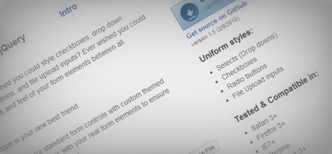
Uniform masks your standard form controls with custom themed controls. It works in sync with your real form elements to ensure accessibility and compatibility. Installation of Uniform is quite simple. First, make sure you have jQuery 1.3+ installed. Then you’ll want to link to the jquery.uniform.js file and uniform.default.css in the head area of your page:

jFormer is a form framework written on top of jQuery that allows you to quickly generate beautiful, standards compliant forms. Leveraging the latest techniques in web design, jFormer helps you create web forms that validate client-side, server-side and process without changing pages using AJAX.

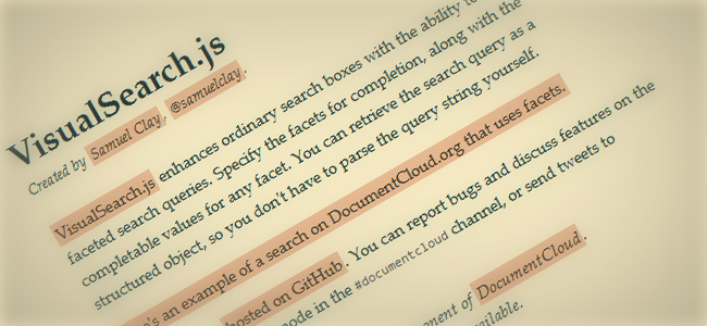
VisualSearch enhances ordinary search boxes with the ability to autocomplete faceted search queries. Specify the facets for completion, along with the completable values for any facet.

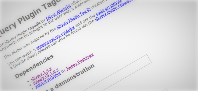
The jQuery Plugin Tagedit by Oliver Albrecht offers an easy way to add, edit and delete lists of keywords. The keywords can be brought to the user with through a nice and functional autocomplete list.

Formsly lets you associate multiple email addresses to the same contact form which is useful when you want to let site visitors to contact different departments of your company. The tool is a complete service for making the most complete contact pages for your site.

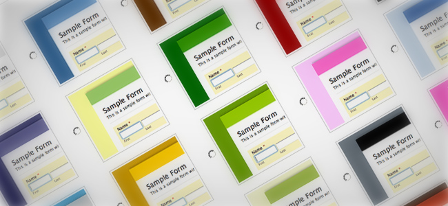
Awesome tool for designing HTML forms. No need to register, free plan available and professional results adapted to your own language.

With Faary you can easily create CSS forms and instantly implement them in your site, just set up your design and the CSS will be automatically generated.

A free HTML form builder, just select a color scheme, customize your design and download the HTML that will be automatically generated by the tool.

An astounding Lorem Ipsum replace, Fillerati is built with HTML5 and CSS2/CSS3, and consequently is best viewed in a modern browser such as Chrome, Firefox, Safari or Opera. Interactivity is thanks to the jQuery JavaScript library, served via the Google Ajax Libraries API.
Design and Developing tools
One of the most helpful sections of this post where you can find multiple tools that can really help you out either if you’re a designer or developer. Some of these tools will help you optimize your website for a better Search Engine Optimization, keep track of your site’s performance, debug any site’s code to see how they were made and more. This section will definitely give you some powerful tools to help you become a more effective designer / developer.
SEO tools
Doing a proper SEO requires a lot of knowledge in case you want to do it 100% manually, fortunately there are several tools that can help you automate this process, letting you focus on the content while these tools take care of what’s going on underneath.

Clicky is a real time web analytics service. This means that when you login and view your stats, you are seeing up to the minute data on the traffic to your web site. Most services don’t let you see what’s happening “today” until the day after. Real time data lets you react to changes in your traffic as they occur.

This is a really helpful tool that allow you to watch your vistors mouse movements and they´re recorded in real time, even in members only pages! Also provides Click heat maps, Scroll Depth heat maps, and Mouse Movement heat maps. But that´s not all, you can help them with a Live chat that supports multiple visitors at the same time and up to 7 additional chat operators, for high traffic. Can be integrated with WordPress and Blogger.

See who’s reading, commenting, joining, or buying on your website right now. Watch your traffic unfold. All this in real time. This website has a great and clear tour, so you can see exactly what you´ll get by downloading this awesome real time web analyser. Responding to visitors the next day is as good as not responding at all. GoSquared monitors your website’s traffic and analyses it for you in real-time. So you can react within minutes, rather than days.

Panopta is a complete server monitoring service and outage management system that gives you the tools you need to minimize the impact of outages to your online business. Network service and server resource monitoring with checks every 60 seconds from our global monitoring network with 25 locations in North America, Europe, Asia and South America. Includes Intelligent notification via email, phone and SMS with automatic team-based escalation.

Visual Web Site Optimizer is a flexible multivariate testing software (full factorial methodology) which means that no matter what kind of testing your conversion rate optimization project demands (A/B, split URL or multivariate), you can be sure that it is covered by the tool. In addition to being dead-simplesplit testing software for marketers, it also dramatically shortens time to go live with your A/B tests because of the innovative tag-less integration

Is an amazing tool that provides full support for your website and gives you a complete report of what´s your site popularity, how to improve the SEO, how well is your website doing, is it getting traffic, does it have SEO problems, how popular is it in social media and many others. All you have to do is enter your website URL and click Generate Report. They´’ll do the rest.

This is kind like Google Alerts but for social media.With this helpful tool you´ll get free daily email alerts of your brand, company, CEO, marketing campaign, or on a developing news story, a competitor, or the latest on a celebrity.

Optimize your post as you write. SEO Blogger is just one of Wordtracker’s keyword research tools It helps you to search for keywords, and see how popular they are, as you write your blog post. It then tracks how often you use those keywords as a raw number and a percentage, helping you write fully optimized blog posts from your Firefox browser.

The SEO Book website offers a wide array of free and paid SEO tools to SEO professionals and DIY webmasters. There you will find some of their most popular SEO tools sorted by category, so you just need to visit the site and choose what tools are best fitted for you! The SEO training site map helps you visualize and locate all the various sections of the training program from 1 page.

The Blog Analyzer is a powerful SEO tool for Professional Bloggers. This SEO Tool analyzes a particular article for all the known SEO factors and helps you improve the Search Engine Rankings of the blog post. The Page Analysisprovided in the Report, allows you to identify and resolve all the major SEO mistakes while the complete text analysis of the report enables you to focus on the important Keywords in order to easily optimize your SEO copy.

Twimbow is a web application that helps any social media user to engage their network of friends more effectively, by organizing and enriching their online conversations. Is an innovative social hub that lets you “consume” your social networks effectively and is set to re-invent the way people consume social media and news and offers a unique way to highlight your most important messages, introduces the concept of “personal buzz” for all your interactions with other users and the innovative concept of “monitor”.

Are you a twitter lover? Well, Imagine this: You’re browsing the web and finding great content. Buffer takes care of sharing that content on a schedule your followers will love. Collect and share from anywhere. You can buffer any page, just hit the Buffer icon to add an article to your queue of Tweets. Also, buffer gives you full analytics for every Tweet you send.

How would you like to manage your Twitter account, today? There are many features that more than one will find helpful, like flush the unfollowers gets rid of those ho don´t follow you back. Reciprocate, instead of selecting from a long list who follow you and follow them back, this simplifies that) Cleaunup the inactives is for delete those unwanted on your TL.

This is a great tool for fast and easy locate hashtag for those who like to keep informed in many hashtags at the same time. You can browse in two modes: Simple and advance. The best thing of it it´s how visual it is. By clicking on one word or subject, more and more hashtags will derivate from it. If you like twitter
Image editing
On this part of the article we have a few great tools that in case that you’re not much of a Photoshop fan will help you a lot on the editing process of your photographs, though you can’t expect to obtain all the powerful features of PS.

iPiccy makes your photo awesome with many easy to use photo tools. Edit pictures, apply beautiful photo effects, add text and even paint! Enjoy free photo editing online and show your creativity with iPiccy editor! You can add your pics from your computer, get them from your webcam or from URL.

Aviary is such a great and flexible tool that help you create and enchance a lot of differents type of file. You can create an avatar or enchance all your Etsy photos, avatar, banner, everything. Aviary also allow you to edit your images with undo and redo, brushes, magic wand, and blend modes.

Fist, you select a picture, then you work with it. Decide what are the parts you want to keep and what are the parts you want to remove. After the editing is done, slide the bar on top of the image and the, you´ll see how magically gets resized! Well, not magically, more like, technologically… sort of :). Just use it! and enjoy.

Step 1: upload a pic. Step 2: cut or customize your pic Step 3: Mail it or save it. Is there anything else you need to know about this elpfl tool? as simple as it sounds. Select your file, click the GO button and then decide if you want to send it or save it. That´s all!

Are you having troubles resizing images that are too heavy? well, that´s about to end with great tool. PunyPNG is a free website optimization tool that dramatically reduces the file size of your images without any loss of quality.

Stripemania is a simple and free web 2.0 tool to create seamless diagonal stripes for your designs. You are able to choose the size of the stripes and the spacing between those. You can even add color gradient effect for all of your stripes. Feel free to play with it. You are allowed to use the created image for whatever you would like to.

It´s a great tool that gives a reflection under every image you input. All you have to do is select a file, upload it, wait and ta-dah! a shiny reflection effect right under your image. This is such a neat effect for any website. Bright and shiny..

Jcrop is the quick and easy way to add image cropping functionality to your web application. It combines the ease-of-use of a typical jQuery plugin with a powerful cross-platform DHTML cropping engine that is faithful to familiar desktop graphics applications.

vintageJS is a tool where you can upload your images and apply a custom retro, vintage look to them for free. Just try it out: upload your photo, apply the vintage effect and share the retro image it with your friends via facebook or twitter. This is so awesome you should be uploading your pictures like, right now!

You don’t have to be a Javascript ninja in order to get involved with CamanJS. In fact, making preset filters is extremely simple and is a lot of fun! The main focus of CamanJS is manipulating images using the HTML5 canvas and Javascript. It’s a combination of a simple-to-use interface with advanced and efficient image/canvas editing techniques. It is also completely library independent and can be safely used next to jQuery, YUI, Scriptaculous, MooTools, etc.
Design and Development tools
On this section you’re going to find many great tools for making your designing/developing life easier, some of the tools mentioned here include background generators, code reset tools, favicon editors (one of the most important elements in any website) and more.

This website is divided into 3 boxes, In the first box you have to Select your body font size Conversions based on 16px browser default size, and Voila! Your conversions based on your body font size appears in the second box. Are you worrying about your custom conversions? fear not! you´ll also find a calculator for your custom EM needs.

This is a great image slider that allow to easily choose the image to display, since it´s accordion styled. By simply clicking on an imagge the acordion will show it.

Markdownify is published under the LGPL, also using Markdownify in commercial products is allowed. Open Source makes it possible! Markdownify Write texts in Markdown and save them in HTML. You won’t need a copy of the original Markdown input, since Markdownify can convert the saved HTML back to Markdown. And because page impressions are far more often than write actions, this gives you a simple way to increase your page’s performance.

Droparea is a HTML5 drag and drop image file uploader jQuery plug-in and a php script for server-side.

Infinite scroll has been called autopagerize, unpaginate, endless pages. But essentially it is pre-fetching content from a subsequent page and adding it directly to the user’s current page.

This is a small jQuery plugin that makes it easy to execute a function whenever you scroll to an element.

jquery-ahm is a replacement for $.ajax. With $.ajax, every Ajax request needs a callback, resulting in a lot of javascript. Reduces Ajax requests to one-line

Like a lot of developers, we start every HTML project with the same set of HTML and CSS files. We’ve been using these files for a long time and have progressively added bits and pieces to them as our own personal best practices have evolved. Now that modern browsers are starting to support some of the really useful parts of HTML5 and CSS3, it’s time for our best practices to catch up, and we thought we’d put our files out there for everyone to use.

Tihs is a really cool tool, give you complete creativity over your background, by adding color to a modificable grid, you´ll see the results in real time on the page background itself.
background generator.

Do you know what favicons are? these are the little images that appear next to your website title, this really simplifies your website identification. Ok, great, right? but, you have no idea of how to create it, where or how to save it. This website does all that for you, of course, this gotta be pixel art style.

BaseKit lets you quickly and simply create, host and manage your own website. website builder. All BaseKit subscriptions come with hosting ranging from 1TB to unlimited bandwidth. Whether you are building a small personal website or a large business website, you can be sure that your website is future proof. We use Amazon S3 for hosting your site so you will never be worried about site maintenance.

If HTML is your passion, I can help you to make wireframes quickly using the dynamic grid, based in Tyler Tate’s 1kb CSS Grid which is already included and can be configured in the perkins.config.less file, as well as many other options.

XRAY: look beneath the skin XRAY is a bookmarklet for Internet Explorer 6+, and Webkit and Mozilla based browsers (including Safari, Firefox, Camino or Mozilla). Use it to see the box model for any element on any web page. See what’s new in this version. Upgrading to future versions should not require changing your bookmark!

qTip2 provides you with tonnes of features like speech bubble tips and imagemap support, and best of all… it’s completely free under the MIT/GPLv2 licenses! qTip2 is dual-licensed under the open source MIT and GPLv2 licenses. These licenses must be distributed with all scripts falling under their terms, either in file form, or a link to a copy in the header of the files.

FlipSnack is an online flipping book software that allows you to convert PDF documents into Flash page flip digital publications. It’s the ideal solution for those who wish to embed a book, magazine, catalog, newspaper, portfolio or any other kind of document into a website or blog. Once created, you can embed your flipping book collection, download them or share them on social networking websites such as Facebook.

jQuery textbox hinter is plugin which allows to add hints to textboxes and textareas. Acts as a complete replacement for labels. It´s simple and light-weight, no knowledge of programming required, you can add classes to default text and you can also add hints to multiple to textboxes and textareas. It is cross browser supported and highly customizable.

SnackTools is a suite of web applications designed to simplify the way you create and publish rich media widgets. Our goal is to enable you to easily create your own blog and website widgets, in a fun and effortless way. All the SnackTools apps are licensed for free with the option to pay for a few premium publishing options mainly intended for professional use.

This is an images only browser simplfies the search of images. All you ahve to do is insert a item name and press the search button. Then a long list of images will appear and by clickin on an image you´ll see a larger image. It´s quite effective because drops different results than other search engines and diversify your search.

Whatever the device you try to reach, the Joshfire framework helps you develop one unique application and make it automatically compatible with mobiles, tablets, TVs, and even connected objects. Using only standards like HTML5 and JavaScript, it allows developers and integrators to quickly create native and dedicated web apps for browsers, Node.JS, desktops, smart phones, smartTVs and connected objects.

Offers two optimized Flash Player embed methods; a markup based approach and a method that relies on JavaScript, offers a JavaScript API that aims to provide a complete tool set for embedding SWF files and retrieving Flash Player related information, utilizes only one small JavaScript file (10Kb / GZIPed: 3.9Kb), is the successor of SWFObject 1.5, UFO and the Adobe Flash Player Detection Kit. intends to unify all existing Flash Player embed methods and provide a new standard for embedding Adobe Flash Player content

Tipsy is a jQuery plugin for creating a Facebook-like tooltips effect based on an anchor tag’s title attribute.
Alerts
A part of creating a friendly user interface is understanding how to interact with the user at all time, one of the ways of doing this is through alerts, which are short messages that inform the user or manager about relevant changes or actions that might trigger a determined event, now we’re going to show you a few alert management tools that definitely come handy at any time.

A free lightweight jQuery AJAX Alertbox Plugin.Have any use for an Alert Box? Well this maybe for you. It’s a simple little plugin which you can tie to anything to create an alert box – in this case the rather popular “Are you sure you want to continue?”.
Animations / Effects
This section covers all those web tools that help you add some nifty effects and animations to your designs and web projects with ease, so you won’t have to be an ace on the subject to have a highly appealing website.

Flying effect Plug-in for Pics and Words, Requires the jQuery Library as well as the Easing plugin.

This is a image slider, or in other words, an animated background image that changes ever once in a while or when clicking over ohter image to display. Is a great way to showcase your photos, illustrations, designs or even text content.

jRumble is a jQuery plugin that rumbles, vibrates, shakes, and rotates any element you choose. It’s great to use as a hover effect or a way to direct attention to an element. You can control the X, Y, and rotation range, the speed, and event trigger for the rumble.

Zoomy is a quick and easy plugin that will zoom into a picture. You just need to link a smaller image to a larger image.

This is a jQuery image with a mosaic effect. This jQuery plugin Automatically generates sliding boxes & captions, allows slide & fade animations with custom directions and preloads images within boxes.

Zoomooz is an easy-to-use jQuery plugin for making any web page element zoom.

Autogrow Search, basically when you focus the input this grow up. Meaning, there’s a small search box, and once you click in it, grows. This give you a extra room for input your search.

Parallax plugin that allows you to orientate an element based on the position of your mouse to the page’s window, or element’s parent.

Is a image slider source jQuery based billboard. It features some really nice transitions and many professional and advanced features.

Bubble Engine is a plugin for jQuery. Several sources of bubbles are generated on the site, all of which can be configured freely.

ShowOff is a jQuery plugin for creating a rotating content module. It works by creating ‘slides’ from the child elements (eg. <li>) inside a specified wrapper element (eg. <ul>) on which .jshowoff() is invoked. It then rotates through the slides, with options for controls, links, and more. This type of module is often used to promote pages, sections, or features on a site.

Supersized is a fullscreen background slideshow built using the jQuery library. This gives a super fresh look to any website, remember to use really high quality pictures, so we don´t get a big blur on screen.

Totem makes vertical tickers easy to implement by:Turning a list of items into an animated ticker that auto-advances Specifying anchors for stop, start, next, and previous navigation links. Totem was released under the MIT license.
Graphics and chart editors/generators

Is flexible jQuery plugin that allows you to spice up your plain data tables in a snap. Table data is visualized using colors, bar charts or bubbles right in the table itself.

Interactive subway map visualization for their website using HTML markup.

Is a graph visualization library built with web workers and jQuery.

jqPlot is a plotting and charting plugin for the jQuery Javascript framework. jqPlot produces beautiful line, bar and pie charts.

This jQuery plugin generates sparklines (small inline charts) directly in the browser using data supplied either inline in the HTML, or via JavaScript.
Music and audio tools
This section covers all those tools that can be helpful at the moment of working with audio, specially on the web where aspects such as the data transfer and bandwidth can severely affect the performance of any audio file.

jMP3 (javaScript MP3 player) is an easy way make any MP3 playable directly on most any web site (to those with Flash & javaScript enabled), using the sleek Flash Single MP3 Player & the fantabulous jQuery. The Del.icio.us Playtagger is OK for basic purposes, but is not very configurable, can often incur startup delays, and is just not very attractive. jMP3 aims to fix all that!

This is a jQuery plugin that allows to play music with a slider look, If you want to add some music or effect to your website here´s a cool option. Full HTML5

Comes out of the box in two variations and with incredible options of customization: Flexible dimensions, unlimited colors and two different button sets for light and dark themes. Easy to set up. Just a few lines of Javascript and a quantum CSS. Featuring the technology of Projekktor it comes with cross-browser compability, Flash-fall back plus optional social- and artists information links.

In just a few clicks, you can turn any audio file on your computer into a different audio file type, including iPhone ringtones! Why wrestle with audio files your media player just won’t read? Why pay money for ringtones when you already own the CD? With Switchr, these are problems of the past.
Sliders, image galleries and more
One of the nicest ways of showcasing your work is through image galleries and sliders. These elements are helpful for displaying your images and products in an easy way and without having to spend much time focusing on the design aspect.

Awkward Showcase is a plugin for the JavaScript Framework jQuery. You can call it a Content Slider. But it can do more then just slide the content. For example you can add tooltips, enable thumbnails, activate dynamic height and lots more. Since version 1.0 it’s integrated with Viewline Plugin enabling new innovative ways for displaying content on your website.

A delicious jQuery image slider. This isn´t just useful but can´t resist to take a bit! The best part is Choco-Slider weighs only 7kb, so, it´s lightweight, flexible, customizable, was released under MIT license and last but not least, it is compatible with Firefox 2 +, IE 6 +, Safari v4, Google Chrome 3 + and Opera 9 +

Slides is a slideshow plugin for jQuery that is built with simplicity in mind. Packed with a useful set of features to help novice and advanced developers alike create elegant and user-friendly slideshows.

It’s fairly simple to get this going, just copy and paste markup from this file if need be. The easiest thing you can do is download the quick start pack and modify as you wish, but if you don’t want to do that then you can take the elements individually and build them into an existing site. Start by getting all of the dependant files that are listed up top, including dualSlider.

Implement your slideshow with the Agile Carousel JQuery plugin. Highly customizable so you can build according to your requirements. JSON data format is used to provide easier integration with external data or data from your CMS. JQuery UI effects and the ability to read files on the server are no longer included. New features are added, such as “Control Sets” which allow for a more customizable setup. Now posted on Github for faster development.

This is a neat jQuery image slider, it has a cool transition effect, and you can choose the numer or the image you wanna see, or you can use thumbnails or dots, instead of numbers. No problem there. It´s easy to add to your code and really flexible. It loads as HTML and XML,

The purpose of Slider Kit is to gather common slideshow-like jQuery functionalities (such as news sliders, photos galleries/sliders, carousels, tabs menus) into one lightweight and flexible plugin combined with ready-to-use CSS skins. This is the 1.5.1 version, was created by Alan Frog. Was released under the GNU License. Was first released on March, 26 2011 and last updated on may, 18 2011.
Sharing tools
No matter how good designer/developer you are, it’s always great having the chance of working together with your colleagues to generate powerful applications and designs. On this section we have included a series of tools that will help you work online with your associates and boost your productivity.

AjaXplorer is an easy-to-install file explorer for remotely managing files on a web server or operation as a simple file-sharing system. Its rich layout and actions make it easily accessible to virtually any end-user.

Plan2Biz was designed to make the daunting process of creating a business plan oh-so-easy. We have integrated professional advice and best practice recommendations into Plan2Biz. Forget about merging templates, finding advice from a business magazine and e-mailing changes back and forth to your team. Plan2Biz includes everything you need to start working on a business plan.

Scadaplan is a project management and collaboration tool for small and middle groups. Similar programs can be found across the internet, which consist of functions like Tasks, Deadlines, Calendars, Comments, etc. This is why they have decided to develop something of their own and to let the people use the product.

SugarSync’s online backup, file sync, and sharing service makes it easy to stay connected. With SugarSync you get secure cloud storage for all your files — documents, music, photos, and videos. Connect with our community and learn how other customers are using SugarSync in their work and personal lives.

Doolphy is your online project management tool that helps you to plan, check and control all your projects and tasks. Define your goals, collaborate, work with your team and track the progress of your projects.

This is one as many other file transfer program, but, this one get it done beautifully, because, afer all, what´s the technology good for if not enhance the old way of doing things and making them more intereactive and creative. We´re designers, developers, our purpose is to make things beautiful and more effective. Pick you file, drag and drop it inside the castle.

Scribd is the company publishing and reading world’s largest social. We have facilitated the sharing and find entertainment content written, informative and original through the web and mobile devices. Our vision is to deliver the written word, to connect people with information and ideas that matter most.

An easy, fast and effective fle transfer website. It allows up to 9GB or unlimited when login in. Sites like these are really done for make our life easier when it comes to file sharing or transfer. The world goes fast, who want to wait a few minutes until the file get attached or the evil “your file exceeds the limit” message?

Simplenote is an easy way to keep notes, lists, ideas, and more. It support a great seach system… just type whatever you’re looking for, and your list updates instantly. You can access multiple backups of your notes. Just drag the version slider to go back in time. Apply tags to your notes so you can browse them as folders, or pin important notes to the top of your list.

This website helps you to create your corporate portal. Among the main features are project, business and documents management. Allows to set milestones, assign tasks and due dates. Track team activity and generate reports. Also Create, edit, store and share documents with colleagues all in one place. Express ideas in blogs and forums, share photos, bookmarks, wiki and post polls and news

The Shareholic crew are strong believers in the value of open, open platforms, the social web, passed links, and generally want to make the web a better place for everyone. They love big data, cloud based infrastructure, social media, analytics, elegant design, products that “just work”. They’re devoted to make products that focus on the important stuff while hiding technical complexity — so you can do what you want to do more quickly and more easily.

DesignSvn is designed and built for creatives. Manage your design process with ease and get feedback from your clients. Workspaces allow you to organize and group your concepts into seperate spaces to reduce clutter. DesignSvn allows you to create multiple workspaces, it would be ideal to create a new workspace when commencing work on a new project. Once completed, workspaces can be archived.

Ge.tt is a real-time file sharing service. But what is it really and what can you use it for? Let’s try to explain it a bit. With Ge.tt you can turn any type of file into web content and share it instantly. You can share documents, video, music and photos in the browser making them instantly available for the recipient. If you sign up, you can even re-use and keep track of the materials that you previously shared.

Are you tired of wanting to get those awesome codes fro Github but, you´re a Mac user? well, those sad days are now over thanks to this great tool. At GitHub, they think that sharing code should be as simple as possible. That’s why they created GitHub for Mac.
Sketching tools
Yes, we know that there’s nothing better than the old pen and notebook, but in case that you want to let go your creativity in a digital environment, these next tools are definitely an open canvas where you can let loose all your crazy ideas.

Sometimes while browsing Deviantart, haven´t you get the urge, the artistic rush and just need to draw? there´s no time to wait until your favorite illustrating program loads and open, a few seconds could be the difference between being enlighten with inspiration and completely loosing the feeling. It includes all the basic tools and a few good ones for effects. This great online tool works with wacom, but also is sensitive to my MacBook pro touch pad.

An online canvas that, among other features, includes pencil, brush, calligraphy, you can modify the diameter and opacity. You can also choose the color, gradient, pattern, swatch, and view history. among the tools you´ll find select, crop, text, brush, bucket, eraser, etc. It´s quite simple and easy to use, give it a try and find out if you like it. Once you´re done, files are saved as png files.
Cloud Canvas

CloudCanvas enables creative people to make digital art, design and other rich media right in the web browser. No plugins are required. Among the Vector Graphics Tools you´ll find ellipses, rectangles, polygons, lines, polylines and curves. Within the filters are blur, drop shadows and bevels. And of course, you´ll also find paint, brushes and texture. It´s a quite practical tool, always good to keep in mind.

This website has a really similar to Windows Paint interface, but this one includes layers. The tools are brush, spray can, syringe, eraser, fill and clear rectangle and paint bucket. There are 8 different brush sizes and you can choose you colors from RGB and HSL.

This is an amazing tool that makes the creation of diagrams a lot easier. All you have to do is click th Try it Now buttons and the, start draging and droping your diagram elements and arrange them as you need it. Among this application features are: You can create multiple Pages on Each Diagram, change the page Size/Orientation, you can change the content size to Fit Page and autoConnect Lines to Blocks.

This is a easy tool for those who prefer to use HTML in everything they do. It´s easily apply to any website. The code is free for all and you can customize it accordingly to your needs. If you want the diagrams to sit on your server all you need is a PHP and a MYSQL database. The web installer wizard will make the installation a breeze.

Pen.io is a super fast way to publish content online – this page was built using Pen.io. It takes just seconds to create a page and start adding content. Pen.io has been designed as a more permanent alternative to blogs. Blogs are great for posting regular content – with Pen.io, you can create a page and set and forget.

This website provides a tool to easily and fast create an iPhone mockup, you can choose if you want your mockup to look like an illustration or like a pencil sketch. The author doesn´t take any kind of responsability on what you do or if your competition figures out how to access it. And since this is an alpha version, it may disappear at any moment. Your mockup may be deleted at any moment.

The Markup allow your website visitors to express thoughts quickly and easily on any website. Share ideas with coworkers and friends. Since Markup works in your browser, so threes nothing to download and install, just drag the Get Markup icon into your bookmarks bar. When you want to make notes on a webpage, click your bookmarklet to load the Markup toolbar. Publish when you´re ready to share your thoughts.

Lumzy is a Mockup and Prototype creation tool for websites and applications. With Lumzy, you can create prototypes of how the site or application will function by adding events within your Lumzy controls. For instance, what happens when the user clicks a button? You can create Message Alerts, Page navigation or Links to external content when your client interacts with your Mockup, yet with the hand drawn feel of a sketch.

Create and share simple drawings — like those you do on a napkin in real life. Draw for fun or to communicate an idea. When you’re done you can share your drawing with a single click! 100% free — no signup required. Share drawings on Twitter, Facebook, email and more! Embed drawings in your blog or website. Add to existing drawings. Works in your web browser, no downloads required. Also works on iPhone, iPad and iPod Touch.
Color tools
Most designers know about color theory, which includes working with harmonies, understanding light temperature, creating color triads and more. Despite of having the knowledge for developing your own palettes, these next tools can give you a hand for creating the best color libraries for your designs.

Enter the URL of any CSS file to view and modify it´s color spectrum. And by installing the CSS prism bookmarklet you will be able to view the colors from any website immediately.

This online tools helps you to get the color scheme from a photo, all you have to do is take a picture with your phone, email that photo and then you´ll receive a reply with your photo scheme. You can also upload a photo from your computer. And once analized, their will also provide some suggestions for that color scheme you´re using. Whose suggestions? Well, no one but Kuler and ColourLovers, two of the giants of color scheme designers online.

This plugin implements an extensiv color parser and a featureful set of color-manipulation methods. There is also an animate() extension to smooth CSS colors. Another useful method isReadable() completes the whole, by allowing you to check if a text is readable on a certain background. The color value can also be passed in different color models: RGB, HSV/HSB, HSL and their adequate alpha extensions.

Like taste and smell, color is a sense that is processed by our brains in multiple dimensions. Section for more information.) Yet traditional methods of choosing colors on computers are limited to obscure sliders and flattened two-dimensional viewers. With ColoRotate, you can work with colors in 3D, in real time, and in a way that matches how our minds process color.

This colorfinder helps you to determine colors used by a website, so you can find suitable colors for your own page. It is not intended to help you stealing complete color schemes from websites but to aid you building your own color scheme.

This tool allows you to visualise good colour combinations on a Photoshop style colour picker. It’s primary use is finding acceptable colours from an existing inaccessible combination – while maintaining the aesthetic appeal of the original. Occasionally might happen across a combination that appears to have sufficient contrast but is failed by the tool, to arrive at a good contrast that is passed, you´ll have to adjust one or both of the colours and recheck until they pass.

This highly customizable, easy to install and speed optimized app comes in 4 different sizes (from 151 x 87 pixels to 407 x 302 pixels) and therefore different feature levels so you can use it for every supposable cause from ‘easy choice’ to ‘professional determination’. That’s probably all you’ll ever need to let your clients choose the right color. You’ll also find a lot of extra helpers and smart features that make life easier. Now full support for IE5.5 and IE6 and all other browsers, also works in quirksMode in all browsers. (* fallback system adds max. 5 files)

This plugin implements an extensiv color parser and a featureful set of color-manipulation methods. There is also an animate() extension to smooth CSS colors. Another useful method isReadable() completes the whole, by allowing you to check if a text is readable on a certain background. The color value can also be passed in different color models: RGB, HSV/HSB, HSL and their adequate alpha extensions.

It´s a scheme maker, you can also choose from almost 1000 amazing color schemes. It´s really important to choose wisely your color, they must be contrasting and complement each other in order to get the most from each design.

This is one of the most complete color scheme designer, it includes mono, complement, triad, tetrad, analogic and accented analogic. You can also adjust the scheme, adjust the variants and gives the entire colors list and it shows you an example how how this scheme will look applied in a light website and how it will look in a dark website example. Once you´re done, you can export your designed scheme.

ColorSchemer offers you a lot of different color related options, the ColorPix is a useful little color picker that grabs the pixel under your mouse and transforms it into a number of different color formats. You can use the built-in magnifier to zoom in on your screen, click on a color value to copy it directly to the clipboard, and even keep ColorPix on top of all other apps and out of the way.
If you ever found a website and LOVED the colorscheme, here´s a really helpful tools that allow you to know exactly what are the color usedd in that specific website. Itá amazing, and all you have to do is paste the website URL and click on Colorfyit!

This extension is mainly meant for web developers who need to pick colors on any web page, either pixel exact or within an area, quickly see color changes on their website without the need of external applications or to search for the right spot in style sheets or code, check for WCAG 2 compatibility, or just to collect colors from sites to quickly set up a color palette.
And now we have reached the end of this article featuring dozens of brilliant web design and developing tools, if you know any other tool that should be included on the list you can leave us a comment or reach us via Twitter and Facebook (oh yes, now we’re also on Plus), we hope you’ve enjoyed this article and if so, we would really appreciate your comments and votes, thanks for your time and we’ll see you soon.
