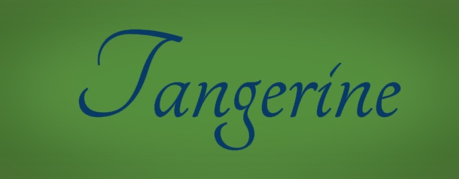
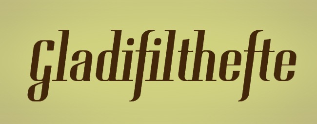
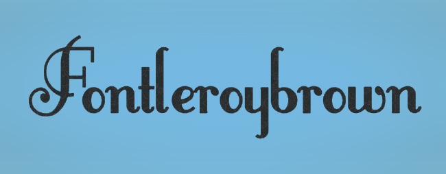
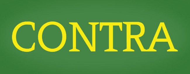
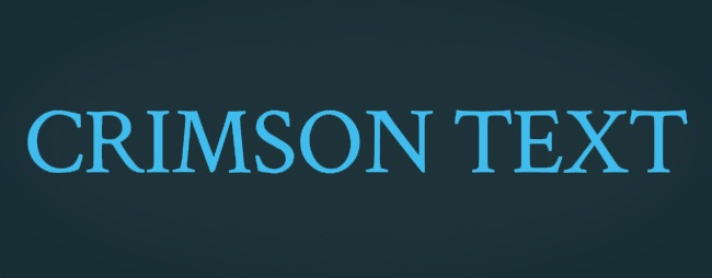
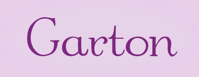
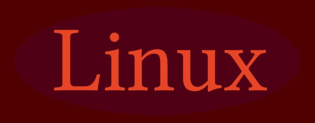
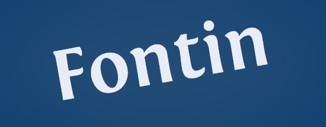
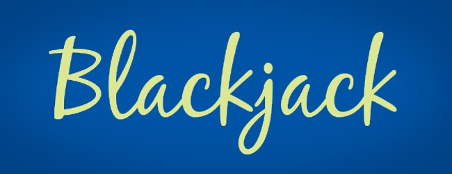
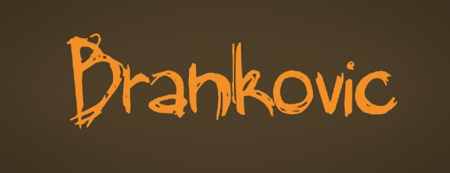
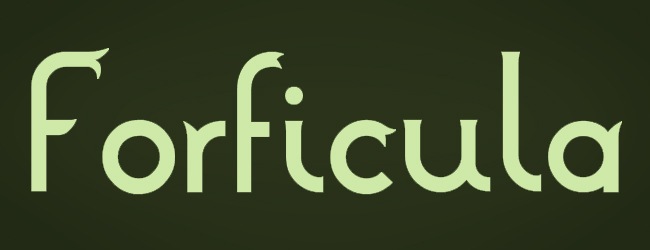
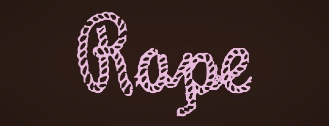
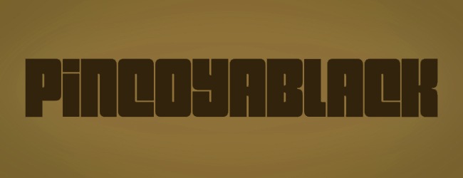
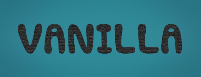
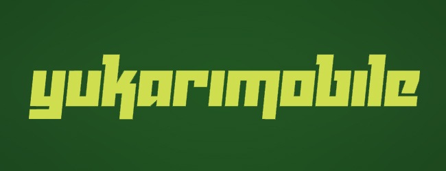
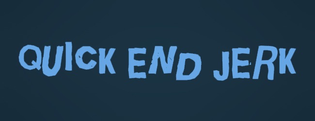
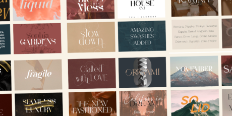
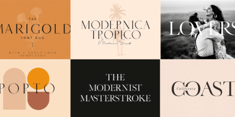
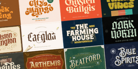
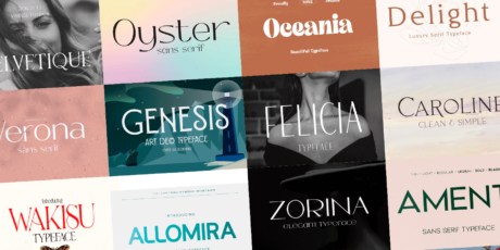
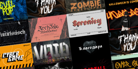
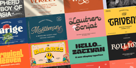
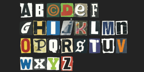
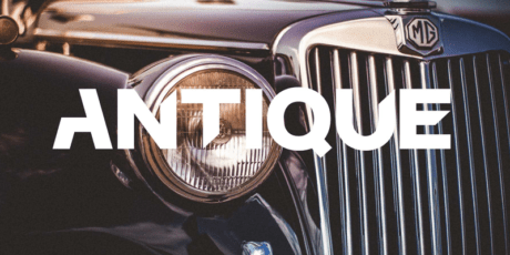
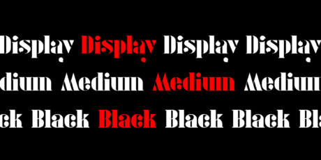
The term @font-face makes reference to a CSS rule that allows you to download a particular font from your server to a webpage so people are able to see it without having the font installed, in other words, we are talking about those typographic families or single fonts that are able to be used in different computers without having to be installed on a determined device. Until a few years ago, there were just a few font families that were readable from any PC, because they usually came installed in every PC, such as Arial, Helvetica and Verdana.
Today the range has became wider, allowing people to embed their favorite fonts to their websites by using a few code lines. On this article we will be reviewing some of the best free fonts ready for download that can be used along with the @font-face properties. These fonts will make your designs look the way they’re supposed to be from any computer. Also if you still want some more fonts we have selected the best fonts from Google web fonts and put them in a single place, Best web fonts extends your font library a bit more with the bests.

Icon by Iconshock.
How to implement @font-face?
When you have a font that you definitely want to implement in your website but you sense that not many people have it on their computers and you are not willing to change the font, it’s time to think about @font-face.
Implementing @font-face is very simple, here’s what you need to do:
@font-face {
    font-family: DeliciousRoman;
    src: url(http://www.font-face.com/fonts/delicious/Delicious-Roman.otf);
    font-weight:400;
}
That previous example works when you need to callback the font directly from the server and it has no special properties, such as bold or script, now we’ll show you a different example that works when you have a bold font and you are calling it from a server’s folder where dir-name is the directory’s name.
@font-face {
    font-family: DeliciousRoman;
    src: url(dir-name/Delicious-Roman.otf);
    font-weight:bold;
}
And now the code line we use when implementing a TrueType font.
@font-face {
       font-family: Calibri;
       src: local("Calibri"), url("fonts/calibri.ttf") format("truetype");
       font-weight: normal;
       font-style: normal;
}

body {
       font-family: Calibri, sans-serif;
}
And a very important example, here’s what you need to do when working for Internet Explorer.
<!--[if IE]>
<style type="text/css" media="screen">

@font-face{
font-family:'Fontin-Regular';
src: url('Fontin-Regular.eot');
}

</style>
<![endif]—>
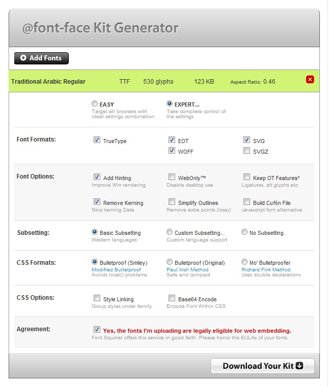
@Font-Face Generator
The guys from Font Squirrel released this amazing tool that allows people to edit their OpenType and TrueType fonts and male them compatible with @font-face. The tool offers a series of complements that helps people to edit their fonts the way they prefer to.
The generator will give you a compressed file with several files that will help you to implement the chosen font as @font-face.

You can find this great tool at http://www.fontsquirrel.com/fontface/generator
Fonts for digital and web devices
OK, now that we know how to implement @font-face and setup your custom fonts to support it, let’s see an extended roundup featuring 100 of the most beautiful, elegant, useful and simply great free fonts that you can adapt to @font-face.
When choosing a font for your web designs, there are several things to take into account, such as the size, resolution, caliber and aesthetics. In terms of size, you have to remember that the same font will often see smaller on a Mac screen than in a Windows one, so always work to guarantee a good reading in Mac, because that will ensure the reading on a Microsoft PC. We suggest you to use fonts above 14 pt to be easy to read for everyone.
The resolution aspect teach us that we should always work at 72 dpi when working for digital devices, but you must know that most of Apple screens are set up for 72 dpi, while the Microsoft monitors usually are made to work with a 96 dpi resolution. If you move something made at 96 dpi to a 72 dpi monitor, it will look larger than in a 96 dpi monitor, so be careful with this aspect.
Regarding the caliber, it’s not the same to use a Sans Serif font with a Script property than a Serif font with Bold, many changes will occur if you play with these values, no matter if you’re using the same type of font. Usually bold works for larger texts. Try to always use Sans Serif fonts when your content is going to digital devices and computers.
And with the aesthetics the theme gets more subjective. We only suggest you not to use fonts with many ornaments, small tracking or light colors over light backgrounds. Finally, do not rasterize fonts, because if you do that, people won’t be able to rescale it.

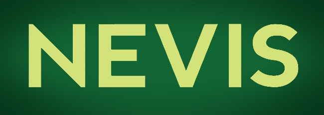
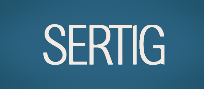
This font designed by Manfred Klein is a lovely sans serif font to use in web design. Legible letters, good tracking and structure.

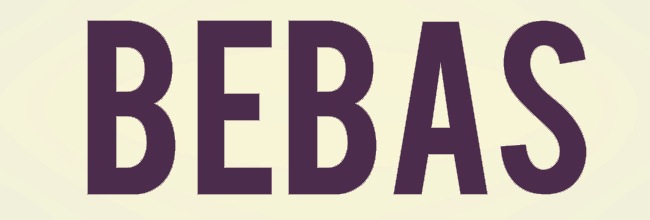
Another contribution by Manfred Klein, very straight traces and nice legibility, it kind of reminds me to the classic font Impact.

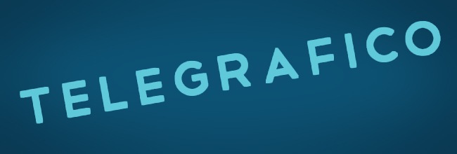
Designed by Ten by Twenty, this sans serif font is ideal for web applications thanks to its strong, angular and easy to read design.

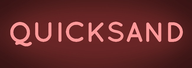
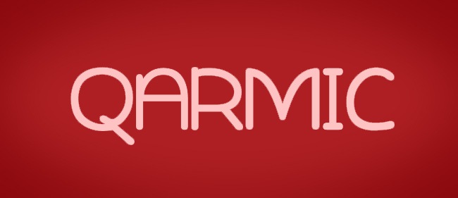
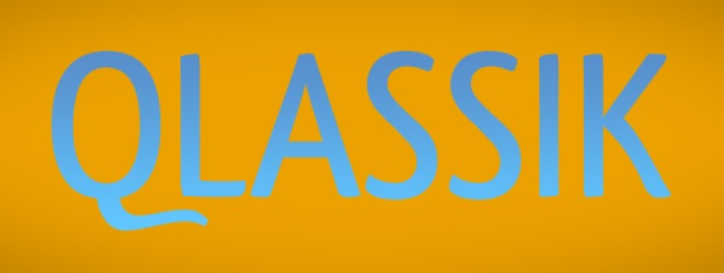
Quicksand was launched on Typophile. Although it’s a sans serif font, it has a lot of serif insinuations which makes it beautiful.

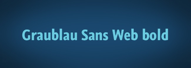
Both Graublau Sans Web regular and bold were designed by Georg Seifert. The fonts are optimized for screen use and support a wide range of character encodings.

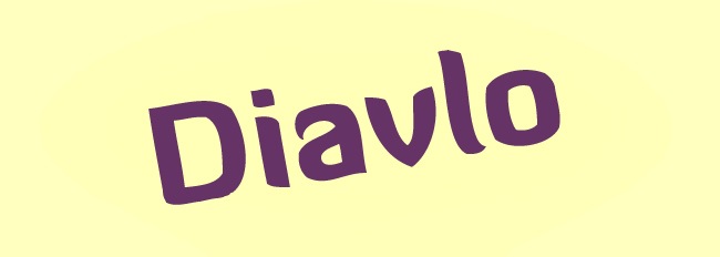
Diavlo is a sans serif font with 5 different weights, nice font if you’re looking for something different.

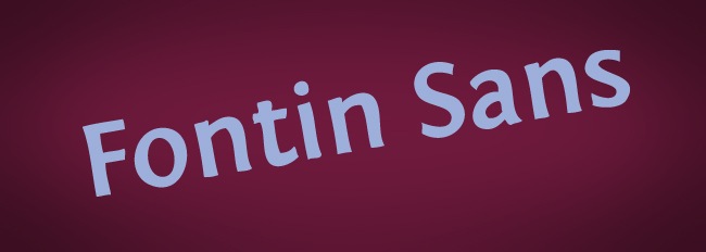
Jovanny Lemonad, who received an award for his excellence in the type design contest Modern Cyrillic 2009 is the mind behind Fontin Sans, another great font.

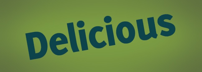
Delicious is fantastic, it’s a new style in sans serif design, very helpful for implementing in tech and TV websites.

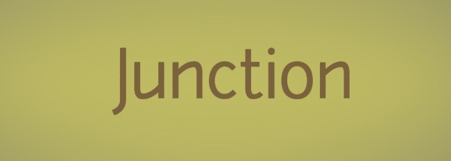
Junction is and attempt of mixing the properties of both the serif and sans serif styles into a good looking and clear font.

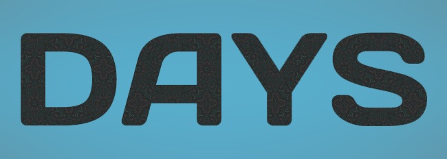
Alexander Kalachev is the person behind this font, tech and industrial could be two good words to describe it.

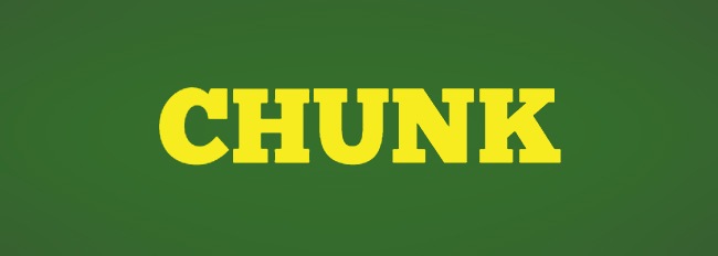
Chunk is an ultra-bold sans serif typeface that uses the old style of the American newspapers and propaganda.

I really like this kind of fonts that eats all its holes, maybe it’s psychological but I really like it.

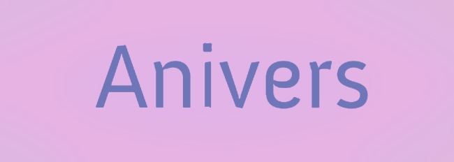
The name Anivers comes from the word anniversary, it was originally designed to celebrate the anniversary of Smashing Magazine.

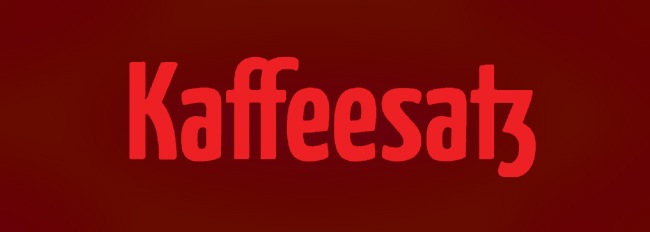
Made by Yanone, despite its hard to pronounce name, this is one of the must successful fonts of the recent years, check it out for yourself.

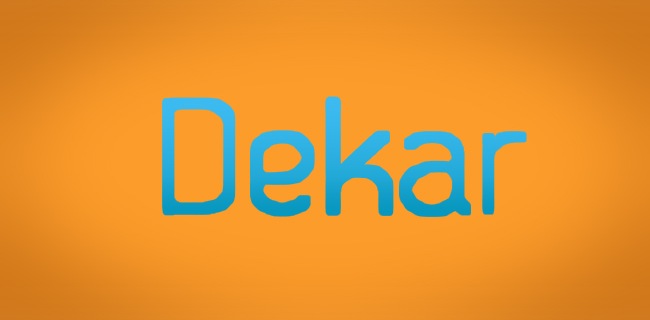
Dekar free font is an OpenType font applicable for different types of design, thanks to it’s lite and easy to read style.

Elegant without being serif, this font works great for your digital works.

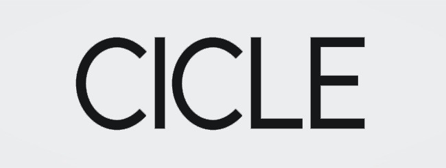
A 21th century font, designed to compete with the design standards of these days.

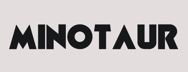
This font started as a fascination for the letter U, which then lead to the creation of the remaining characters.

This vintage-looking font it’s perfect for web design due to its light stroke and wide kerning.

This font was released a time ago and it’s one of the newest fonts of this countdown.

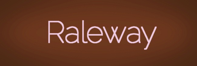
Raleway is an elegant sans-serif typeface, designed in a single thin weight, good selection for your digital creations.

This is a nice font from the DeviantArt bank, you should check it out.

Industrial design, this font uses a strong hierarchy similar to other fonts such as Impact.

Great font, helpful for designs related to architecture and engineering thanks to its geometric shapes and spacing.

League Gothic is a revival of an old classic, Alternate Gothic; it’s great to see this revamping of this font.

Cantarell is a contemporary sans serif designed for on-screen reading; in particular, reading web pages on an HTC Dream mobile phone.

Another Impact-like font with a modern touch, ideal for branding and web design applications.

Dejavu it’s a font family based on the Bitstream Vera Fonts, with more characters than the original.

Inspired on Myriad Pro, this is another good font to use in your blog and / or website.

Designed in 1992, Eau takes its name from the French word of the same name that means “water” , this is a refined typographic design.

This font designed by Barry Schwartz takes a minimal look to the sans serif designs and places into a beautiful design.

The credit for the customization of this font belongs to Johan Aakerlund, this font has certain resemblance with Arista.

Clear character structure behind the construction of this font, recommendable for chill out websites.

Another good sans serif font, this one separates itself from the more straight and geometrized fonts.

A reduced kerning and a major focus on the height; this is definitely a good choice for creating titles and headings.

Designed by Manfred Klein Fonteria, this font reduces its ups and highs to almost a single character box.

This is one of the many attempts that typography designers have made to revamp the famous Comic Sans.

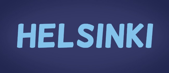
Helsinki is a refined version of the Vic Fieger handwriting, altered to appear more similar to traditional comic book lettering.

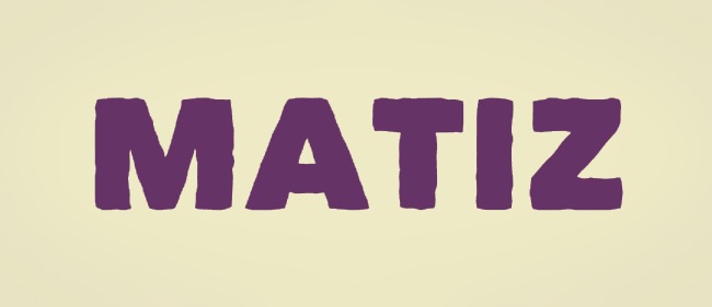
Designed by Beycan Çetin, Matiz is a cute font to implement on your web designs.

Optimus, we have found the old spark, it wasn’t inside a glass, it was inside a great font.

Mark Simonson is the person behind this lovely font, it tends to be serif but with all the qualities of the sans-serif group.

Simple, elegant, this is for sure a good font selection to resolve a web design issue.

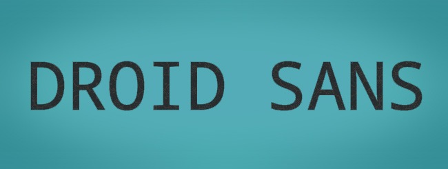
Droid’s a font family created by Ascender Corporation for use by the Open Handset Alliance platform, Android.

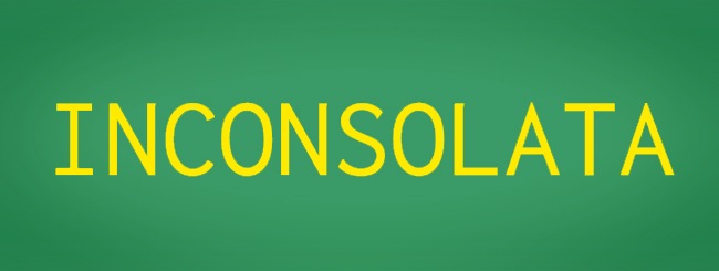
This is a font designed for digital devices and websites, a fine selection for programmers and developers.

Elegant and retro are two of the fittest words to describe this nice looking font.

Outstanding font, strong characters, great legibility, definitely a top choice for you designers.

Another nice font, completely different to those lite looking fonts that many people like.

I’m fascinated with the letter “g” of this font family; you need to check it out.

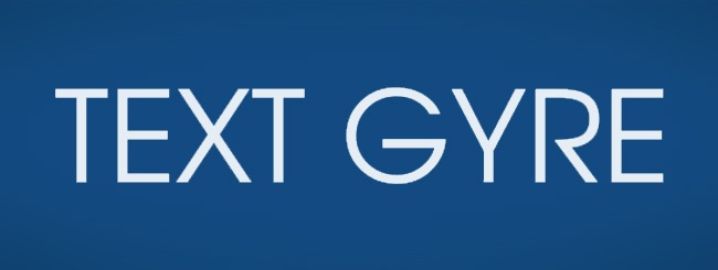
TeX Gyre Adventor it’s a sans-serif font family based on the URW Gothic L family distributed with Ghostscript.

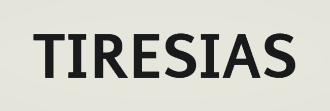
Tiresias was one of the must fascinating fonts of the 90’s, designed by David Carson, it’s still a great choice for graphic designers.

Designed by Thatcher Ulrich, this is a standard but still well done sans-serif font.

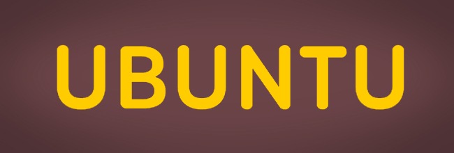
As the description on the original source says, this version by Christian Robertson of betatype.com is much nicer and includes capitals and small cap alternatives. Highly recommended over the older Ubuntu-Title font.

If you’re looking to place a great amount of information inside a small area and you don’t want to sacrifice the design, this font is a good choice..

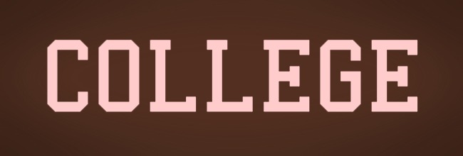
This is a super classical font, you can see it every year on the college teens that are proud of leaving high school and make it to college.
Fonts for printing and similar media
Now that we have studied some of the best fonts to implement in digital design, let’s talk about print media. We are going to study those fonts that work the best to be read in printed medias and also safe ink in many occasions.
Usually the best font choice that you can make to work in printing is serif fonts, because they’re easy to read in small spaces when the amount of text is huge, just take a look at your local newspaper and you will notice what we’re talking about.
In terms of resolution, you can use a 150 dpi for newspapers, that will make the cut properly, but if you’re working in a magazine such as Rolling Stone, it’s imperative to work with a minimal resolution of 300 dpi. Do not use more than 4 different font families in one page, and even that quantity it’s excessive, try to make your print creations as clean and simple as you can.
Sans-serif fonts can work with titles and short phrases, so the previous fonts of this countdown can provide you a great assistance at anytime. OK, now we proceed looking at some of the nicest fonts for print medias that also can work with the @font-face property.

This kind of fonts are quite easy to read thanks to its serif design, this particular font has a medieval look that for sure can work in many print publications.

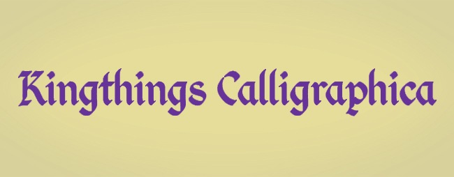
Kingthings Calligraphica is based on a calligraphic lettering; it could be a saturated choice for clean interfaces and publications.

A serif font that evocates a classic style but, due to the subtle grunge texture, becomes modern without losing its line.

This font was designed by Toshi Omagari, the small caps characters are simply beautiful.

Retro, elegant and strong can be some of the fittest words to describe this font.

I really like this font, specially the small caps characters, a personal selection.

No, it doesn’t have a relation with the classic arcade game; it’s just a beautiful serif font.

Simple and cute serif font designed by Sebastian Kosch.

Designed by David Rakowski, this is a different style on serif fonts that keeps the essential objects of a good typographic design.

We like to thank Philipp Poll for posting this nice serif font.

According to its description, Tallys is a font that is one degree slanted and has large caps, a small x-height and long ascenders. It comes with hybrid numbers and a complete character set.

Fontin font was designed to be used at small sizes. It has loose spacing and the x-height tall. This font is family with the already listed Fontin Sans.

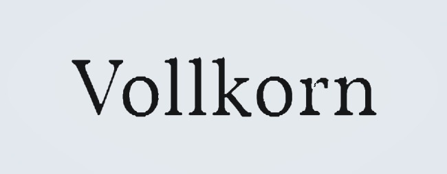
Volkorn it’s classic, elegant and ready to be implemented on your print designs.

Jura is a distinctive and yet readable serif typeface, suitable for headings and body content on print publishing.

Geometrized, beautiful and clear, this is one of the nicest fonts of this countdown.

Easy to read, especially for print media, this font designed by Andreas Stoetzner it’s for sure a good choice.

This is a very similar to the font to the always quoted Times New Roman.
Fonts for corporative design and art pieces
Finally we have reached the last section of this countdown, we’re talking about those fonts that are either sans-serif or serif but beyond that, have something cool that makes them ideal to use on artworks, logo creations and general corporative design.
Now we are going to show you some good examples of typography used so you can get some inspiration and then the final part of this roundup, some of the finest fonts that will make your design work much easier and well made.
If you want to check out an amazing logo selection that will show you how to proper use a font inside a corporative design, visit http://www.fuelyourcreativity.com/50-kick-ass-logos-for-inspiration/, a very recommended design article. Now we continue with the rest of this countdown.

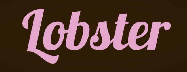
A super calligraphic font, ideal for corporative design focused on familiar companies, feminine sites and oldies.

Man this is a great font, I beat that many skate shops will be happy to get a logo with this font included.

I’m not sure what’s with this font but I really like it, so I decided to put it on this part of the list.

What amazes me the most about this font is the fact that is suitable for @font-face implementation.

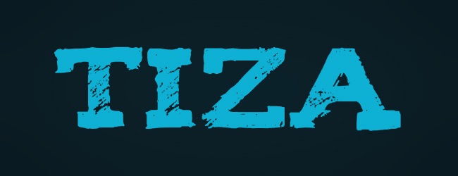
Tiza rules, it feels like if you were writing over a dashboard from one character to the other.

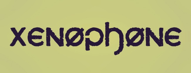
This font has an interesting description: The letters in Xenophone were created from hand-drawn figures in which American coins were traced around to create curves and circles. Some capitals are meant to resemble symbols from the International Phonetic Alphabet.

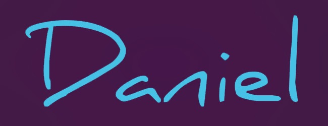
Daniel Midgley managed to create a gorgeous handwritten font, ideal for many corporative designs.

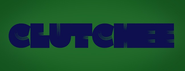
This font has definitely a Bauhaus influence on it, pretty cool to use on your typographic artworks.

I don’t know about you guys but this font makes me feel like I’m inside an Austin Powers film.

This font is amazing, it’s so pretty and suitable for corporative designs concerning kids and happy themes.

These type of fonts are usually good for technology companies that are looking for a new identity.

This is for sure a nice font for a teen clothing line, keep that in mind you future fashion designer.

Perhaps this font works for cuisine places or handcraft shops.

I think this font will look great inside a pet store or something like that.

I have recently seen this font in many corporative designs, perhaps you should take a look on it.

This font can be also on the print media section, but it’s also a good selection for corporative design.

Another Bauhaus inspired font, great for alternative and contemporary designs.

Amazing font to implement in corporative design, classical, friendly and elegant.

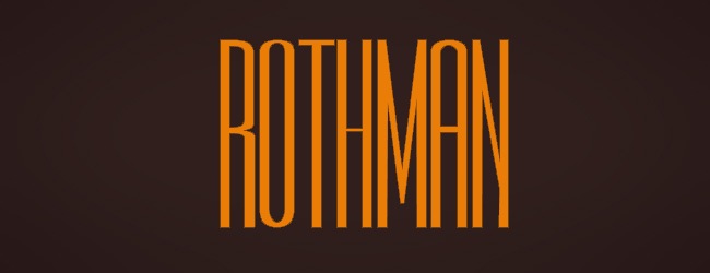
Rothman works for large-name companies that need to make simple and elegant images.

The small caps characters of this font are really great, take some time to check them out.

One more font that you need to have on your library.

Cute serif font, suitable for reading or even graphic design work.

One more serif type face for the countdown, remember that many fonts work for more than just one kind of use.

Many independent film companies like to use this type face on its logo, nice selection for designers.

This font is a revamping of the classic 60’s posters, nice for a vintage design.

Super girly looking font, suitable for many applications.

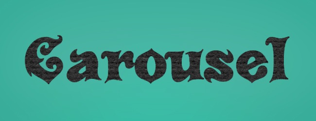
Kind of Arabic, serif looking font, Carousel is an interesting type face selection.
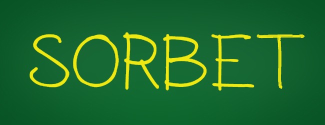
99. Sorbet

Light font, ideal for logo designing, a recommended reference.

Heavy font, suitable for logos that accept artistic designs.
OK guys, that’s it for this countdown, now we have an extended library of type faces that are suitable for the @font-face implementation. Hopefully this article will remind you that there’s many more types than Arial and Georgia. Let’s know if you missed some of your favorite times, we want this community to grow with your contribution, thanks for reading this article and, see you soon.

