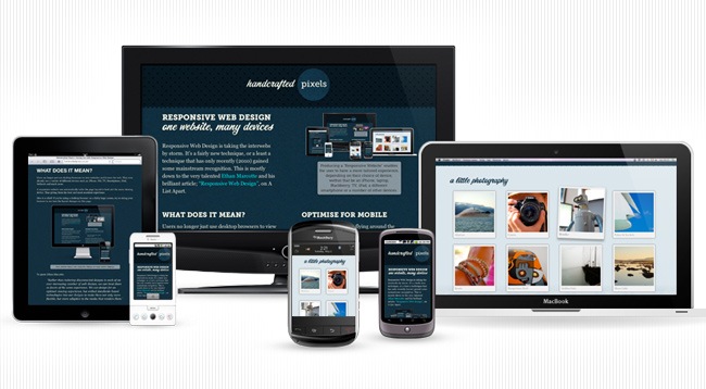
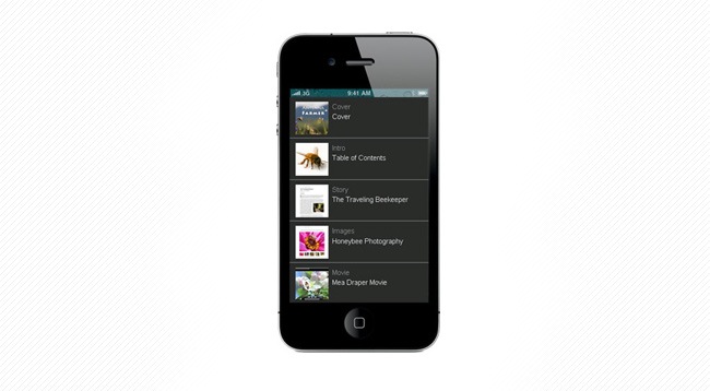
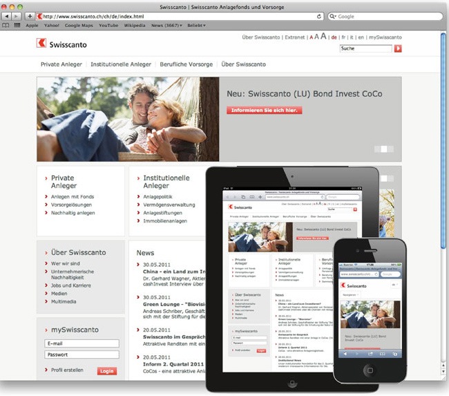
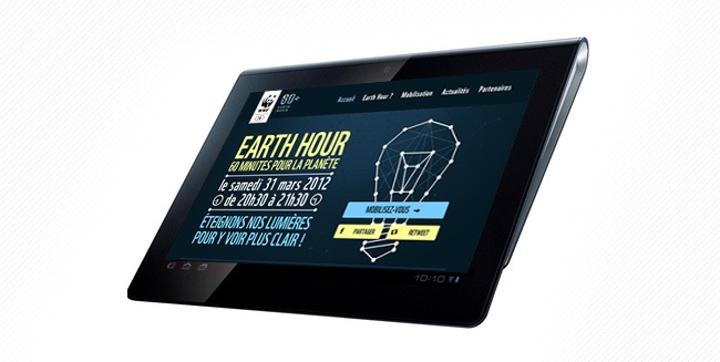
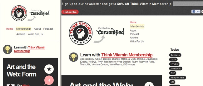
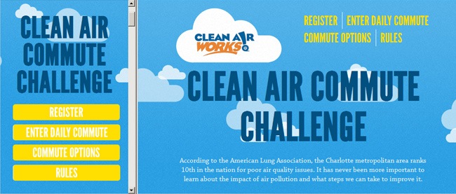
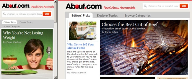
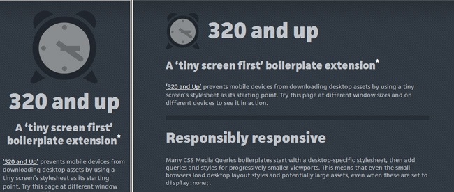
If you’ve been working in the web design field for the past couple of years you should know that designing a fixed interface for a widescreen computer is not enough. Most of the clients you’ll be dealing with from now are going to request that their site is not only desktop-compliant but is also optimized for smartphones and tablets. This issue presents the necessity of working with different screen resolutions in order to guarantee that a website looks good in all sorts of devices.
But if the devices’ production continues at the same speed that it has for the past couple of years, the amount of screen resolutions and formats that designers will have to deal with is going to become unbearable. On this article we’ll be discussing one of the most effective solutions to face this problem with a certain easiness, we’re of course talking about responsive web design.

So, what’s responsive web design?
Firstly introduced by Ethan Marcotte on his article “Responsive Web Design” for A List Apart, the initial concept behind responsive design was based on the emerging responsive architecture, in which rooms and spaces have the capacity of automatically adjusting according to the number and flow of people within it.
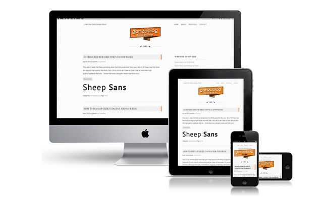
The concept of responsive web design makes reference to the process of designing and developing websites that are able to react to user’s actions and detect the medium where the site is currently being watched in order to provide the best experience possible to the user in terms of navigability and readability. The theory behind responsive design involves the utilization of several grid and layout systems, image optimization and CSS media queries, therefore, no matter how many devices are released on the future, responsive websites will always be able to provide a proper response.

But responsive web design is not simply reducing font sizes and shrinking a picture to make it fit the new format. This concept requires a thoughtful process where the designers and developers work together to determine how to redistribute the elements according to resolution, which elements may be eliminated and how to maintain the concept while simplifying the structure.
According to many internet gurus, the future of the internet will rely on mobile devices (tablets, smartphones, portable consoles) rather than desktops and laptops. More and more people are starting to acquire cutting edge technologies and the tablets’ battle is on, so it’s indispensable that you start seeing these devices as an important part of your audience. But this increment on the amount of mobile devices does not mean that desktops are doomed, in fact we can see how everyday larger monitors are released, and these are highly appreciated by designers, visual artists and producers, thus at least for them, a tablet will never be able to replace a desktop computer.
Flexible grid
The first element we have regarding responsive web design is dubbed flexible grid. Before this concept became popular, most websites were designed using a fixed width style and centered content, which was an effective method as most computers worked under the same screen resolution. Now that screen resolutions have changed so much, a fixed width design is not the best solution for your designs and therefore liquid layouts are the new answer.
But the concept of flexible grid goes beyond the liquid layout concept, where the elements are essentially resized and kind of rearranged. A flexible grid makes a complete overhaul in terms of proportions, making that all the elements in a layout are resized in relation to one another when stretched or contracted.
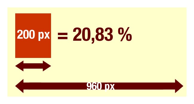
The essence of flexible grids relies on stop thinking in fixed pixels and start considering percentage units. To recalculate an element’s proportions accordingly, you must take the element’s width and divide it by the full grid’s size e.g. 200 px / 960 px = 0.2083, then take this result and multiply it by 100 (0.2083 * 100 = 20.83 %), that we you get the percentage value that needs to be applied over the element in order to perform a correct resizing.

Although fluid grids can be helpful for performing an accurate resizing when moving from one resolution to another, it can get a little troublesome when you have multiple column systems and you want to make them fit in a smartphone screen, fortunately this problem has been solved with media queries, of which we’ll be talking about later.
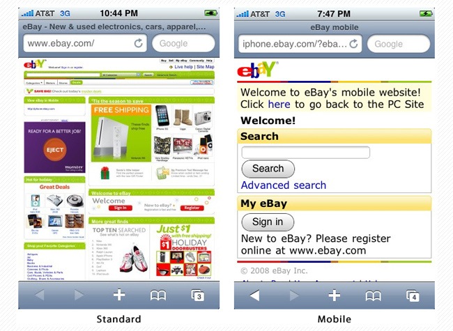
An alternative solution that developers/designers have proposed is developing a mobile version and a desktop version to reduce the developing times and still provide a good navigation to the user, the problem with this is that screen resolutions keep changing and new devices are released all the time, so if you use this method you’ll be forced to continuously upgrade your mobile version or release more than one version to support different mobile devices. Another issue that this solution carries is that you cannot share a mobile version to a desktop user because it will look awful on his 1900 x 1200 screen.
The whole idea of responsive web design is developing sites and applications that are able to respond to the context where they’re currently being viewed and provide an optimized version for that display specifically, this can also be configured through media queries, but first we want to discuss some other aspects regarding responsive design.
Screen resolution
Having explained the fluid grid concept, it’s convenient to discus an aspect that goes along with it, and that’s screen resolution. Although fluid grids can help you create sites that adjust to all the different resolutions, sometimes it’s not necessary to cover all possible resolutions if you know that only certain screen resolutions are used by your visitors.
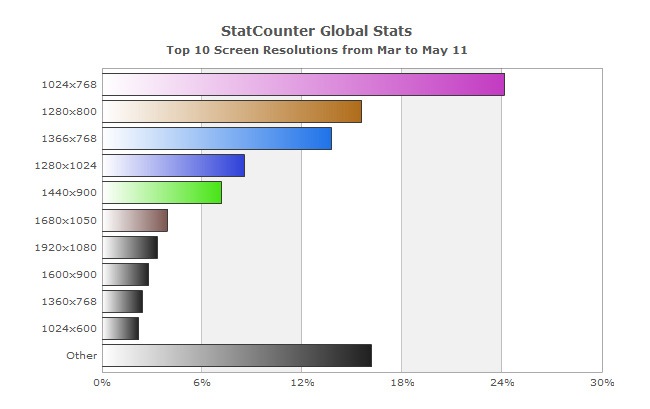
Currently the most popular screen resolution is 1024 x 768, and the reason for this is that the well-known iPad works under that resolution, besides there are still many places where these monitors are still operating. In any case, before thinking about using a fluid grid, make sure that your site looks perfect in the resolution that most of your visitors currently have.

Even if most of your users have 1024 x 768 monitors, consider that they don’t always maximize their browsers or they might eventually switch to a larger screen, so make sure that you implement an effective fluid grid system that can anticipate to all events.
Aspects to consider
Once you start to develop your fluid grid system to make your site look good and work in all kinds of resolutions (works with a percentage systems that adjusts appropriately), it’s important to mention three essential aspects that you must always keep in mind at the moment of creating your fluid grid:
Regardless of the screen size, always make sure that all the key information remains visible to the users without having to scroll, this can be achieved by simplifying buttons, reducing words and removing elements.
The text must be easy to read despite of the amount of columns, either if you have three wide columns or a single and narrow column.
More than a simple resize, the site actually suffers a thoughtful reorganization when the screen resolution varies, keeping all the elements easy to find and the navigation easy and organized.
The largest version of your site must provide a larger amount of information prior the scrolling becomes necessary while maintaining a good structure for smaller viewers.
Responsive Typography
Typefaces play an important role in responsive web design, you can base the entire layout in the font size using ems (percentage units), that way the site will remain resolution independent and will easily adapt to different environments. A List Apart has include a really nice demo on this.
It’s also important to use the max-width property to define the line length of the paragraph in order to make it as readable as possible (approximately 66 characters per line). This can vary according to the font you use, though something that goes around 30em will usually work just fine.

On the following example, the body type is shrinked as the browser width decreases. Since the font size is declared in ems and thus everything remains relative to the body, resulting in a cascade effect that affects all the layout elements.
body {
    font:1em/1.5em 'Verdana', 'Arial', sans-serif;
}
@media screen and (max-width:800px) {
    body {
        font-size:0.8em;
    }
}
@media screen and (max-width:400px) {
    body {
        font-size:0.7em;
    }
}
Flexible images
The second component in responsive design is flexible images. In regular liquid pages, images are simply resized through width and height attributes, which helps to keep the information organized indeed but does not optimize the loading times. Another method for fitting images into different screen resolutions is using CSS’s overflow property for cropping them dynamically as the containers are modified to fit new environments.
You can also create multiple versions of an image and store them in your server, then you can ask the website to call the fittest image depending on the current screen size, this exercise can be done using a detection feature in tandem along with DOM manipulation.
One of the most popular methods for resizing images was proposed by Richard Rutter, who said that CSS’s max-width property can be an effective solution. This property works great as long as no other width styles override this rule, what it does is tell the image to load in its original size unless the current screen is smaller than the original width, in that case the image’s maximum width will readjust to fit the current screen size, this trick allows you to perform a good image resizing regardless of the screen resolution as it focuses on the browser’s size instead. The problem with this technique is that the image rendering gets affected when the image must be resized to very small scales, though there’s a JavaScript solution for this. You can ready more about this technique on this great article published on Unstoppable Robot Ninja.
Filament Group’s solution
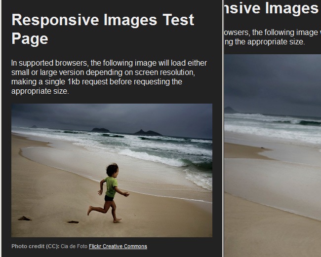
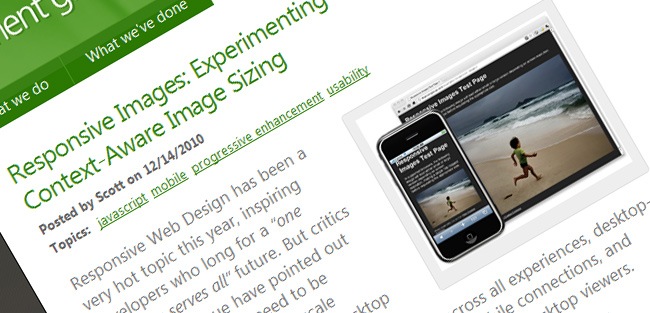
A solution that seems to work very well was proposed by the Filament Group. On their proposal, images are resized accordingly and image resolution is reduced when displayed in mobile devices, which results in an optimization of load times.

To use this technique you’ll have to download a few files from Github. The first one is a JavaScript file, then a .htaccess file and finally an image file. You just need some HTML lines to reference both the small and large versions of the image, the great thing about this technique is that it reduces load times considerably and is supported by all main web browsers, IE included.
<img src="smallRes.jpg" data-fullsrc="largeRes.jpg">
The data-fullsrc is a custom HTML5 attribute, defined in the files included on Github. Everytime you’re viewing the site on a screen whose resolution is wider than 480 pixels, the larger image will load, whilst in mobile and tablet devices, the small image will load automatically.
What the JavaScript file does is inserting a base element that allows the page to separate responsive images from others and redirects them as necessary. When the page loads, all files are rewritten to their original forms and only the large or small images are loaded according to the current screen resolution, hence this technique can become a great bandwidth saver.
The iPhone / iPod Touch issue
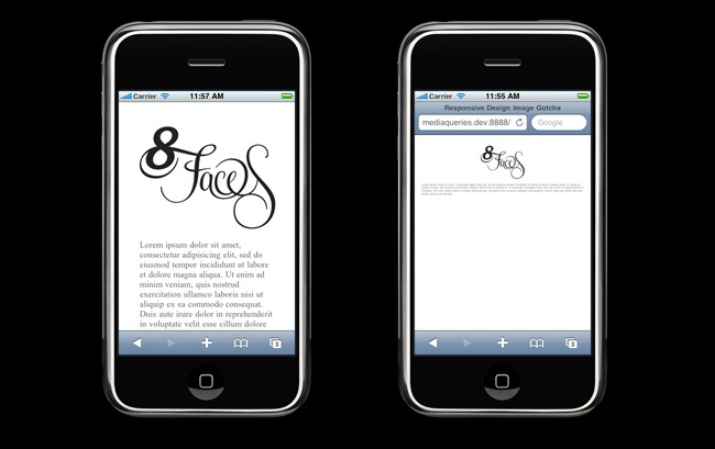
If you have had the chance of navigate using an iPhone or iPod Touch, then you know that by default, these devices rescale a website to make it fit their small screen, then the user can easily zoom in to visualize the different elements across the page. The problem is that even if you have configured your site, the browser will continue to resize your images, affecting the rest of the layout.

To fix this problem, you need to use an Apple’s specific meta tag, the meta tag must be placed below the site’s <head> section in the following way:
<meta name="viewport" content="width=device-width; initial-scale=1.0">
By setting the initial-scale value to 1, it overrides the default parameter to resize images proportionally, whilst leaving them as if their width is the same as the device’s width in both portrait and landscape mode. You can read more about this in Apple’s documentation on viewport meta tag.
Responsive borders on images
While making the research for this article, we stumbled upon a nice trick on CSS Wizardry that shows how to implement responsive borders in your images. Because borders cannot be specified as percentages, you need to perform a simple trick to make them behave responsively, the trick works like this:
img{
  max-width:98%;
  padding:1%; /* A percentage that, when doubled and added to the above, makes 100%. */
  background:red; /* Color of the faux border. */
}
Media queries
The third element of the responsive design triad is CSS media queries. If you’re not very much into developing and programming but more into design, then this concept may seem a little tangled for you. Media queries allow you to collect data about the visitor and utilize it to apply the CSS styles that can provide the best user experience to the visitor.
In the case of responsive web design, media queries are used for establishing the min-width parameter, which allows you to apply specific CSS styles according to the current browser size, hence if the screen size drops below a certain size, a new CSS is applied instead of the previous one. to give you an example, this is how a default media query might look like:
@media screen and (min-width: 480px) {   .content {
    float: left;
  }   .social_icons {
    display: none
  }
Although these are the most common resolutions of these days, you might not need to use a 1900px query if you’re developing a high school website or a health care page, they will probably have 1200 monitors as maximum, so we suggest you to parse your target before start entering code lines, that will probably save you a lot of time.
With media queries, designers can build multiple layouts using single HTML documents and selectively provide stylesheets based on different features such as browser size, orientation, resolution or color. Although media queries provide a great solution for developing highly responsive websites, there’s still a lot to work with in order to offer a complete solution for mobile devices.
Conditional IE Style Sheets
This is one of the most popular techniques in responsive web design. On this process, an unique stylesheet is loaded to browsers that actually understand media queries for Internet Explorer. In the case of mobile devices, the normal procedure is to load a basic stylesheet that sets up a multicolumn layout for large screens.

This simple technique works effectively for supporting IE on your desktop while also providing support for mobiles due the fact that it loads a light and appropriate linear layout. The only problem with this is that you cannot run this procedure under browsers that don’t support CSS3 media queries.
You can utilize this method when your media queries are simple enough to be included within a single stylesheet, this also works if your desktop IE requires a multicolumn layout, at expense of speed.
JavaScript
In case that you’re developing for devices that don’t support CSS3 media queries, JavaScript can be an effective solution. There’s a JavaScript library that makes older browsers support CSS3 media queries, then you just have to grab a copy of the library and include it in the mark-up css3-mediaqueries.js .
And in case you want to try a more advanced solution, there’s a jQuery snippet that detects browser width and changes the CSS accordingly, so let’s take a look at it:
<script type=”text/javascript” src=”http://ajax.googleapis.com/ajax/libs/jquery/1.4.4/jquery.min.js”></script>
<script type=”text/javascript”>
$(document).ready(function(){
$(window).bind(“resize”, resizeWindow);
function resizeWindow(e){
var newWindowWidth = $(window).width();
// If width width is below 600px, switch to the mobile stylesheet
if(newWindowWidth < 600){ $(“link[rel=stylesheet]”).attr({href : “mobile.css”}); } // Else if width is above 600px, switch to the large stylesheet else if(newWindowWidth > 600){
$(“link[rel=stylesheet]”).attr({href : “style.css”});
}
}
});
</script>
Width considerations
This is something that most people don’t notice unless they’re pixel-precision curators. When your browser window is reduced, the max-width that you have specified kicks at different points in Safari, Firefox and the other main browsers. This difference goes around 15 pixels, which apparently is related to the vertical scrollbar, though in the end it seems that the problem is that besides Firefox and Opera, neither Webkit browser is following the spec.
Under normal circumstances, the width should be including the vertical scrollbar, which is something that Safari is not doing. This indicates that the webkit behavior might be better for developers in a certain way because the scrollbar width can vary from one browser to another.
Responsive emails
With the boom of responsive web design, many sites are focusing their attention on designing for mobile devices, however it seems that not too many have considered developing responsive emails. Many people spend more time with their smartphones that in front of their desktops, hence they tend to read most of their emails through these elements, so it’s necessary to develop a special structure for all your emails.
If you have tried to check your inbox in an iPhone or a similar mobile, then you’ve probably noticed how the text is automatically rescaled to an almost unreadable size and the design looks all cluttered and messy, also when you have large images within your email, an horizontal scrolling becomes necessary. Thanks to media queries, you can create a separate style directed to emails specifically that behaves just like if you were configuring a regular site. In case that the device does not recognize the query, it will degrade gracefully by simply reverting to your default styles.

The previous picture shows an example of an email design that has been set up to fix into an iPhone screen (portrait mode). Here’s the mobile stylesheet in the <head> section of the email:
@media only screen and (max-device-width: 480px) {
     .page {
          padding: 0px 10px 5px 10px !important;
     }
     body {
          padding: 10px !important;
     }
     #airmail-line {
          margin: 0 -10px !important;
     }
     .header {
          font-size: 16px !important;
     }
     .headline {
          font-size: 20px !important;
     }
     #screenshot {
          width: 275px;
          height: 190px;
     }
}
What these code lines say is, “Only use these styles if the screen dimensions are 480px or less” (480px being the width of a “flipped” iPhone’s display). Then, using the !important declaration to override any inline styles, change the padding of the body and the .page DIV, alongside the font-size of certain text when these styles are invoked. This maintains the pretty layout of the email and keeps the headings from being too large on the small screen.
Now let’s take a look at the screenshot at its original 550 x 380px in a desktop email client:

And here it is resized to 275 x 190px for a mobile display:

Resizing your images can prevent the sort of layout breakage or unnecessary scrolling that can appear when an image is too large for the mobile devices’ viewport.
A final tip is the addition of -webkit-text-size-adjust: none; to prevent handsets from automatically resizing your text. For example, the iPhone scales small fonts up to 12px, so it can be used to override this. That said, all your text should be above 12px and desirably, 17-22px. =
This method is not only simple but largely supported by most devices that offer media query support, e.g. let’s take a look at an email opened in an Android and then a Palm device:

Considerations for different devices
We have seen how responsive design can help designers to provide a comfortable experience to their users regardless of the medium they’re navigating through. Establishing a fluid grid and using flexible images along with media queries are the three main components behind any responsive site, we have also seen the importance of typefaces and how to create a responsive email template. Now we like to talk a little more about the different devices and resolutions that most users work with.

Mobile-first responsive design
First proposed by Luke Wroblewski, the concept of mobile-first emphasizes the necessity of prioritize the mobile context at the time of developing user experiences. The reason that sustains this concept has among some other points:
More than 70% of the world population has a mobile device and 85% of the mobiles sold the last year come with web browser incorporated.
Designing for mobile involves much more than just the layout, as mobiles incorporate additional features such as applications, touch events and more.
One of the differences between desktops and mobile is that while desktop conserves a similar structure from one device to another, the mobile world includes smartphones, tablets, eReaders and more, offering a bigger challenge for both designers and developers. The idea of mobile-first suggests a concept of progressive enhancement opposite to the gradient gracefully concept that we mentioned before.
Progressive enhancement states that by starting for mobile you will insure that the site will look well in all larger environments, which certainly makes sense because mobile is the most restricted medium where designers/developers need to work at, therefore you can include additional features as the medium becomes larger and offers a better support for most media queries and additional options.

According to the brilliant article by A List Apart, following the recent rise of mobile Webkit, media queries became a popular client-side technique for delivering tailored stylesheets for the iPhone, Android phones and mobile devices in general. To do so, you need to incorporate a query into a linked style sheet’s media attribute:
<link rel="stylesheet" type="text/css"
  media="screen and (max-device-width: 480px)"
  href="shetland.css" />
The query contains two components:
a media type (screen), and
the actual query enclosed within parentheses, containing a particular media feature (max-device-width) to inspect, followed by the target value (480px).In other words, we’re asking the device if its horizontal resolution (max-device-width) is equal to or less than 480px. If the test passes—in other words, if we’re viewing our work on a small-screen device like the iPhone—then the device will load shetland.css. Otherwise, the link is ignored altogether.
Good practices
Moving away from the coding part, there are some key aspects that you need to consider at the time of setting up the mobile version of your site using responsive web design techniques. Following these guidelines will help you assure a great navigation experience to the user, so let’s see what they are about:
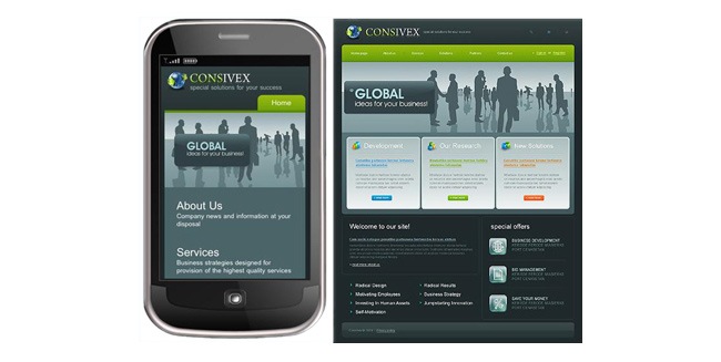
Use single column systems as the main structure for your mobile layouts. This structure helps you manage the reduced amount of space and also allows an easy scaling between different device resolutions as well as flipping between portrait and landscape mode. Thanks to responsive web design, you can turn a multi column layout into a single column system and vice versa.

In case your site has a lot of information that needs to be presented asap, one of the easiest ways of organizing all the information is utilizing a collapsible navigation, harnessing the single column system that we already talked about. You can insert the information on multiple folding modules that allow the user to only open the content they’re actually interested in while keeping the rest hidden.

Mobiles and tablets work differently to desktops and laptops, not only in terms of size and structure but navigability. While computers utilize mouse or pen tablets, mobiles require a direct finger-screen interaction. Therefore, you need to evaluate all the clickable events of your site and make them work during a tap event in a mobile device.

Designing for tablets
There’s not much difference between tablets and mobiles other than the size fact, which means that all the mobile guidelines that we shared before can be applied in tablet design and those we’re about to add can be used in mobile design as well. Designing for tablets and mobiles requires a correct separation of content and presentation, doing this requires a correct usage of semantic markup to properly transport meaning to the markup without having to add additional CSS or JavaScript components. Semantic markup creates a better separation of style and content, providing a better accessibility and less code that eventually translates in smaller size.
Other good practices include removing unnecessary images from the HTML code, though they help to reinforce meaning they’re not absolutely indispensable. Use tags that represent the content’s meaning such as <em> for extra emphasis or <abbr> for abbreviation. The <div> tag should only be used to define large portions of content that are directly related to each other
Although tablets can work under large resolutions, they still can’t match those humongous resolutions of 1600 x 1300 and beyond, so focus on the essential content and provide a simplified version of the site that is easy to navigate and yet provides all the important information regarding the site.

Load times are very important when a person is browsing through a tablet or mobile, these devices were designed for portability and quick access, hence a website that takes a while before loading is not offering a correct mobile support. To improve load times, avoid using too many images and make sure that the ones you use are optimized, also use less amount of text, keep just the essential.
One difference between desktops and mobile units is that the last ones don’t have hover states, so don’t even bother in using them. Instead of that you can use buttons instead of underlined text, icons and elements that indicate about a link condition; gradient textures, beveled lines or dot grids can also be helpful. Anything on a tablet screen can be touched, pushed or moved, hence there is no need to use scroll bars to indicate vertical or horizontal movement because that’s implicit, so think of your mobile site as a giant content gallery and think about how the user can navigates through that gallery.
Content and navigation
Although the comfortable type size on large displays goes around 14px, it actually increases in mobile devices, which represents a reduction in the amount of available space for information. Some of the things you can do include removing irrelevant information, use simpler terms and phrases, reduce the line breaks usage and insert ‘more’ buttons in case you cannot place all the information on a single page.

Because tablets and smartphones are smaller, people tend to get closer to them while navigating, hence the colors tend to look brighter, which can produce some eyestrain. Consider lowering the color intensity, avoid neon colors and reduce saturation while keeping contrast high.
In the end, a good responsive design should not only resize but to consider all these elements in order to provide an actual “responsive” experience that offers the best look and functionality to the user.
Further touchscreen thoughts
Although we have already discussed most of the considerations regarding touchscreen devices, we want to make emphasis on this as we consider that technology is definitely turning towards touchscreens gradually. Now let’s take a look at some of the main considerations that you must keep into account when developing for touchscreen devices:

Despite the lately increase on huge screens sales with resolutions that go up to 1900 x 1200, the classic 1024 x 768 resolution remains as valid as always due the raise of tablets. The height is something that you can easily control through media queries and good design, the one that really must be evaluated is the width.
Don’t make sites that fit exactly into this resolution but try instead smaller grids such as the famous 960grid system, which allows you to leave some margin in both sides and make the site look as if it was originally designed for that resolution. Then you can harness media queries to create responsive sites that fit into different touchscreen devices.
Fingers are not as precise as mouse cursor, therefore you should probably space out your links and items to make them easier to reach, include white space areas to help the user navigate without hitting on a button accidentally. Another think you must remember is that most users are right handed but you cannot forget left handed users, in that case you may want to implement a browser detection feature that switches elements to a certain position where both users can navigate with ease.
Finally, add visual feedback to help the user to guide, this can be achieved by adding different color states, include loading states, icons and more elements that can emulate things like the hover effect.
Widescreen considerations
If we place mobile users aside and only focus on desktops, the latest studies have revealed that more than 73 % of desktop users are working with resolutions above 1024 x 768, so this screen resolution will soon be replaced by larger ones. Despite of this increment of widescreen users, the main market still focuses in mobile devices, but anyway, let’s see how to proceed in case you need to design for the largest resolutions.
Widescreen users are mostly designers and people on that field, which covers graphic designers, filmmakers, photographers, animators, 3D artists, etcetera. The sector also includes tech addicts who are always buying the latest equipment, including widescreen monitors of course; another sector that uses widescreen monitors is the one compounded by Apple fans, the latest MacBook, iMac and other Apple products possess screen resolutions of at least 1280 x 800 (excluding mobile devices obviously).

Non-widescreen users
So far we have determined that there are many people acquiring mobile and tablet devices but there are also many others who are opting for purchasing larger and larger screens. If you consider these two focus groups you have covered almost the whole spectrum, however, there’s a considerable sector that does not fit in neither of these two.
Probably the major concentration of these third group can be found in schools. These places often buy equipment that lasts for a decade due the high costs, so if a school purchased all the equipment in 2004, they probably have 1024 x 768 monitors mostly and even smaller ones. This is an important aspect because if you are going to design an application that is going to be used by the school only, there’s no need of wasting time and effort on developing a complex responsive website.

Think global, the reason why 1024 x 768 remains as the most popular screen resolution is because not every person around the world can afford a large monitor or buy a smartphone / tablet. Many people navigate through netbooks, whose resolution oscillates between 1024 x 600 and 1024 x 728 pixels.
Third world countries also run lots of old equipment that does not support large resolutions. Large corporations based on these countries are not able to afford major upgrades, so it’s probable that most of their computers are still old 1024 768 computers. These considerations are very important if your website is going to be viewed in different countries and by multiple sectors.
Does your site need to be responsive?
Responsive design is definitely a alluring idea that many people is willing to try on their designs, but have you thought if responsive web design is actually the best option for your site?. While making this research, we found lots of articles where designers and developers defend and attack responsive design, with both postures presenting very valid points.

Creating separate versions
Before you decide whether to make a responsive design or not, is important to understand the difference between the users that access your site through a mobile and those who do it via desktop. A good example can be found in restaurant websites, whilst desktop users usually want to see the menu, check pictures of the dishes and the restaurant and even take a video tour, mobile users enter the site to find the address, a telephone or make a reservation.
On this case it’s better to create an entirely separate site for mobile visitors as they will not be searching for the same information and resources. You may be thinking “but this means I’ll have to do twice the work”, well actually, making a separate mobile version is easier than making a quality responsive site, besides, the content is coming from a single database, which means that you don’t require many duplicate entries.
When you have cases such as the one we mentioned regarding the restaurant, the mobile version is going to need less data, specially images and things like that, which in case that you make a responsive design will still be loaded despite the resizing. Therefore, developing independent versions can guarantee an optimal performance in both environments.

Although the developing phase might be simpler, eventually this will require a bigger job because you’ll be updating different templates and stylesheets and the maintenance will have to be done separately, include a tablet version to the formula and you’ll have three different sites to work on.
One of the reasons why you should create a separate site is that you’re absolutely sure (after checking analytics and more) that a considerable (or most) percentage of your visitors are landing in your site through mobile devices. Some of the benefits of creating a separate mobile site is that you can use smaller images without having to use the display=none property (might be hidden but still consumes bandwidth), also less content has to be loaded which results in a faster load time and better performance.
Another aspect regarding separate sites is that you can mount the mobile version on a specific domain or subdomain, that way the user will know that he’s visiting the mobile version and will be able to switch to the desktop version at any time. Finally, there’s another alternative though it might be a little cumbersome due the amount of systems, that option is creating an app for the different devices, which will prevent the users from having to use a browser and instead just open the application directly.
Choosing responsive
Even when there are many cases in which creating a separate site is the best solution, this doesn’t mean that responsive design is useless because actually, both concepts can easily go hand in hand. So does responsive web design become a good option for your site?. The reason that we found the most whilst making our research is that responsive web design works amazingly well in widescreen devices rather than mobiles and tablets.
Nowadays, the most popular grid is probably the 960 system, which works wonderfully indeed, but what happens with those massive monitors of 1900 x 1200 and beyond?. Using the 960 system will leave a bunch of empty space on both sides when the site is visualized in these large screens, so that’s when responsive design comes to save the day.
With responsive web design, you can harness these additional areas to include information that has been placed after scrolling down or even adding an additional column. Another case is that there are screens that have a large width but the height is not so much, in that case you can take advantage of that extra width to place the missing information that the user can only find by scrolling down.
Another case when responsive design can suit you well is when your site does not have too much information that might slow down the site while viewing in a mobile, this occurs in places such as blogs when everything is mostly text and therefore developing a whole new site is not worthy.
Contras
Responsive design has many great pros that make it a completely valid answer to the current diversification of browsing mediums and resolutions. The fact of being able to develop a site that reacts differently according to the user’s current screen is just great, however there are some problems that might persuade you from using responsive web design all the time.
It’s certainly a major improvement being able to see the site perfectly rearranged and resized to fit any mobile instead of having to zoom in and zoom out. However, responsive design also presents a few problems that is important that you know about, so let’s see which ones they are:
Crafting a fully functional, well designed and cross browser responsive design involves a considerable amount of work, specially during the CSS creation. Although media queries facilitate a lot the developer’s job, in order to do it right you’ll have to create a complete stylesheet and additional ones for all different sizes.
Because creating a responsive website requires a bigger amount of work, it could also carry extra costs that the client may not want to afford. Another aspect that can increase the costs is having to design multiple mockups and layouts to generate the site’s look.
Adopting a responsive web design presents an issue regarding advertising. People are paying for a 125 x 125 banner that will look smaller as responsive design is applied, hence it could be seen as a mislead. In that case it will be better to adopt an AdWords system.
If you want to read about other facts why responsive web design is not always the best choice, we recommend you our article 11 reasons why Responsive Design isn’t that cool !.
Great examples
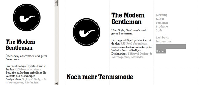
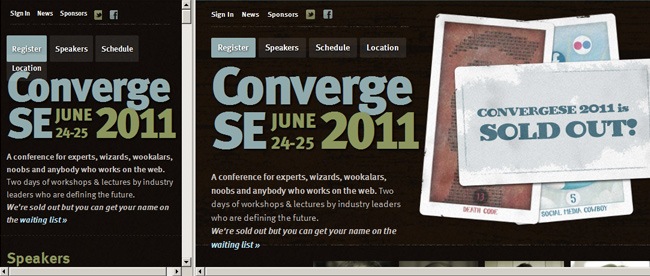
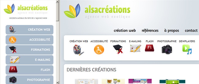
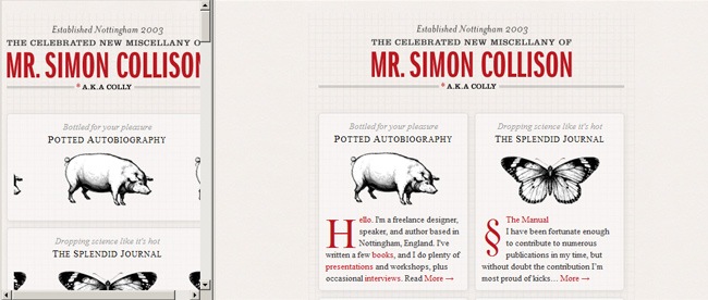
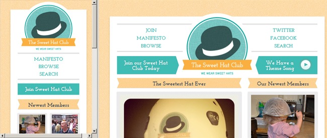
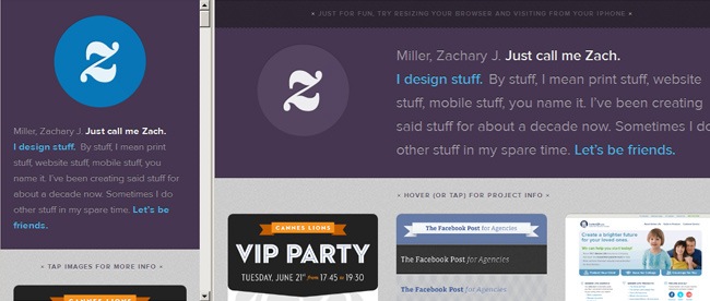
So, this whole responsive web design thing is a very captivating thing indeed, but it’s hard to know where to start without having some references of how other designers have approached this concept in order to develop compelling websites that include the responsive design concept. So now let’s take a look at some great examples to give you an idea of how can you make your first responsive site.


Useful responsive web design resources
For the final part of the article, we have gathered some useful articles, tools and resources that can really help you out at the time of developing a responsive web design. We have included useful charts, grids, frameworks and many more great tools, if you know any other resource that might come handy.
Image / Video adjust
Optimizing images is something that when is not done properly can turn out in slow load times, messy structure and navigation problems. Same thing happens with video, specially in respect of the data transfer aspect, so in this section we have included a few useful tools that can help you out.

A must-read article by Ethan Marcotte that makes a complete study about the fact of working with fluid images by using media queries (max-width), the article also covers the technique for making fluid images to work on Internet Explorer.

On this article the people of Filament Group propose a method that allow designers to generate responsive layouts that serve different image sizes at different resolutions, therefore it becomes a good strategy for creating mobile-friendly websites.

On this method proposed by Craig Russell, a server-side script (PHP-based) is utilized to serve up images at multiple resolutions. The concept states that inside the PHP script, a nested array is utilized to list image files and their relative percentage scale values. The complete information can be found by visiting the original link.

On this article, Harry Roberts presents the idea of using the img element for the smaller of two images, which usually is going to be the mobile one. The method uses divs to hide and display images and only show the one that suits the best in the current device.

To continue with the experts’ opinion, Nicolas Gallagher suggests a method based on media queries, CSS3-generated content and additional extensions. With this method you can make an attribute value to be interpreted as the URL part of a url () expression.

On this method proposed by web expert Keith Clark, cookies are used to serve smaller images to mobile users. Everytime the browser requests a file from the server, it automatically forwards any cookie data along with the request. The trick also includes some JavaScript elements that you can read about on the original link.

Harnessing the max-width: 100% snippet and applied to videos, Nick La manages to produce HTML5 videos and iFrame-embedded videos that are responsive. On the official link you can find all the documentation to learn how to take advantage of this neat method.

On this tutorial from CSS-Tricks you can learn how to easily resize images without affecting resolution.
Email newsletters
To complement the information that we already shared regarding the elaboration of responsive email newsletters that can be visualized in both mobile devices and large widescreens, we have found a couple of helpful links that you might want to keep within your bookmarks.

On this article posted by Eugene Fedorenko you can read how the development team behind Beanstalk used screen-size-specific media queries to target styles and what was the design process behind the construction of a better mobile email experience.

This article makes a great study over media queries and how to take advantage of them for creating appealing and functional mobile-based email clients.

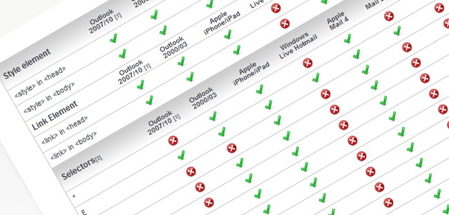
An amazing chart by Campaign Monitor to save you time and effort. With 24 different email clients tested, the chart covers all the popular applications throughout desktops, web and mobile email.
Previewers
Not all developers have the luck of owning a widescreen computer, a tablet and a smartphone at the same time to perform tests and see if their responsive designs are looking good. Fortunately you don’t have to have all these fancy gadgets as there are fully functional testers that you can find online, let’s take a look at some of them:

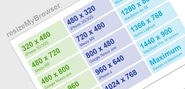
A great tool to instantly check your site under the main screen resolutions. Just choose one resolution and see how your site looks like, besides you can also customize your own resolutions in case your working for other devices. The tool shows some problem with Chrome and Opera because of the ResizeTo event.

A neat tool that helps you perform a quick and easy testing of your website in multiple screen widths and/or mobile versions to see how other peoples are perceiving it.

This tool shows you the exact size of the current viewport and which media query has just been fired. You can drag it to your bookmarks bar and use it anytime you want.

Adobe Device Central is a great alternative for those who are not able to check their websites on the different devices directly. The application includes many great features that makes it more than just a previewer, to use Device Central just enter the URL of your site and start switching between the different devices.
Templates and Frameworks
On this section you can find lots of useful resources to help you build your responsive websites. Grid systems, mobile boilerplates and more great elements that you might want to keep within your bookmarks at the time of constructing responsive websites.

This boilerplate runs under the mobile-first principle, where designs are specifically built for mobile screens initially, then 320 and up expands them for tablets and widescreens.

An useful template for media queries usage in standard devices, the site also covers placeholders for targeting devices and attributes that you might be interested in when making responsive designs.

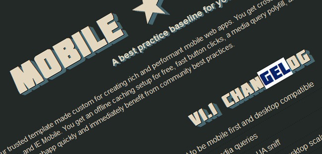
Mobile Boilerplate is custom made template for creating rich and functional mobile web apps. You get cross-browser consistency among A-grade smartphones and fallback support for legacy Blackberry, Symbian and IE Mobile.

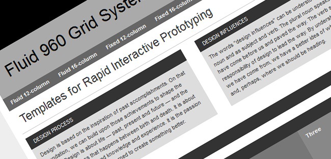
If you’re fan of the 960 Grid System by Nathan Smith, then you should take a look at this fluid adaptation of the original project. If you’re comfortable with the original 960.gs, then you already know how to use Fluid 960 Grid System.

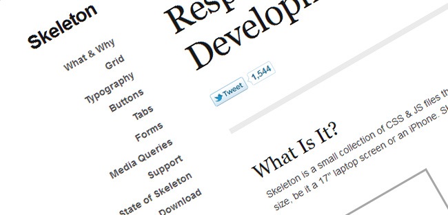
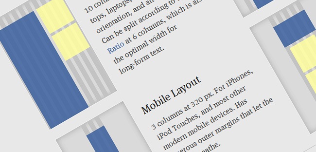
Skeleton is a small collection of CSS and JavaScript files that can help you develop websites with ease that look beautiful at any size, either if it’s a 17-inch laptop or an iPhone. Skeleton’s grid is responsive right down to mobile, it’s well organized, well structured and provides most basic styles.

1140 CSS is an optimized grid to work on screens that can range from mobile size to 1280 pixels wide. It’s a simple flexible grid system that uses media queries for smaller screens, essentially stacking columns on top of one another.

This CSS framework was built to provide a solid foundation for designs on small screens (such as tablets) and tiny screens (such as phones) straight out of the box with minimal effort. It also has a custom grid system builder for creating fluid grid systems.

Flurid is a liquid grid layout with up to 16 columns.
If a grid system for web page layouts seems too restrictive to you, check out Gridless. Gridless is built to be leaner than other grid systems and was constructed with responsive designs in mind. The Gridless code bases its philosophy on the much-discussed mobile first method for crafting websites that must be delivered to a multitude of device environments.
For designers seeking more of a barebones, content-focused approach to responsive web design, you may find yourself quite at home with Gridless.

FluidGrids is a cross-browser CSS grid framework that creates layouts based on 6, 7, 8, 9, 10, 12 or 16 columns.

A CSS grid system for creating adaptive layouts. It includes four basic layouts that include tablet, mobile and wide mobile, plus three sets of typography presets.

A web grid system designed by Joseph Silvashy and New Gold Leaf that allows designers to use the screen real estate on large monitors and retain great design on smaller ones.

Tiny Fluid Grid helps you generate your own fluid grid with 12, 16 or 24 columns, minimum and maximum widths, and percentage-based gutters.
Additional tools
And finally we have all those tools that don’t fit on any of the previous category or perhaps can be included in more than one. Typography tools, additional documentation and more are part of this final excerpt of this article dedicated to responsive web design.

Lettering.js is a jQuery plugin for controlling the appearance of web types. Whether you’re working with a responsive web design or not, having this kind of control over your web type can help you craft a truly creative look without falling onto image-based solutions.

FitText helps you make your headlines responsive while assuring that your display text appears optimally on various devices. Despite its simplicity, the plugin’s flexibility leaves the creativity in your hands and is easy to implement.

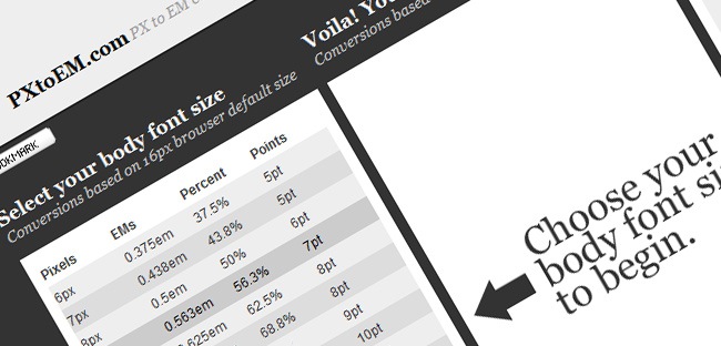
Converting absolute units of measurements (i.e. px and pt) into relative units of measurement such as ems and percent (%) for typography, spacing or container widths must be one of the most boring tasks for web developers. Now you have PXtoEM, a tool that provides users with a simple conversion tool to help them with all the math. The site also allows designers the ability to quickly and easily change the base font size of their layout to something that leads to more manageable math.

Web Developer is a browser extension available for Firefox and Chrome, this extension provides designers with several tools that come in handy when developing responsive or fluid websites.

Elliot Jay Stocks provides insights into the combination of CSS media queries and CSS transitions under the basic premise of using media queries to design responsive websites that adapt in layout according to browser width.

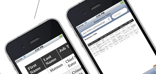
This link shows you how Chris Coyier and Scott Jehl are experimenting with responsive design techniques for displaying data tables. By default, data tables can be quite wide, and necessarily so. You could zoom out and see the whole table, but then the text size would be too small to read.

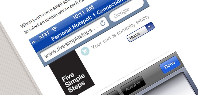
On this link Chris Coyier describes another technique for converting a regular row of links into a dropdown menu when the browser window is narrow.

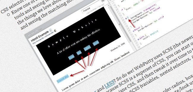
WebPutty is a web-based CSS editor with auto-save feature and a real-time preview of your website. WebPutty also has CSS selector highlighting and SCSS support (for Sass and LESS), as well as Compass support. To use the tool, just embed a link tag at the end of your website’s head tag.

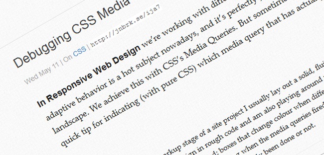
On this post the web design expert Johan Brook shares a quick tip for indicating through pure CSS which media query has kicked in. The article also provides a mixing for developers using Sass.

A great and yet simple calculator and fluid grids generator for your responsive designs developed by Harry Roberts. Just provide the number of columns, the width of one column and the width of the gutters, and the tool will generate a fluid grid system in CSS for you.

On this like you can find Luke Wroblewski’s conference notes on Ethan Marcotte’s presentation about applying responsive web design principles and workflows to the redesign of a major newspaper website.

The Goldilocks Approach uses a combination of Ems, Max-Width, Media Queries and Pattern Translations to consider just three states that allow your designs to be resolution independent.

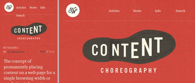
Useful article where you can read how to properly plan your site to live according to today standards. Begin to choreograph content proportional to size to serve the best possible experience at any width.

A galore of well designed websites that have been created using media queries and responsive web design, definitely a great site to look for inspiration.

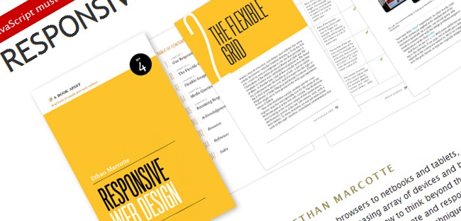
And finally we have what might be considered the Holy Bible of responsive web design. Written by Ethan Marcotte and published by A Book Apart, this book is a brilliant resource for learning how to design responsive websites. It covers all the basics behind responsive web, flexible grid systems, flexible images and media queries.
That’s it for this article, we hope this can help you resolve all your doubts regarding responsive web design. Although is not the only way of approaching mobile devices while presenting a good design and functionality, this is definitely one of the most effective solutions nowadays.
Note: Don’t forget to follow us via our Google Plus profile , RSS channel, Facebook page and Twitter so you can find useful resources for web professionals. If you don’t have a Google+ profile yet, please ask for an invitation in the comments :).

