What’s up guys?. I hope you’re doing fine because we are about to start a new tutorial. In this opportunity we are going to show how to create a complete GUI set slider using Adobe Illustrator. For those who are not familiar with the GUI term, it goes after the words Graphical User Interface and as its name suggests it, is a type of user interface item that allows people to interact with programs in more ways than typing, it uses images rather than text commands. A GUI displays graphical icons and visual indicators to completely represent the information and actions that are available to the user. These actions are usually performed by a directly manipulation of the graphical elements. After this short introduction, let me tell you that through all this article we will be practicing the graphic styles option. Now its time to start this tutorial.
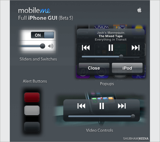
1. Take a look at some GUI examples
As we said before, its useful to look at some references before you start designing; the web is full of GUY examples, so feel free to take some time to check out.
2. Place your ideas on paper
No matter how far technology has gone, the best way to draw some quick sketches will always be through paper and pencil. There are no intermediaries between your brain, your eyes and your hands.
3. Create your canvas
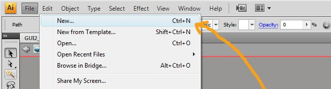
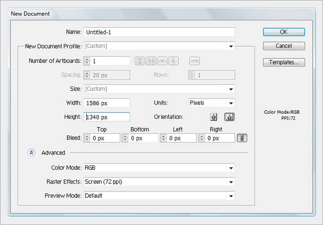
OK, in this tutorial we will create a little GUI set, which in the future can be extended a lot, so we should start with a big canvas, go to File>New and assign it a 1586 px X 1340 px measures, RGB color mode and 72 dpi, this last two are screen parameters.

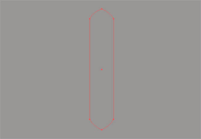
4. Our first shape
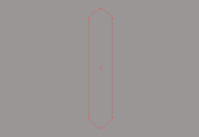
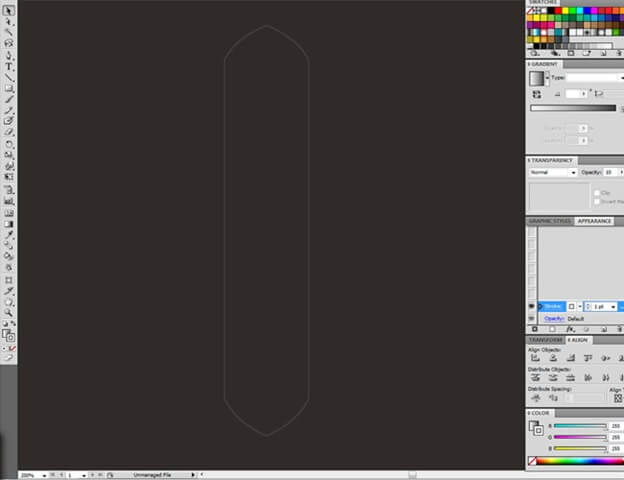
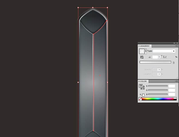
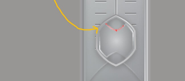
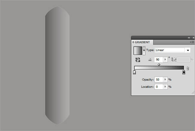
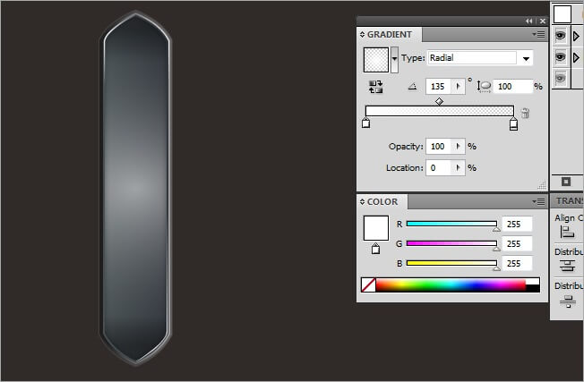
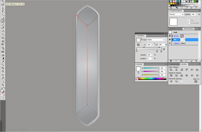
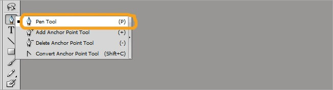
Its time to start drawing the first symbol of our GUI set. Select the pen tool and draw a large hexagonal figure. Remember that by holding Shift you can create straight paths and by clicking over an anchor point you can make straight turns

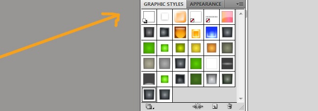
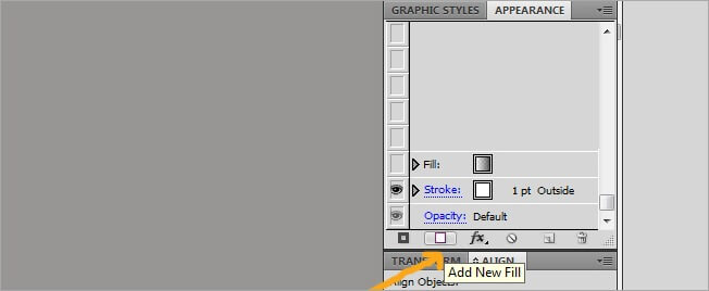
5. Using the Graphic Styles
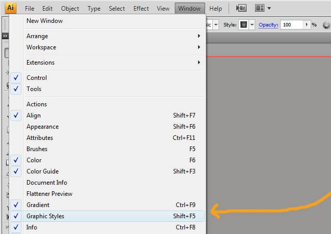
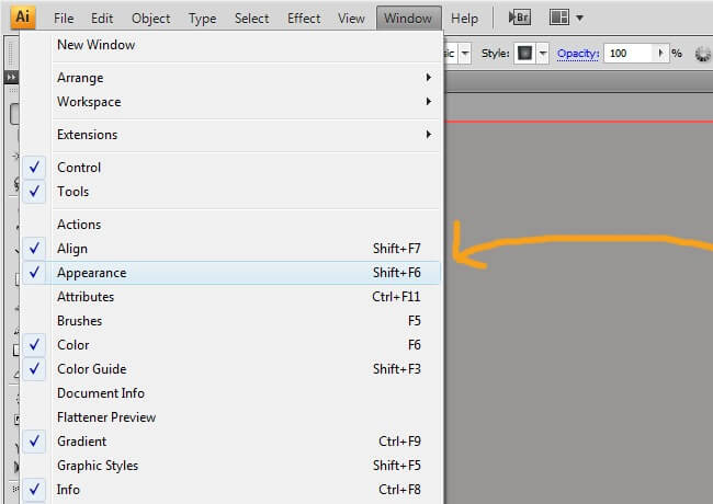
The graphic styles vignette is one of the most practical tools that Illustrator has to offer. You can generate quite complex shapes without using layer after layer. To create a graphic style, go to Window>Graphic Styles and verify the option is checked, then go to Window>Appearance and activate it.

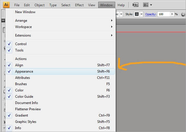
This is how both windows look like.
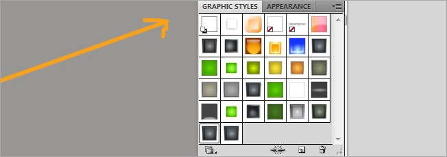
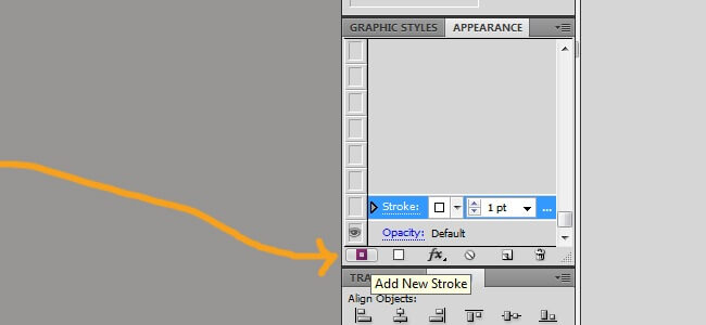
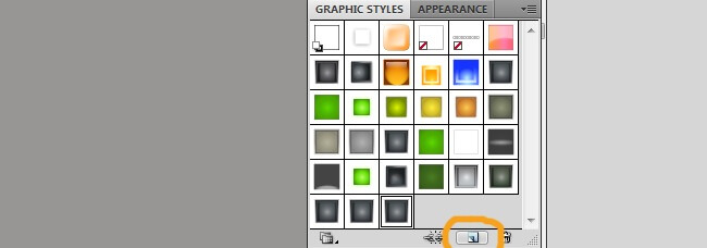
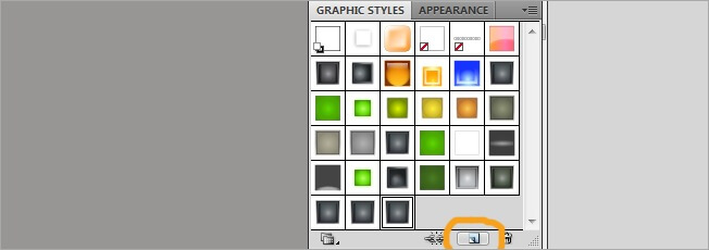
Select the path we just did and then click on New Graphic Style.

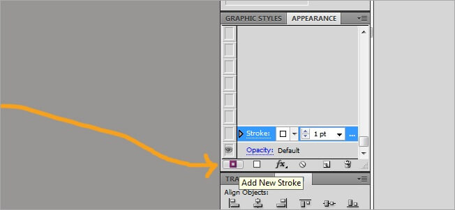
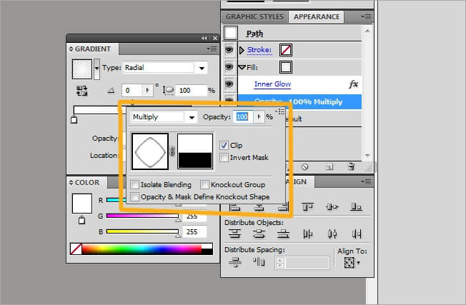
Lets start playing with our new style, make sure that both the path and the graphic style are selected, then go to Appearance and click on the Add New Stroke button.
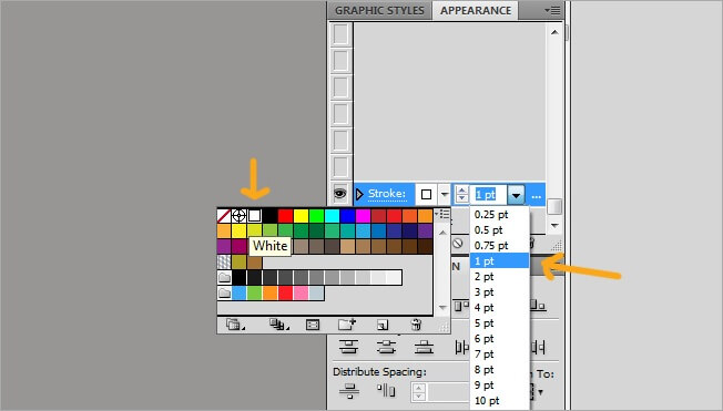
Adjust its values to white and 1 pt stroke weight.
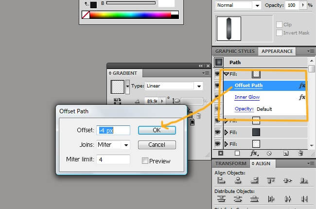
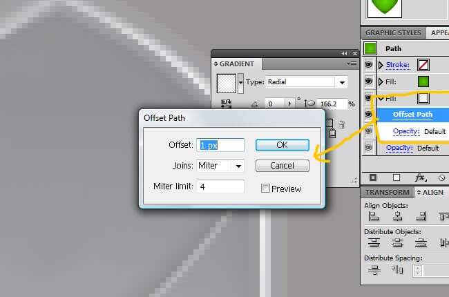
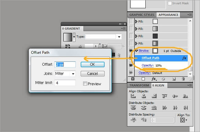
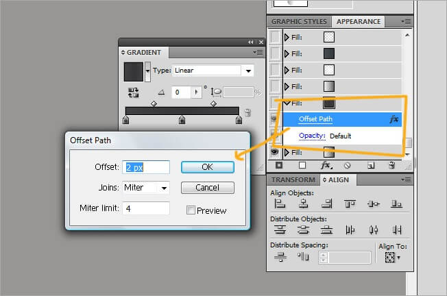
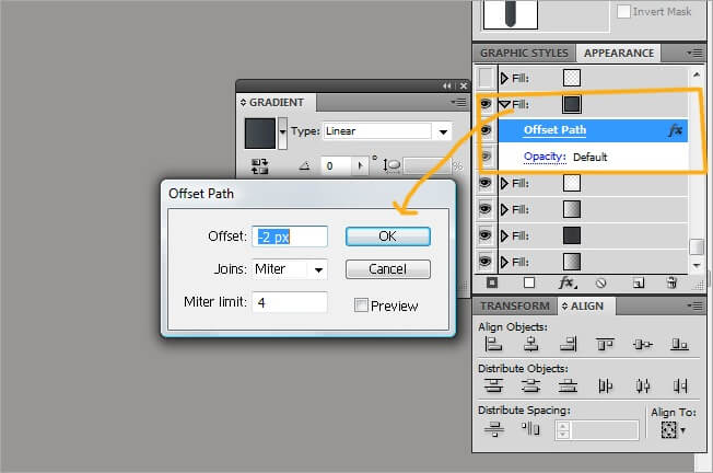
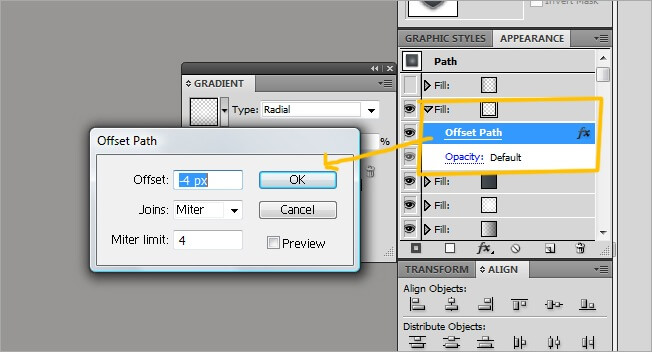
By doing this we’ve just added a stroke to our shape. Now lets add it some effects, click over add a new effect and select path>offset path.
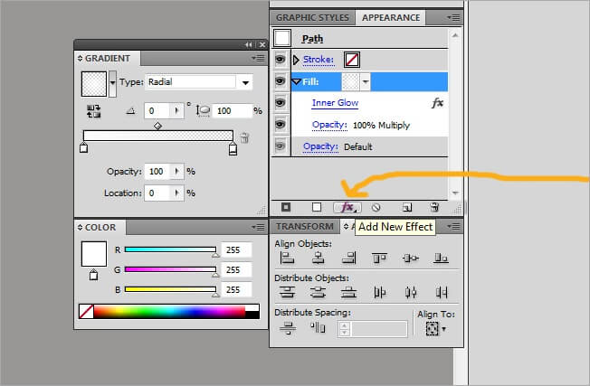
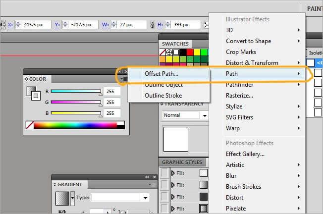
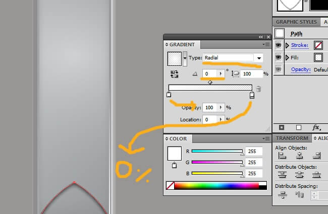
Adjust the effect values to offset>2 px, joins>meter and miter limit>4. At the stroke vignette change the opacity to 10 %. You can display the stroke or fill options by clicking over the gray arrow left to the words “stroke” or “fill”.
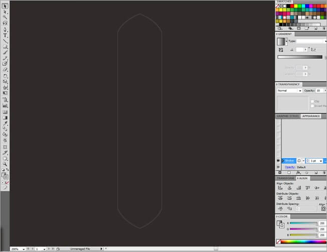
Now our path is being seen as follow.
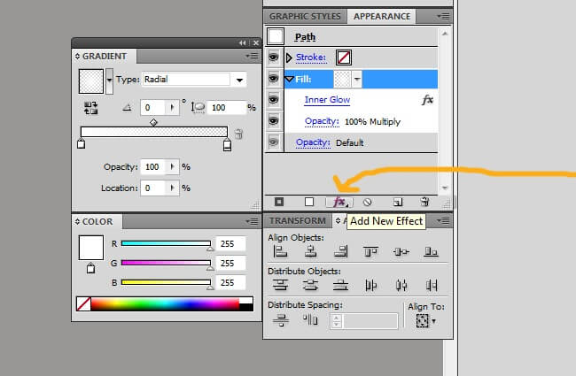
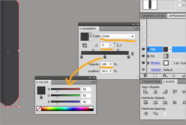
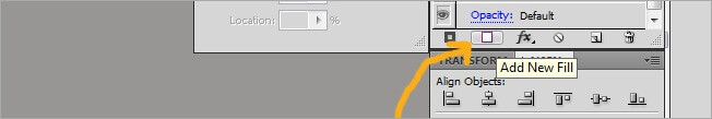
Next a fill, click over the Add New Fill button.
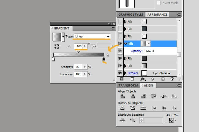
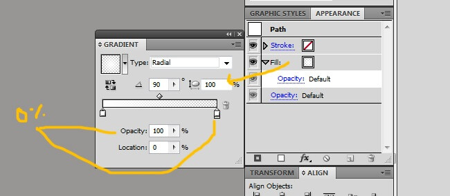
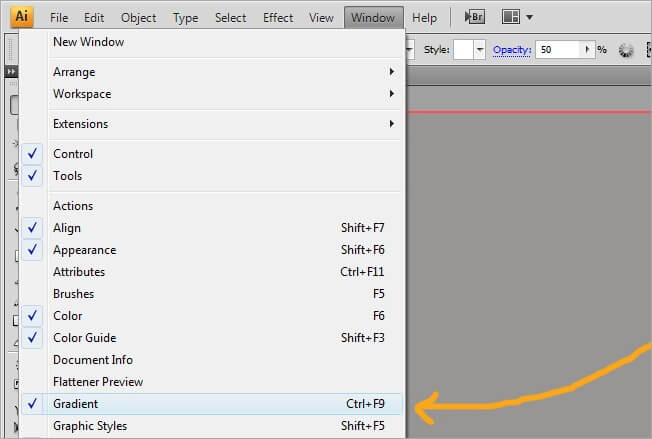
Go to Window>Gradient if you’re not seeing this window, ‘cause we will need it to edit the fill we’ve just entered, if you want, place it next to the appearance window to find everything quicker.
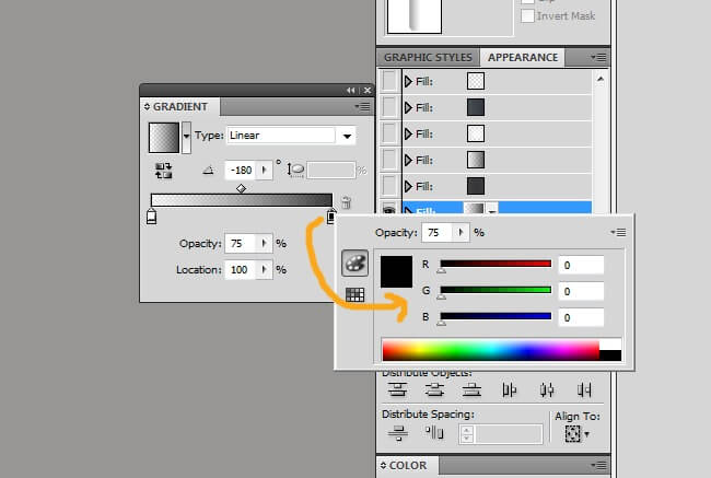
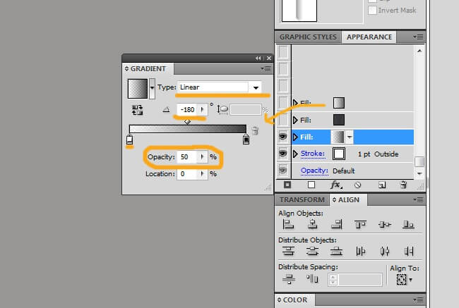
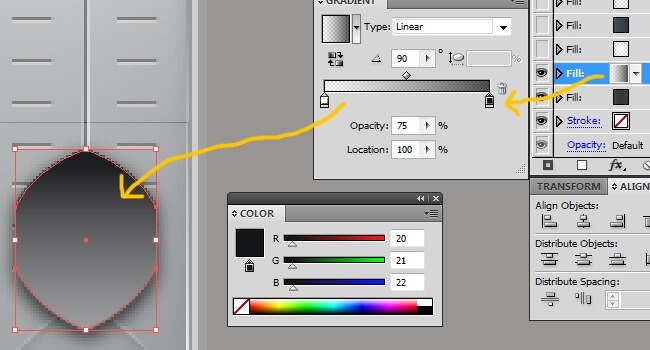
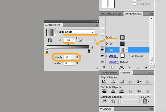
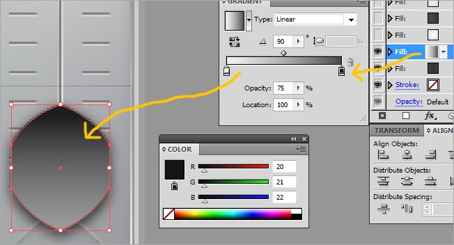
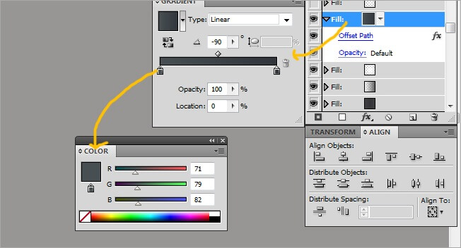
First choose a white color at the left side and a black color to the right side, remember you can change the color by double clicking over the house-like button.


Then modify the black color properties to the following: Type>linear, angle>-180 and opacity>75 %.
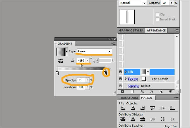
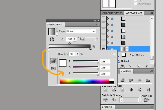
The white color should have the following values: Type>linear, angle>-180 and opacity>50 %.

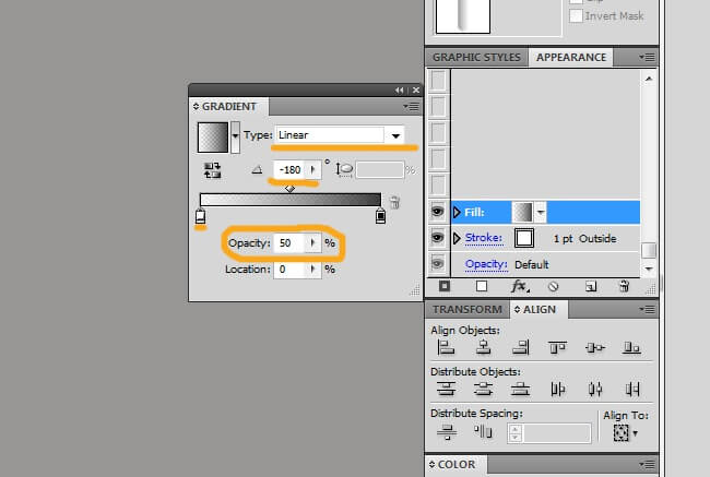
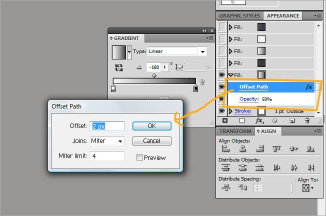
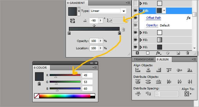
Now display the fill vignette and add a Offset path effect, leave the values as we did with the last shape, finally, change the opacity of the fill to 50 %.
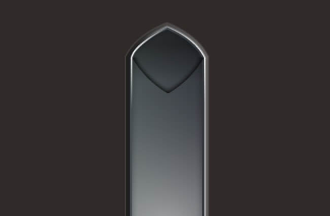
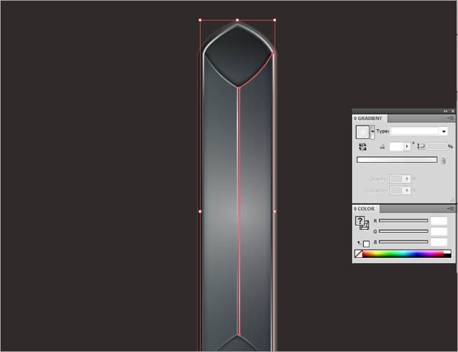
The symbol must be looking at the moment like this:
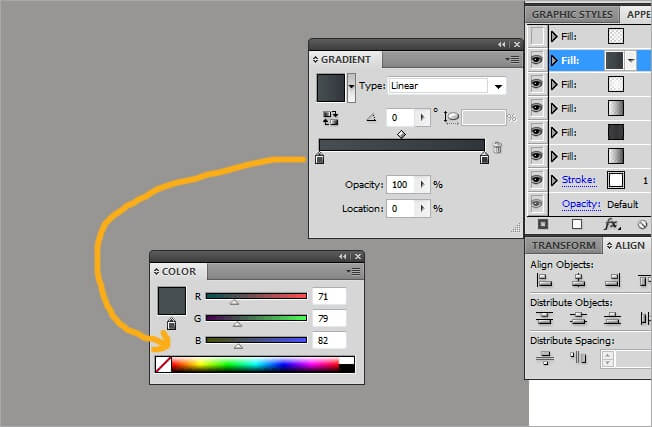
So far this is has been easy, at this rhythm we will finish it in a blink. Now click on Add a New Fill.

Change both colors to black and click on the center of the bar to add a new color, then change it to dark gray. The properties of the three colors will be the same: Type>linear, angle>0 and opacity>100 %.
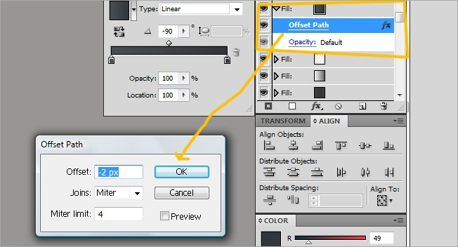
Then you need to add an offset path, leave the parameters as usual but the opacity must remain in default.
This a repetition process that at the end will provide us some great results, so keep it up and lets add a new fill.
If you’re seeing three colors below the gradient bar, clear the one in the middle by holding click and dragging it down. Change the left color to white and the right to black, adjust the black parameters to type>linear, angle>-180 and opacity>75 %.

As we did with the first fill, these two had the same values, check that the white parameters are set to type>linear, angle>-180 and opacity>50 %. This fill has no effects and a default opacity.
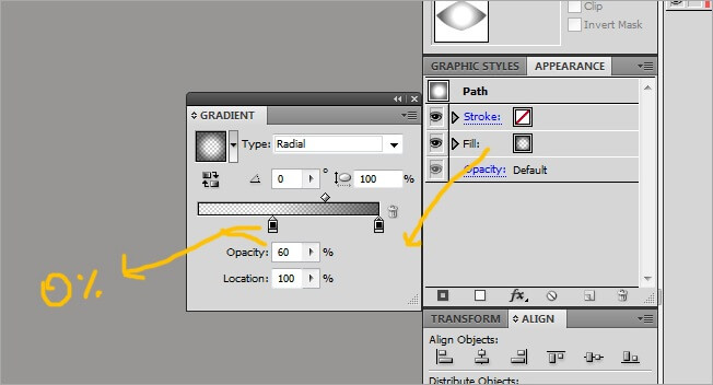
One more time, but this fill is special, because its designed specifically to be a glow.

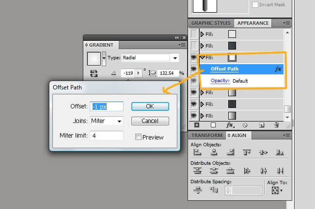
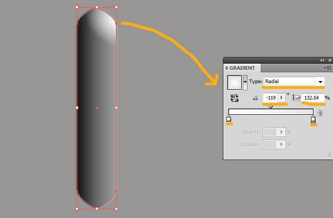
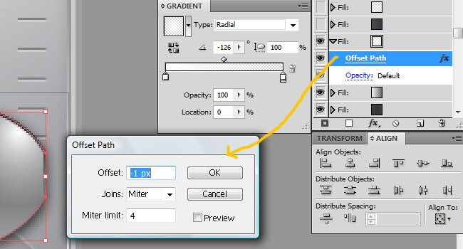
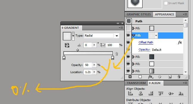
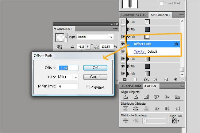
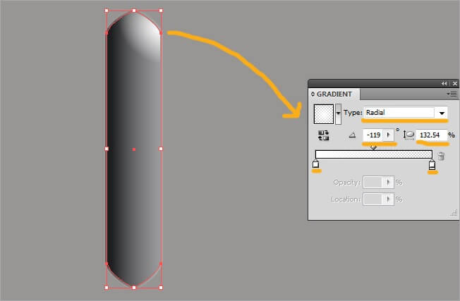
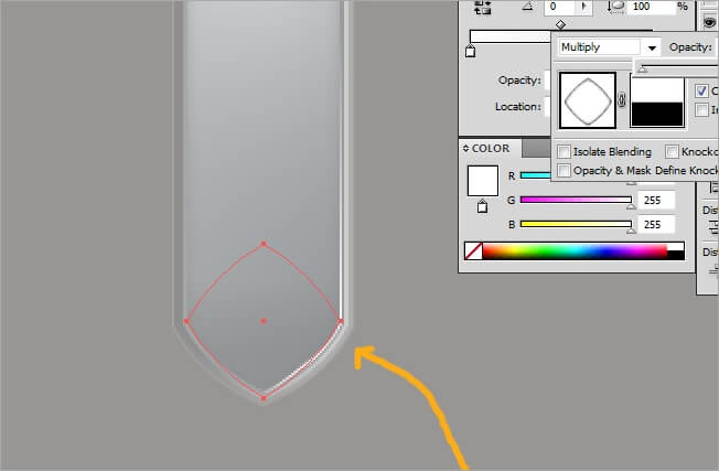
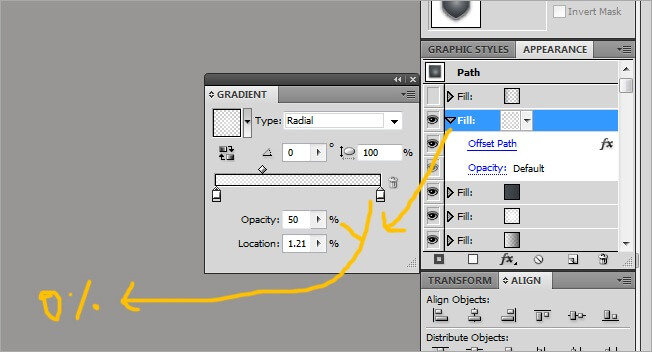
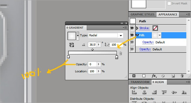
Switch both extremes to white and adjust the parameters (be careful with this values) to type>radial, angle>-119 and the aspect radio to 132.54 %. Then add a new offset path effect and adjust the parameters to offset>-1 px, joins>miter and miter limit>4, leave the left color marker’s opacity unchanged and the right one to 0, finally, press G to change the gradient’s position and place it at the top right corner. If you did it right, our shape must be looking like this.
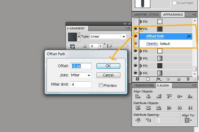
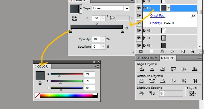
The next fill goes black at the right side and dark gray to the left one, leave the values in type>linear, angle>0 and opacity>100%. Next we show you some print screen images so you can check out.

Add it an offset path effect with the parameters offset>-2 px, joins>miter and miter limit>4. Leave the opacity default.
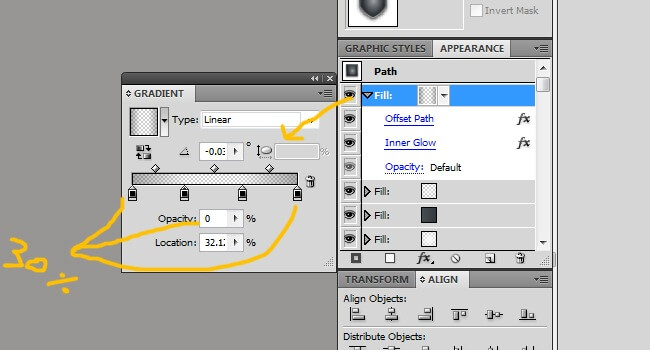
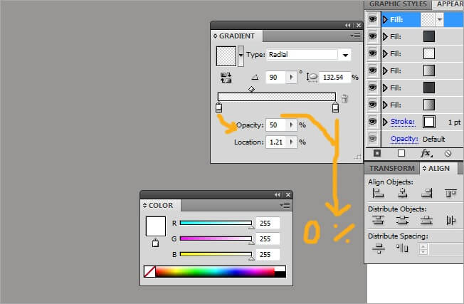
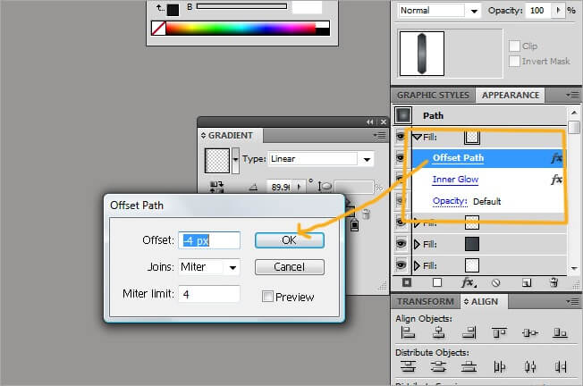
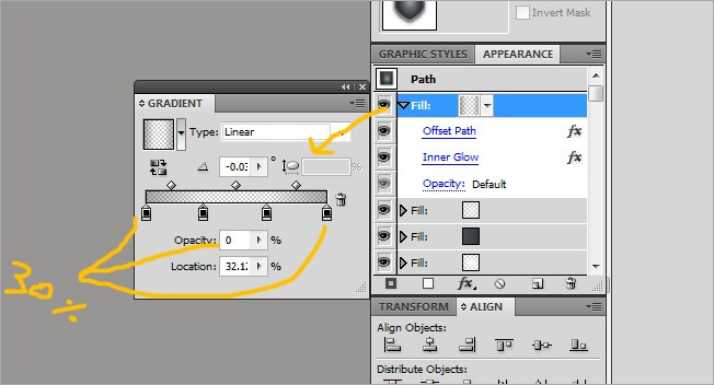
For the next fill, switch both color extremes to white and adjust its values to type>radial, angle>90 and aspect radio>132.54. Give the right color a 0% opacity and the left one a 50%.

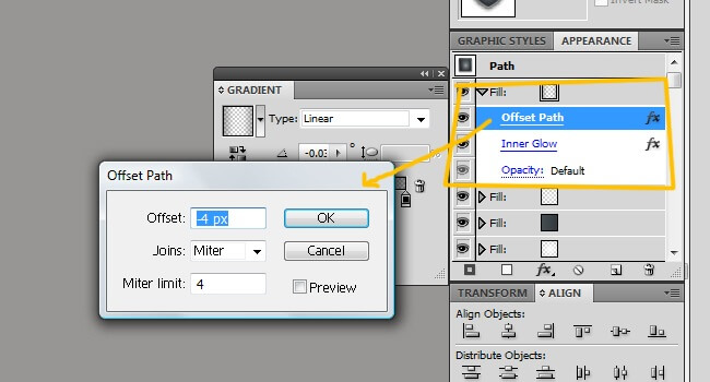
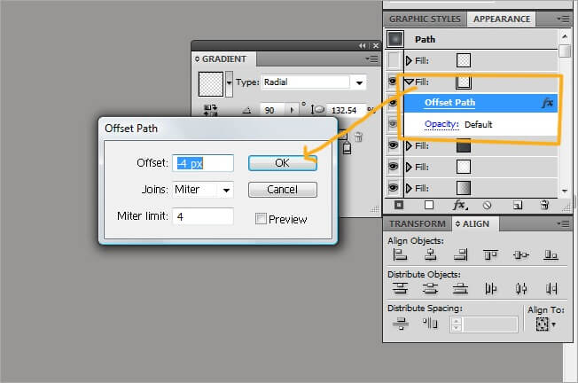
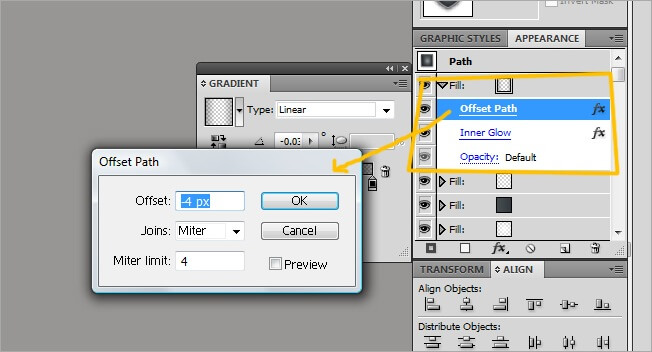
This one also needs the offset path effect, so select it and adjust its values to offset>-4 px, joins>miter, miter limit>4 and a default opacity.
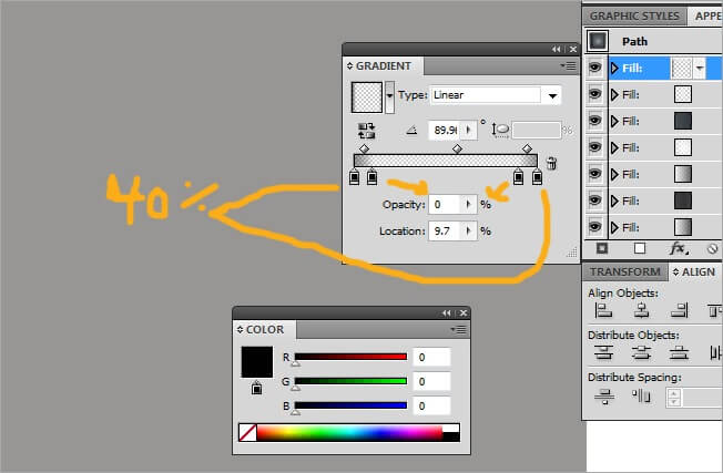
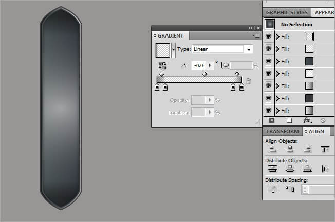
OK, the final fill, we are flying!!!. This one is a little bit more complex than the others, but that’s not a problem for us. Leave both the left and the right black and then add next to each icon another black one. Leave the values in type>linear and angle>89.9. Leave the opacity of the extreme colors in 40 % and the inside ones in 0 %.
Now lets add offset path with its values adjusted to offset>-4 px, joins>miter, miter limit>4 and a default opacity.
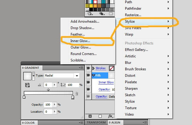
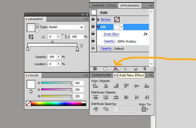
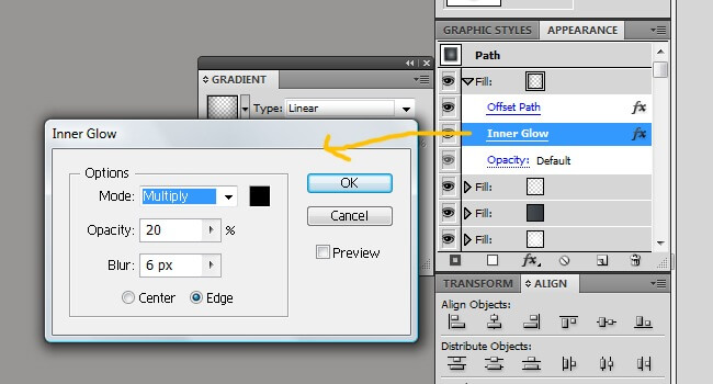
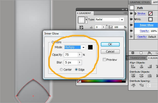
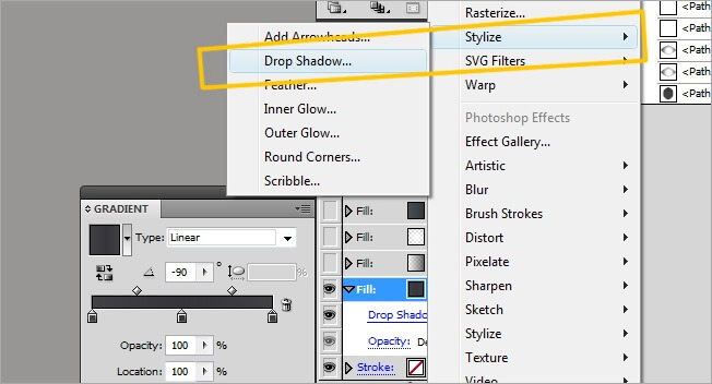
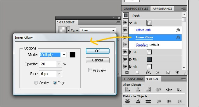
Go to Stylize>Inner Glow.
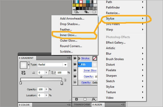
Adjust this effect values to mode>multiply, opacity>20 %, blur>6 px and edge. This will finish the basic shape. Although is kind of a long process, the result makes it worth.
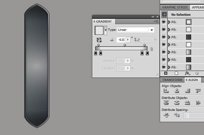
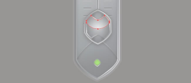
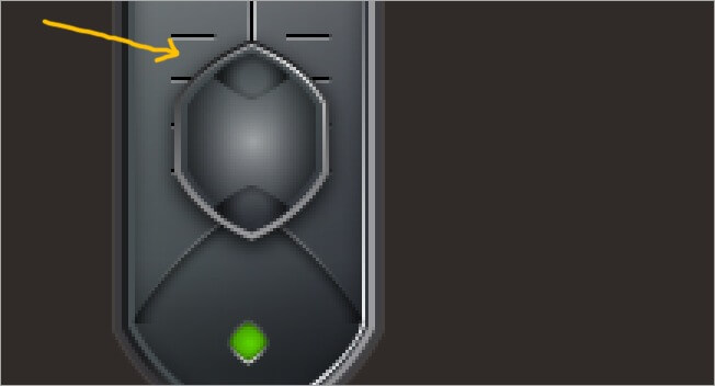
We have completed our first shape made exclusively with graphic styles. Now every time we need to apply the same style to a shape, we just go to the graphic styles panel and select our style.
6. Some extra details
The next thing to do is to add a couple of glows. We are adding this glows apart because we need it to be very small and precise.
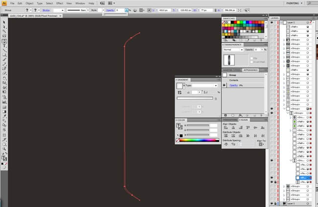
Using the pen tool, draw something like this.

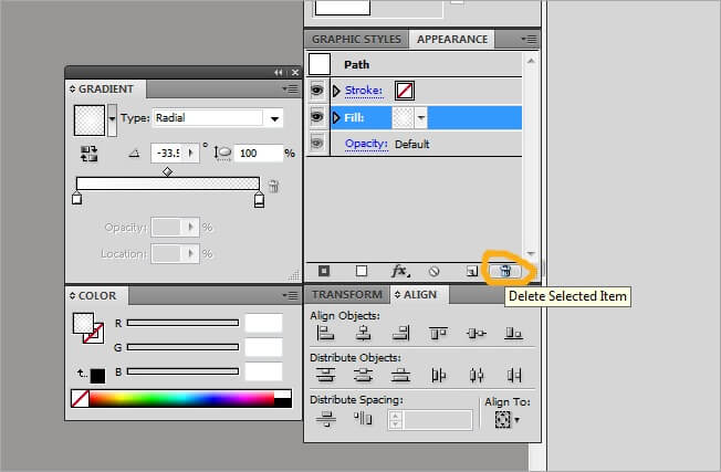
Let’s go back to the graphic styles window and add a new one.

Now go to appearance and if you see the previous values we left, simply select each style and then click over the trash can icon to delete it.
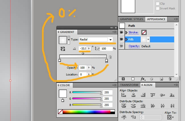
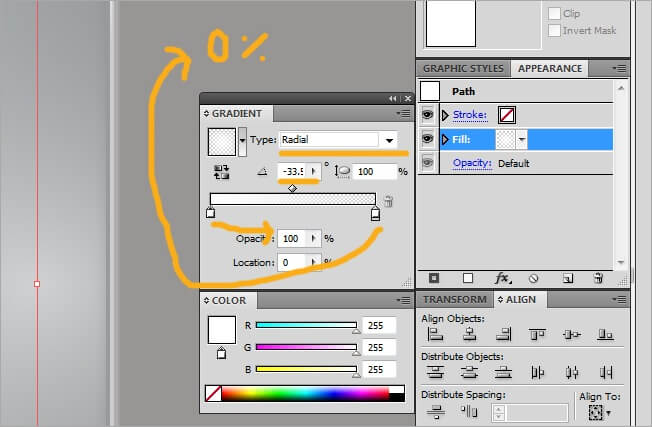
This shape is very simple, it only requires one graphic style element. Select Add a New Fill and then leave both extreme colors in white.

Now adjust the fill values to type>radial, angle>-33 and aspect radio to 100 %. The left color must have a 100 % opacity and the right one 0 %.
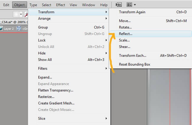
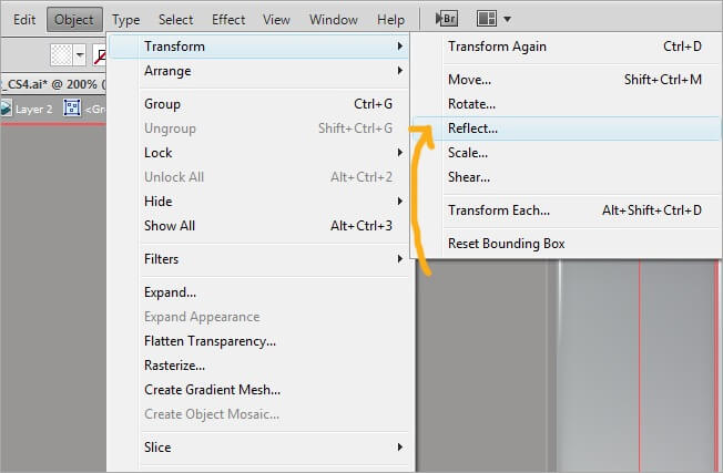
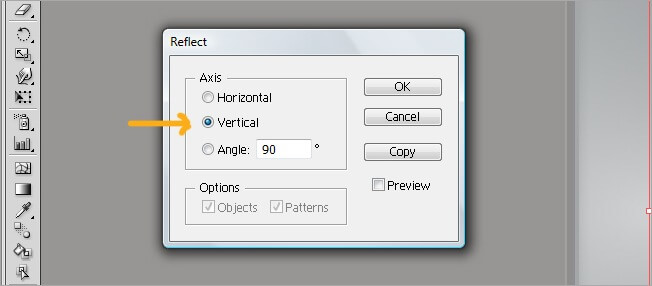
We need a glow in front to complete the volume. Select the one we just did and copy it (Ctrl + C), then paste it in front (Ctrl + F) and go to Object>transform>reflect and choose vertical, Finally, place it right in front of the original glow.

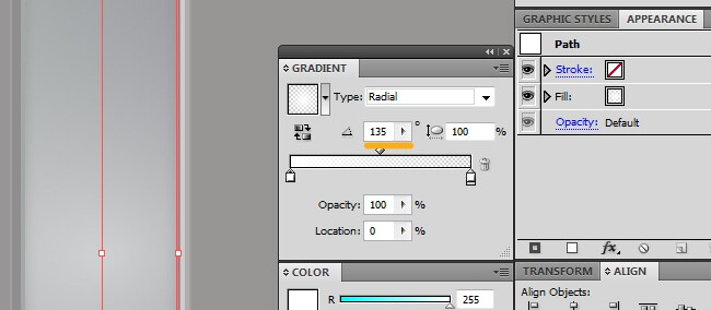
Now we must adjust the shape parameters, go to appearance and change the angle in the gradient vignette to 135.
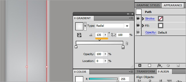
Our figure will be so far looking like this:
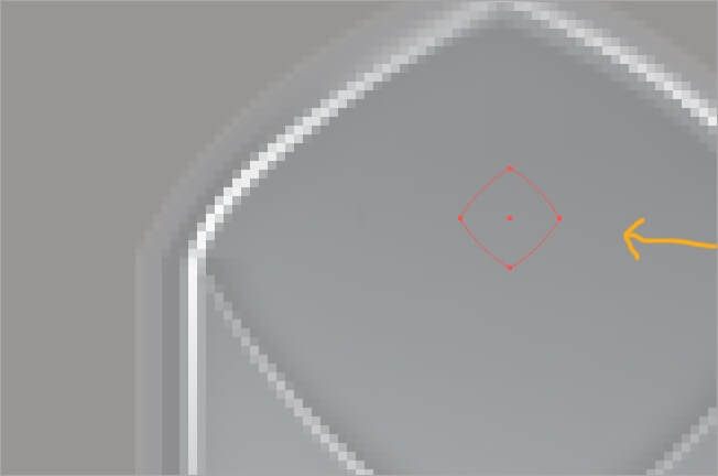
The next step is a subtle shape to generate volume. Use your pen tool to draw it and then go to graphic styles, add a new one and clear everything.


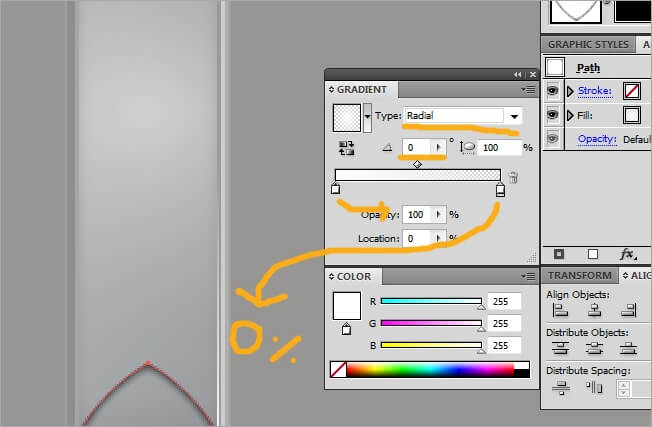
Now the graphic styles. Add a new fill and adjust the two colors to white, type>radial, angle>0 and aspect radio>100 %. Give 100 % opacity to the left one and 0 % to the right.

Now display the fill menu by clicking over the gray arrow, then change the opacity to multiply and check the clip fill.
Its time to add some effects, keep the fill selected and click on the add new effect button.

Go to Stylize>Inner Glow.

Adjust its values to mode>multiply, opacity>75 %, blur>5 px, edge.
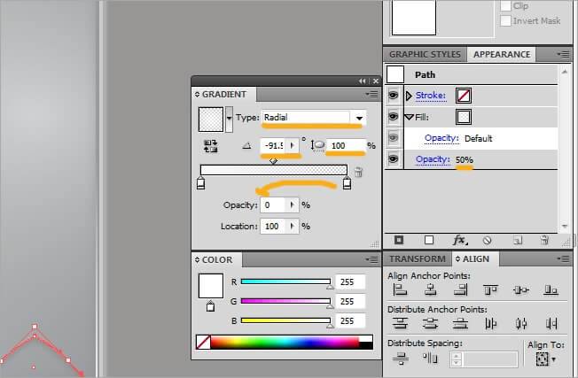
Draw a new path above the one we just did, then add a graphic style and adjust its parameters to opacity>50 % and add a new fill.

Keep the two colors in white and adjust the left one opacity to 75 % and the right to 0 %, adjust the type to radial, the angle to –91 and the aspect radio to 100 %.
Now copy the penultimate shape we drew and rotate it 180 degrees, then place it on top of the bar.
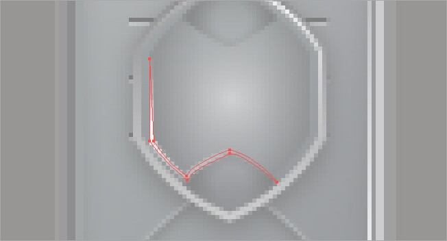
As you have seen, we are making every single piece using the graphic styles, because is an organize and effective way to do things in Illustrator. The next shape follows the same parameter. Draw it with the pen tool and then add it a new graphic style. Although is a thin figure, its a contour shape, not a stroke.


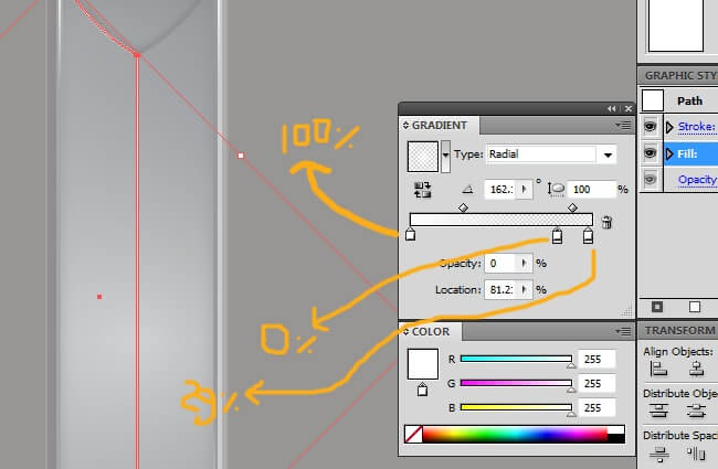
OK this one has a unbalanced gradient. At the left side choose white with 100 % opacity, at the right side select also white with 29 % opacity and next to it another color marker, also white but with 0 % opacity. Everything must be in type>radial, angle>162 and aspect radio>100 %.

The next figure is similar, copy paste the last shape we did (Ctrl + C, Ctrl + F), then reflect it vertically and place it in front of the original.


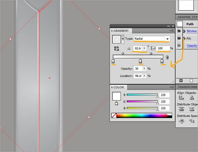
Go to the appearance vignette and adjust the gradient properties to 3 colors (all white), type radial, angle>82.6 and aspect radio>100 %. From left to right assign the following opacity values: 75 %, 0 % and 30 %.
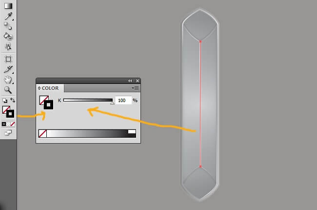
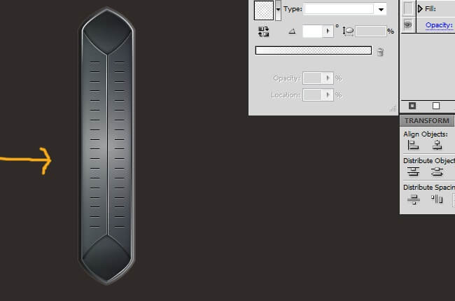
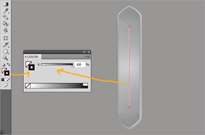
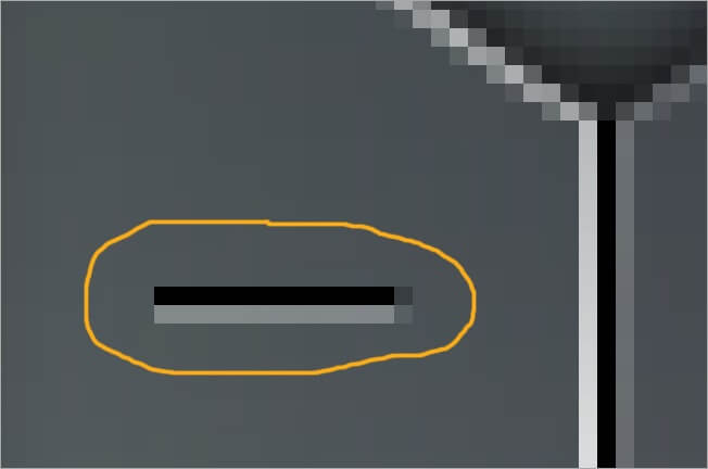
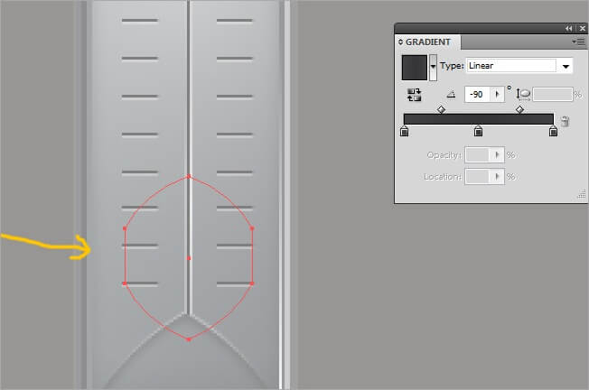
We now continue with a black stroke in the middle to keep generating volume vibes. Draw a straight vertical shape. If you want we can select the black stroke through the graphic styles, but lets do it by clicking over the left icon at the bottom of the tool bar.
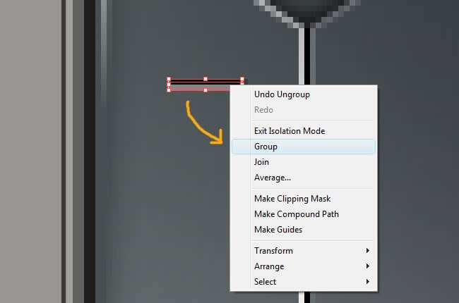
The next thing to do is the lines across the bar that emulates the volume control. We just need to make one and then copy and paste a lot. Simply draw a horizontal black line using the pen tool. Then copy and paste it below and change the stroke color to gray. Next select both lines and right click to display a menu, select Group to join them.

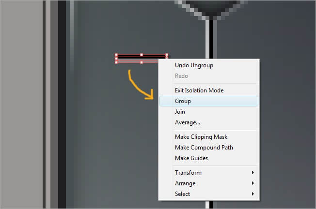
Now its copy after copy (Ctrl +C), paste after paste (Ctrl + F). Be careful with the position of each group so it won’t look disorganized; at the end you will be getting something like this.
I guess you are starting to get bored by seeing black and gray gradients only, so lets add some color. Grab the pen tool and make a curved square.

Now the graphic styles. Add a new fill and leave the two gradient extremes white. The left white must have a 100 % opacity and the right one a 0 %. Also adjust the type to radial, angle>0 and aspect radio>166.2 %.
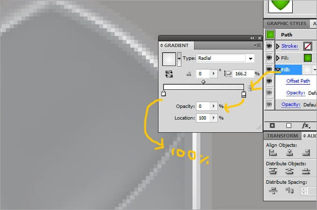
As we’ve been doing, let’s add an offset path effect with the following values: offset>1 px, joins>miter, miter limit>4. Leave the opacity on default.

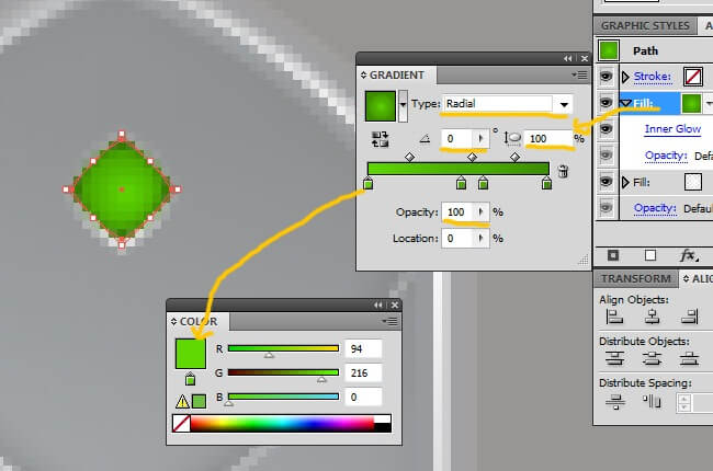
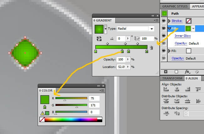
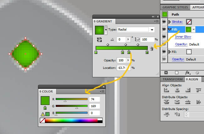
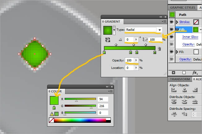
And here comes the color. Add a new fill and adjust the gradient to four key points, each one with a different green tone that we show you below. Leave the type>radial, angle>0, aspect radio>100 % and all the opacity levels to 100 %.
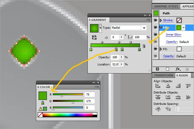
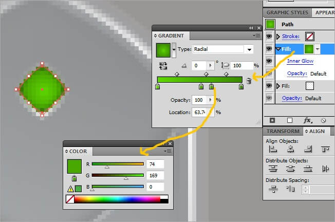
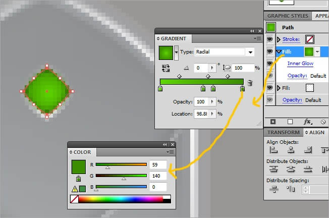
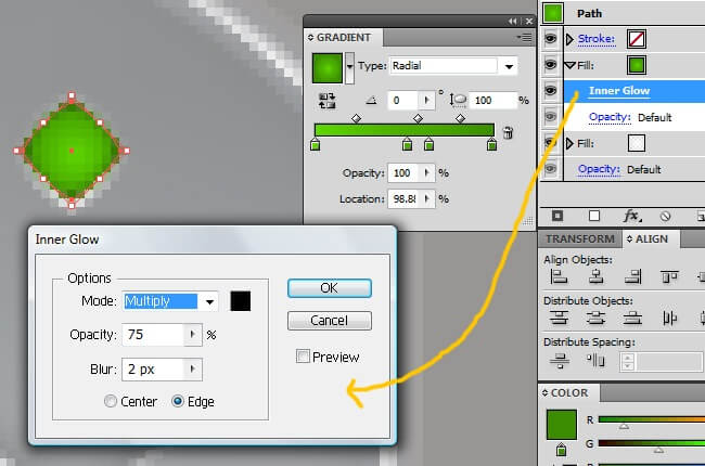
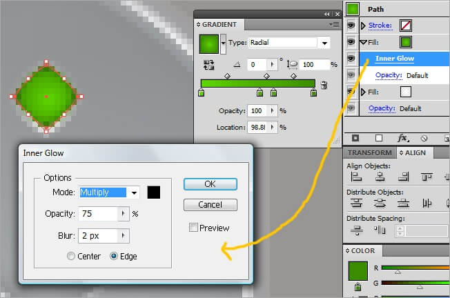
Leave the opacity on default and proceed adding an inner glow with the following values: Mode>multiply, opacity>75 %, blur>2 px and edge.
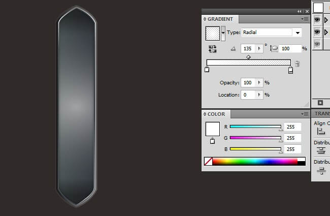
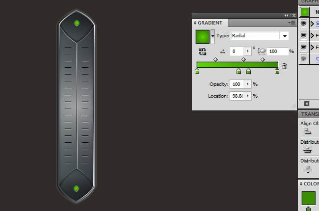
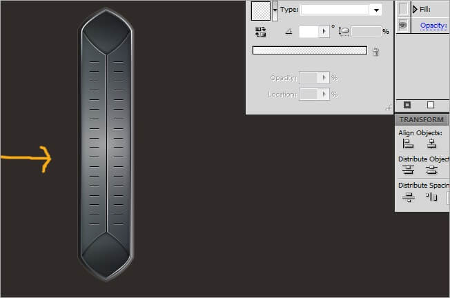
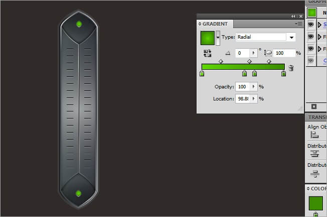
After zooming out, our little color object will be looking like this.
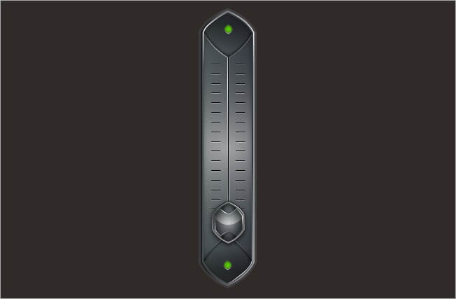
7. The control button
OK guys, so far we have made a lot of usage to the graphic styles option, leaving us to the currently result. Now that we are getting closer to the end I suggest you to go for a cup of coffee or hot chocolate.
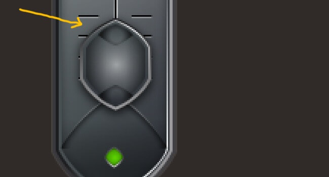
Using our beloved pen tool, lets draw the button’s shape. You can do it as you prefer to, you can do it as you wish, we made a hexagonal figure.
Is time to apply what we have learned throughout this tutorial. Pick the new graphic style button and in the appearance box, clear all the items.


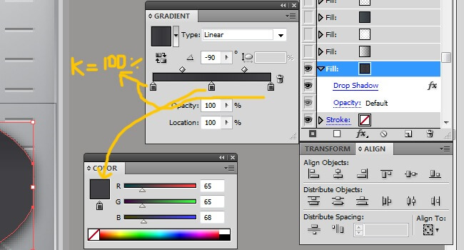
With our appearance box empty, its time to start working. Let’s add the first fill. Adjust the gradient parameters to black at both sides and one key color at the middle with a dark gray on it. Adjust the type to linear, angle>-90 and all three opacities in 100 %.


To give some volume to our button, lets go to the effects button and then click on stylize>drop shadow.
Adjust the drop shadow options to mode>multiply, opacity>75 %, X offset>0 px, Y offset>2 px, blur>3 px and color black. Remember to leave the opacity default.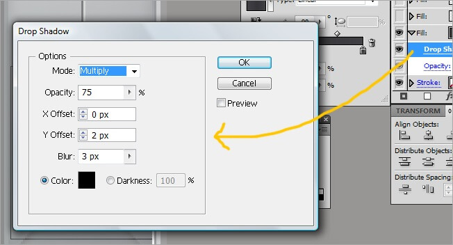
Don’t give up my young Padawan, we are getting closer. Insert one more fill and leave the left color key in white with 50 % opacity and change the right one to 75 % opacity black. Leave the type linear and the angle in 90.
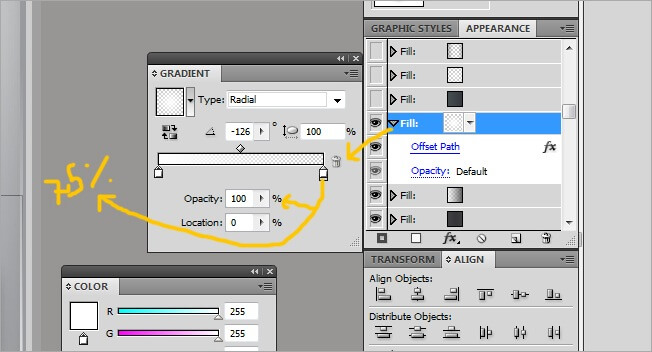
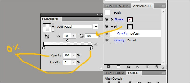
The next fill will help us developing our button’s volume. The gradient will be white at both extremes and with the following properties: Type>radial, angle>-126, aspect radio>100 % and 100 % opacity to the left and 0 % to the right.
Now we need the offset path. Add it through the new effect button and adjust its values to offset>-1 px, joins>miter and miter limit>4. Leave on default the opacity.


The next fill will place the main color of our button. The color keys of the gradient will be two scales of gray and the values are type>linear, angle>-90 and 100 % opacity in both extremes.

Enter the offset path effect and adjust its values to offset>-2 px, joins>miter and miter limit>4, also keep the opacity default.
Another fill. Switch the two the gradient elements to white, leave the left one with a 50 % of opacity and the right with 0 %. Regarding the parameters, choose type>radial, angle>0 and aspect radio>100 %.
We continue using the offset path effect, this time adjust the parameters to offset>-4 px, joins>miter and miter limit>4, as usual, leave in default the opacity.
OK guys, for the last fill of this shape, place 4 color key points over the gradient bar, all black. The two on the extremes with a 30 % opacity and the ones in the middle 0 %. The type should be linear and the angle 0.
Now the offset path, adjust its values in offset>-4 px, joins>miter and miter limit>4, as usual, leave in default the opacity.
Then Inner Glow, the values for this effect will be the following: Mode>multiply, opacity>20 %, blur>6 px and edge.
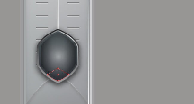
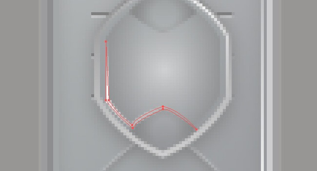
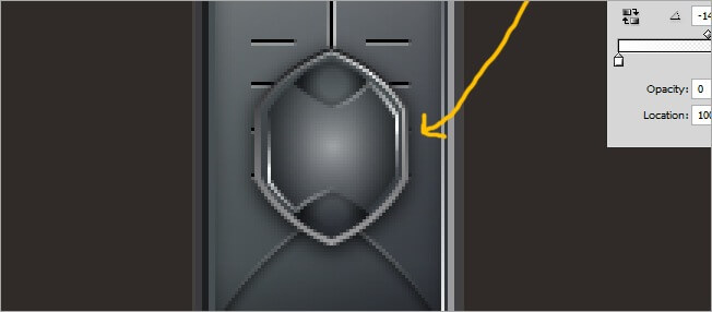
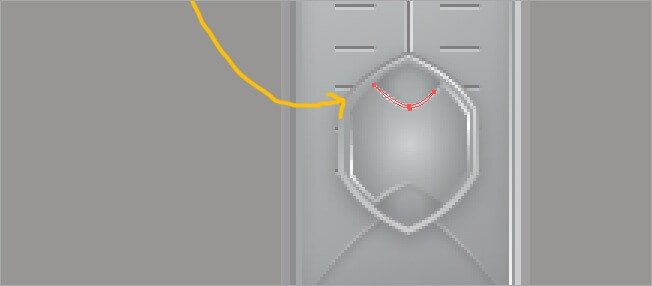
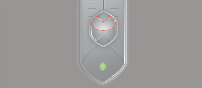
Now some shapes at the point of the figure. Select the pen tool and draw as it shows next.
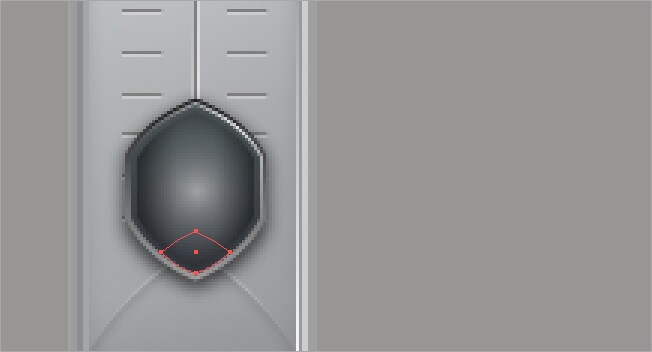
This one needs also the graphic styles, add a new fill with default opacity and adjust the gradient to a 60 % opacity black to the right and a 0 % black at the middle, clear the key color of the left side. Also make sure that its type>radial, angle>0 and aspect radio>100 %.
Now copy this shape and place it on top of the button (Ctrl + C, Ctrl + F), then rotate it 180 degrees.
Lets add a thing glow at one side of the button, using the pen tool draw the following figure:

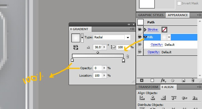
Now add it a fill with default opacity and enter the following values to the gradient options: Type>radial, angle>38, aspect radio>100 %, 100 % opacity white to the left and 0 % white to the right.
Copy paste the shape we just did (Ctrl + C, Ctrl + F), reflect it vertically and place it in front of the original.

Another tiny glow, we are almost there. Draw it with your pen tool.
Go to graphic styles and add it a new fill. First clear all the items if there are any. The parameters must be: Type>radial, angle>26, aspect radio>100 % and white keys at both sides, the left one with a 100 % opacity and the right one with a 0 %.
OK, after all this long process, one last thing, the final glow. It will cover the upper side of the button; you can draw it with the pen tool.
One more time, go to graphic styles, select one, clear everything and add a new fill.


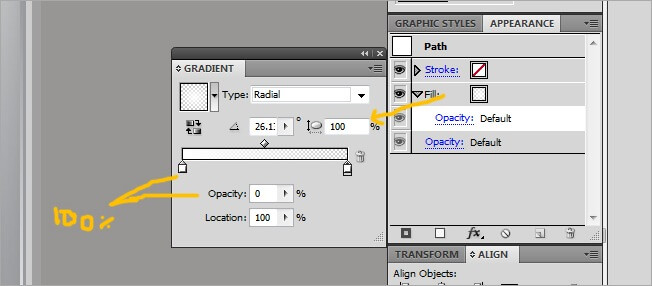
The gradient properties of this fill will be type>radial, angle>90, aspect radio>100 %, a 100% opacity white to the left and 0 % white to the right.
OK, I think we are done. It has been a nice journey through almost a hundred images and some of the coolest tools that Illustrator has to offer, we will continue bringing you new articles, countdowns and tutorials, take care.