Vintage Design Breakdown, All About Vintage Elements, Styles & Typography
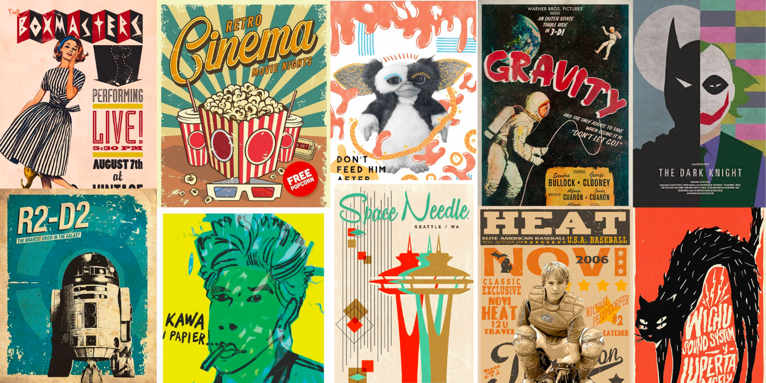
Vintage design is everywhere, if you think about it. For centuries, we’ve been taking trends from earlier times to alter how we want new designs to be perceived. In fact, you’ll find throwbacks in every design category, from decorative arts to fashion design to music. Although let’s say that vintage design is a trend these days, we’ve been doing it forever.
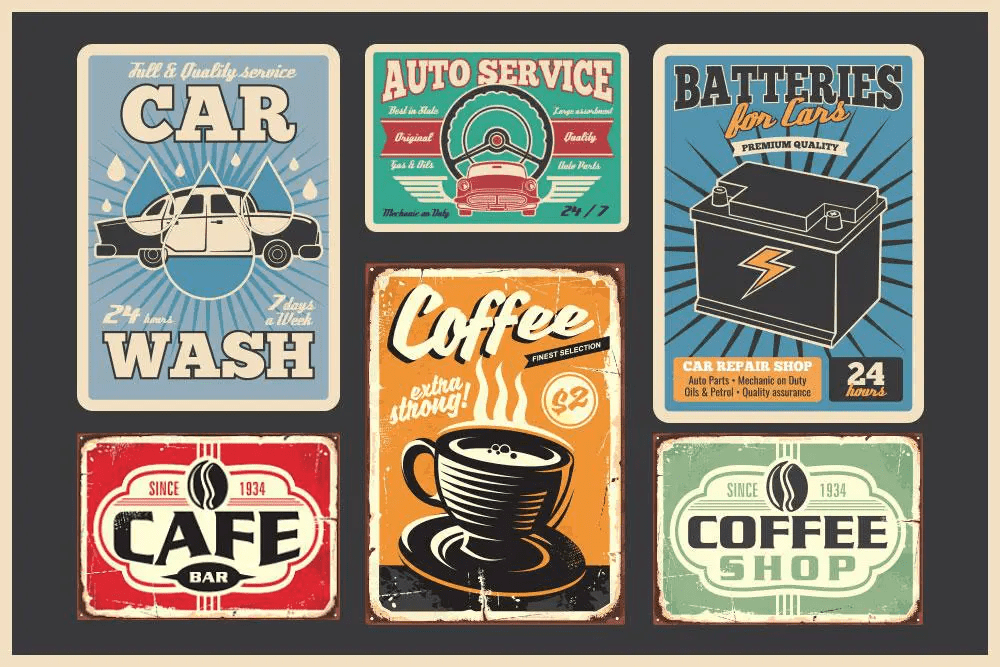
Collectively, vintage design takes us back to earlier eras that were based on elements with specific styles, usually those that became popular in the late 19th and early 20th centuries.
So if you are thinking about working or using vintage design, you came to the right place—because in this article we’ve got not only inspiration for you to use, but we will also really explain the essence, the characteristics and the uses that you can give to this type of design.
What is Vintage Design?
When you’re asked to give a design or an image a ‘vintage’ look, what does that actually mean? Vintage design refers to an item from an earlier era that holds significant and recognizable value. The style of said article can be applied to interior design, decor, architecture, arts, and other areas.
Vintage design is very popular today, and items in this style have been rising in price. There is currently a debate about what really determines if something is vintage or not. Some say that this connotation falls within the definition of anything old and of value. The most widely accepted and used definition of something vintage worldwide is that it is older than 40 (and less than 100) years old.
An item described as ‘vintage’ should speak of the era in which it was produced
Vintage or Retro-What’s the Difference?
Let’s get a little nerdy for a second, there is a difference between the terms retro and vintage in the field of design, even though they are often used alike and have some overlap. The term vintage is commonly understood as items and designs that were actually produced in the past, while retro is a term typically used to refer to modern designs that emulate those old designs. So the vast majority of the designs that we will talk about in this article are vintage-inspired, rather than really vintage designs.
But in the practice, the transition between retro and vintage has become seamless. Today the two terms are often used interchangeably and to refer to different styles and eras that are emulated in one design.
Textures and Backgrounds Used
Textures are one of the elements that are most taken care of in vintage design. Of course, always as an accompaniment to the main design, which in the vintage style has all the prominence. Otherwise, the focus would be on a secondary element, which accompanies the main design and complements it, but which should not have a leading role.
Texture is commonly used in vintage design to refer to old printing techniques. These textures often appear stiff, grainy, gritty or tough. Imagine images of rough cardboard, gritty paper or chalkboard.
Images may include faded areas, as if they represent something worn. There may also be “rough” patches or an asymmetrical area within the texture, as if a background or figure had been rendered by hand. These effects often appear to be random and “worn” rather than carefully designed.
When creating texture, color should also be considered, as when creating texture, the goal is to be subtle so that the effect appears natural or genuine.
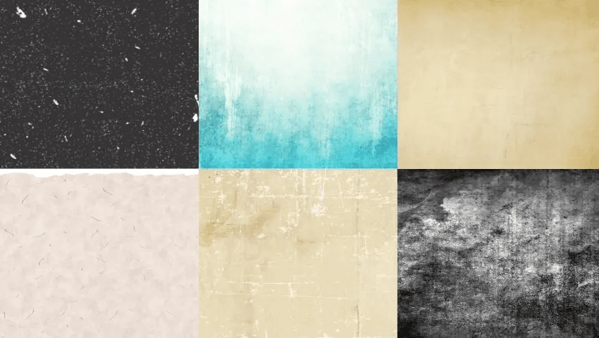
Another of the common elements in this vintage style are the backgrounds with noise. It is a resource that completes the retro air of the designs created to resemble those made several decades ago. Of course, the noise in this case is advisable to be very soft. Otherwise, it will be loud and detract from the whole.
Floral Patterns
The ‘white box’ minimalist look that’s been on trend for so long is being replaced by a maximalist pattern-clash style.
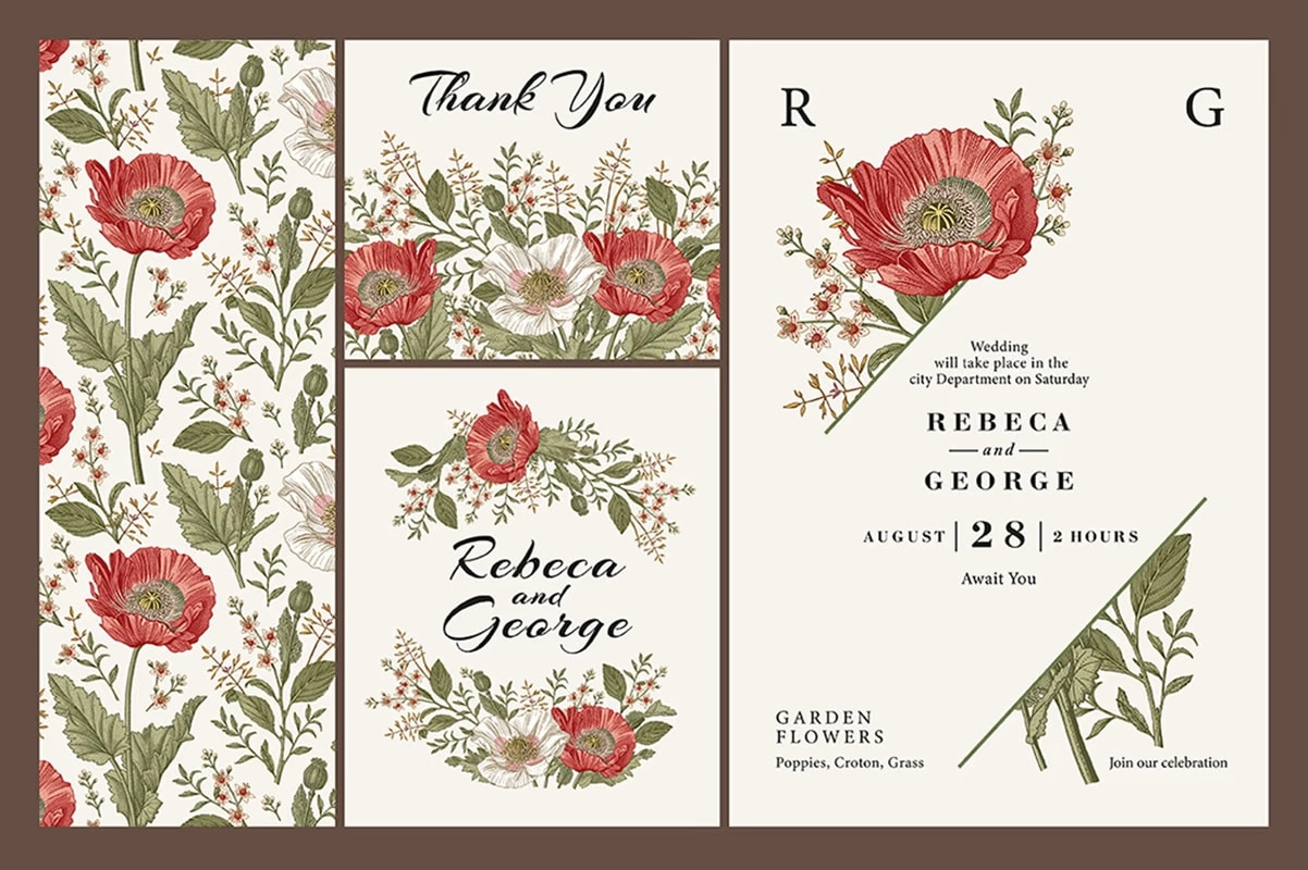
Floral patterns are making a comeback. A floral design can feel fresh and modern when used in varied color palettes, painterly printing, and against a dark background. Flowers are naturally organic, but arranging them into an organized grid gives them a more contemporary vibe.
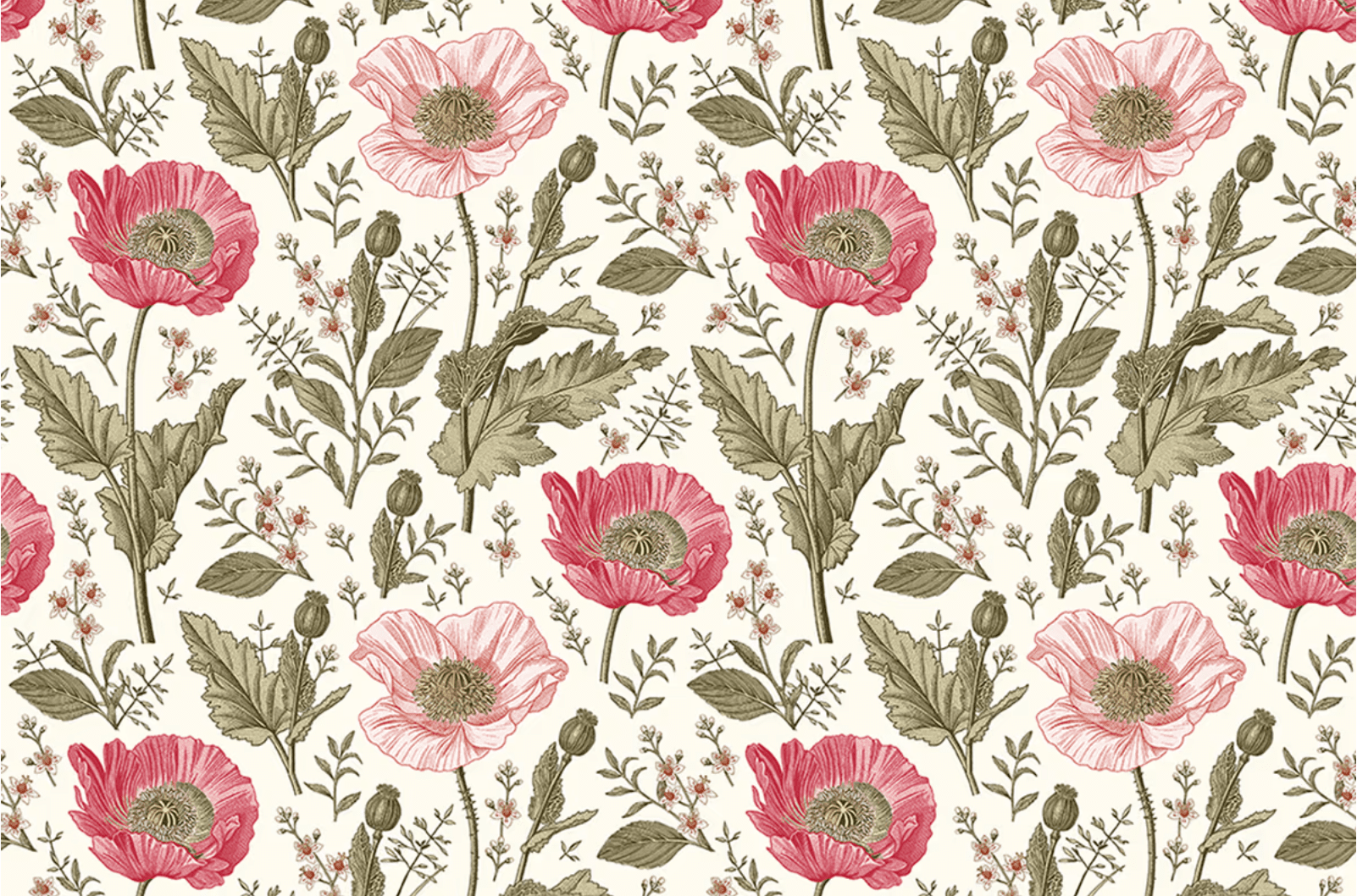
The language of flowers and floral design is symbolism personified. Not only does the type of flower used or represented has a meaning, but there is significance in how it is placed, where it is placed, quantities, and of course in its physicality (example, whether it is a bud or heavy-headed flower being used).
Back in the day, the same floral fabric was used throughout the room or parts of the house. For example, the sofa would be matched to the curtains, then repeated through some carefully placed pillows. Obviously, this had to be carefully planned; otherwise it could look like a busy disaster. The focus of florals have been more subtle in recent years, but they never really left. Now, in the present day, they are more pronounced and make a statement.
Flowers have always been symbolically connected to both springtime and femininity. A traditional motif used by perfume and fashion houses, flowers are often presented in graphic and editorial imagery with a delicacy and fragility befitting of ladylike style, elegance, and restraint.
For you to apply this technique in your own designs, we’ve got this new bundle which features a set of vintage floral patterns and templates with a diverse variety of colorful floral designs including wreaths, floral arrangements, bouquets and more, everything delivered in 100% vector file formats so you can recolor, rearrange, add/remove elements and modify shapes without losing image quality.
Advertisements
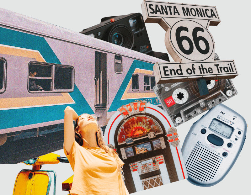
Why do vintage ads evoke such curiosity? Sometimes, especially on social media, it’s the humor from old-time political incorrectness that draws us in. Other times, the appeal stems from emotions that go much deeper than humor. Vintage ads tap into emotions that simply cannot be present in modern-looking advertising. You can’t create that feeling in a design that looks like it was created today. A nostalgic design must evoke a memory or feeling that’s linked to yesterday. There are six main elements of traditional vintage advertising that you can include in your designs to catch that nostalgia:
- Headlines
- Slogans
- Photographs
- Road and restaurants signs
Create beautiful retro vintage collages & compositions using this brand new elements package featuring many of said elements from vintage magazine & newspaper cutouts, delivered in high resolution PNG file format.
Propaganda
From a pure design perspective, propaganda art can be overwhelming, as it idealizes and stylizes the ordinary into something much more grandiose to rally support for causes or gin up national fervor against something.
Design is in everything we make, but it’s also between those things. It’s a mix of craft, science, storytelling, propaganda, and philosophy.
But the past centuries have been incredibly moved by propaganda vintage graphics. In said graphics you can immediately see telltale characteristics that are common to all types of heroic realism, regardless of what country, cause or movement produces them. A few of these graphic elements include:
- Uprising symbols
- Pointing finger
- Bold sans serifs to make the message stand out loudly
- Realism in art to make it more relatable
- Color contrast
- Caricatures
You can get inspiration or even make your own vintage poster with this amazing Retro & Vintage Vector Graphics Pack that includes 650 + items that you can use to create posters, logos, banners, flyers & many more in a vintage look. The pack includes fonts, text styles, color palettes, icons, textures, brushes, and many more.
Drawings and Illustrations
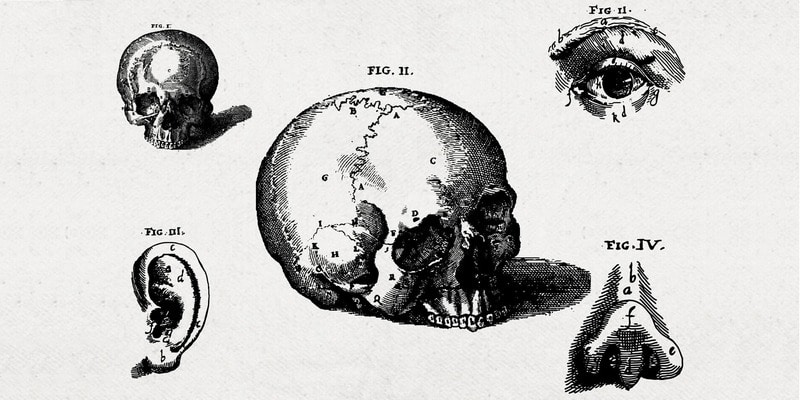
Many vintage designs typically include drawings or illustrations in black and white (or just black). Originally they were hand-drawn or engraved and that’s why they may look realistic yet simple. Many books produced in past centuries are illustrated with these designs, from botanical to academic to novels.
During these periods of time, photography was not so common, nor was industrial printing, so drawings and illustrations were the only way to record and represent what was around us. Before the new technologies we now have, the world relied on artists and illustrators to share the beauty of plants, animals, anatomy, and new inventions with the world. The work required great artistic skill, great attention to detail, and technical knowledge.
You can use this type of drawings and illustrations in cards, invitations, presentations, sketchbooks and many more. We’ve got an incredibly extensive pack of vintage drawings and engravings you can buy here (it’s on discount)!
Color Palettes
In addition to logos, vintage design can be used to create other types of elements. But, as with all trends, certain elements are used. Especially in the case of colors.
The tones that are used in this style of design are not very varied. Generally, those that were in fashion in the years in which you want to inspire the design are used. Decades ago, color printing was quite expensive, so the usual thing was to use two or three colors apart from the black of the letters. It was rare to find more colorful designs.
As for the type of tones used in vintage graphic design, they are not usually strong. Pastel colors and paler tones are usually used, which contrast with the black of the edges and letters.
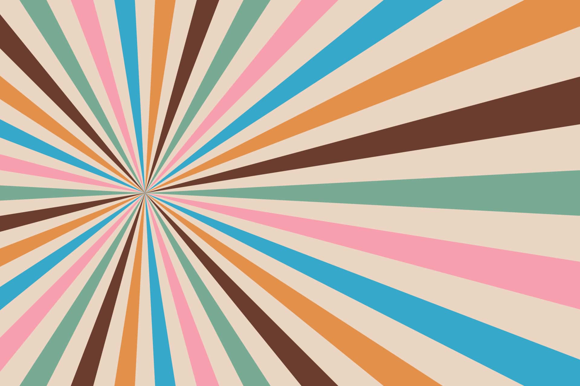
Retro color schemes can be complicated to create as they use a lot of vintage or cream colors, which can be tricky to use in print. On a website, however, they do stand out. These colors are contrasted with brighter hues. Background colors are normally desaturated. Hues are muted, but often look as though they have been mixed with a touch of black, or grey when compared to the brightness of pastels.
Retro colors come in a variety of hues but tend to be more muted. They don’t draw from primary colors, but range from neutrals such as creams, and yellowed browns, to blues, sage green, teal, and art deco style pastels such as peach or pale pink.
Color influences range from the 1920s to the 1980s. As time passed, colors became brighter. However, the large time range gives designers a huge variety of influences to draw from.
Fonts
Another of the most important elements in vintage graphic design is typography. Texts have a lot of strength and presence in retro designs, partly because of their appearance.
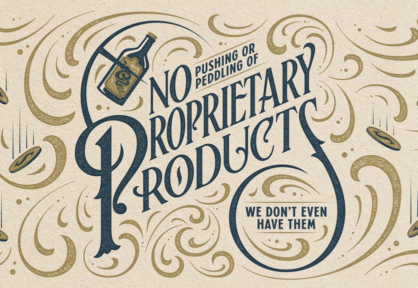
The vintage design not only plays with the font, but also gives a fundamental role to what is written. For this, the location of the texts in the designs is carefully selected. In addition, letters can sometimes be embellished with additional strokes and ornamental details. Just like it was done several decades ago, or in certain styles of calligraphy.
These details add elegance and character to the designs in which they are implemented. If you are looking to make a creative design with these characteristics, you can count on the typeface Rumble Brave to bring luxury, elegance, and style to any design project: branding, logos, badges, wedding invitations and so much more!
Typography has always played a crucial role in creating a retro design. It is not just the choice of a font that will make a difference, but how this font is used. Designers wishing to create a retro look might reposition a font, duplicating pixel strokes for added texture and a unique element to their designs.
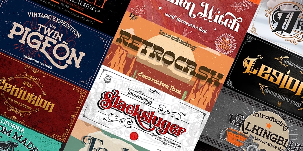
Typography is just as important as color in creating a retro design, you can look for the perfect font in this new collection of retro vintage font designs which contains 20 fonts that will create your desired feel to your designs.
One example of vintage fonts is the Victorian typography. More whimsical than the sleek and simple Art Deco style fonts, but with less adrenaline than Wild Western fonts of the same Century, Victorian fonts are recognizable by their ornamentation and lavishly intricate decoration.
As product competition in post-industrial England skyrocketed, so did the public’s demand for bold, bright and eye-catching typography. The use of decadent color-layering, borders, decorative finishes and flowing letters became the dominating period style. These enriching typefaces still evoke the excitement of a time when luxury items were finally accessible to non-nobles. And bring a sentimental nostalgia to any creative project.
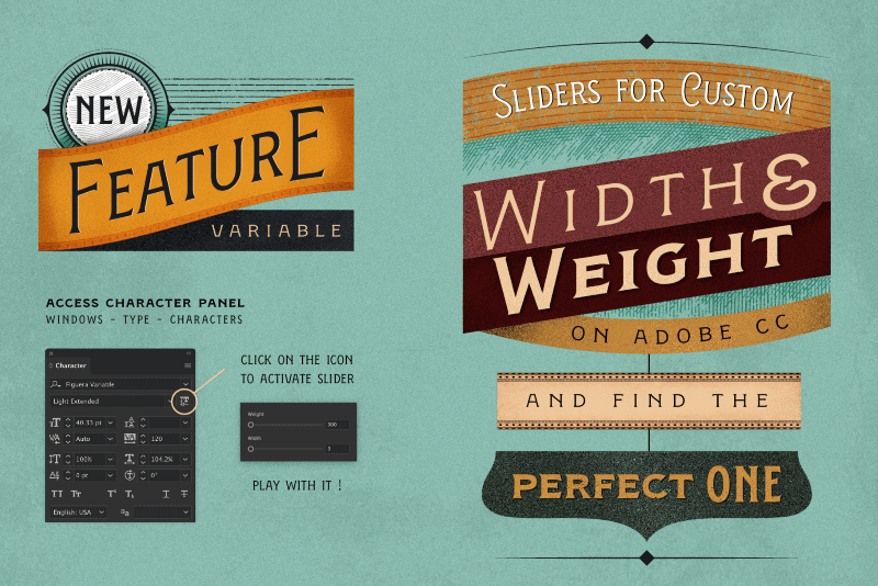
If you want to bring that sentimental nostalgia to any creative project, use the Figuera Font Family! It is a variable font with a Victorian design that features a neat vintage style, delivered in many formats and you can even create web fonts & customize it to your liking.
Letterpress
Letterpress Printing is one of the oldest printing techniques, using a relief printing method to create an embossed color effect. The effect adds an attractive handmade look to designs, making it a great pairing for vintage-style designs. Letterpress designs look like they were pressed with moveable type—like a printing press.
When you look at letterpress designs, you’ll see they vary from each other…a lot. What ties them together is their relative simplicity. Letterpress designs have limited color palettes and fonts. You should be able to run your hand across a letterpress design and feel its indent into its paper, or at least look at it and imagine feeling the texture when you touch it.
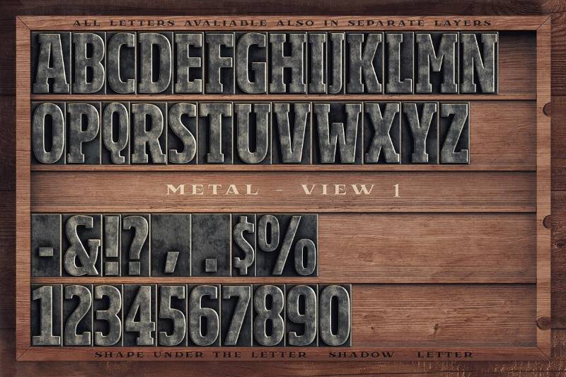
Including this type of fonts in your vintage designs, regardless of the type of design, is extremely trendy nowadays. To do so without complicating or altering your initial idea, get your hands on this carefully designed & highly detailed vintage letterpress toolkit.
Uses of Vintage Design
Now that you’ve decided to work with the vintage trend, let’s talk about how you could make it happen. You don’t have to go full-on vintage in your design—your brand might be represented better by a blend of modern and vintage elements or by elements from a few different eras, like a font that would feel at home on a Steampunk video game cover and graphics that look like you cut them out of an 80s skate zine.
Fashion
There are a lot of fashion trends that emerge quickly but soon become a flash in the pan. However, there are other trends that come back into fashion years after their initial iteration. The vintage trend is one such style. There are styles within it that are timeless classics, and there are others that are trendy simply because they fall under the vintage label.
There are plenty of vintage fashion pieces that speak to a sense of nostalgia within the wearer. These are trends and pieces that they remember from their youth that they missed out on. They get the chance to relive that. Perhaps they ended up giving away or throwing out those pieces, and they regret it, only to find them again at a vintage store or charity shop.
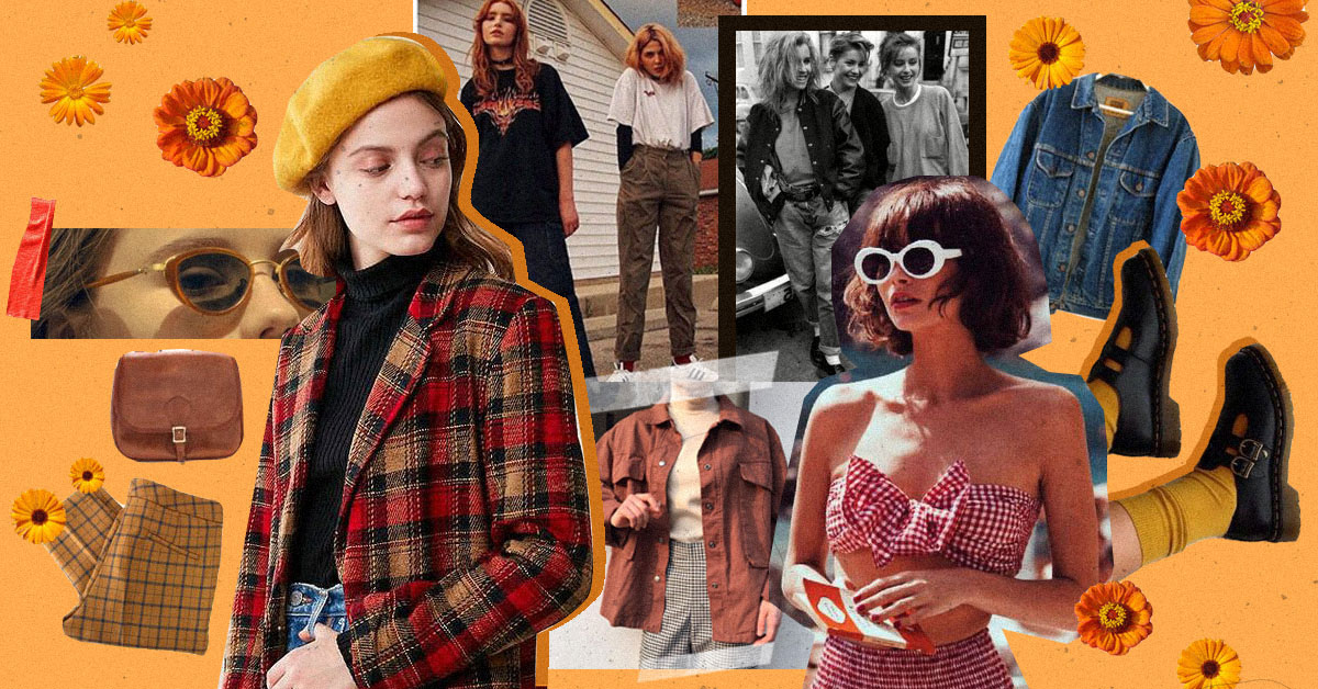
Here are some of the vintage fashion trends that are currently making a comeback:
- Puffer jackets
- Flares
- Bucket hats
- Platform shoes
- Slim-Fit Turtlenecks
- Corduroy and Velvet Trousers
Vintage T-Shirts
It is likely that when you go out for a weekend, you will notice that many people wear t-shirts with vintage designs. These vintage print t-shirts are extremely popular nowadays, and you may wonder one thing; why are they so popular?
As trends change and fashion evolves, many types of clothing go out of style as people stop wearing them to move on to something new. But it seems that these shirts will never go out of style. This popularity can be attributed to many factors, some may be:
- They are of High Quality and Unique. Today you see hundreds of graphic t-shirts that look similar because they all have the same brand logos or pop culture characters. And while there’s nothing wrong with these designs, people can take their fashion to another level with more creative T-shirts that aren’t mass-produced.
- They’re Incredible Versatile. Something that’s immediately noticeable about these shirts is their versatility. Unlike some kinds of clothing, which usually only come in specific patterns or colors, you can find a good casual tee in practically any color or design. So, if you have a particular fashion style or you prefer specific colors or patterns, you will most likely be able to very easily find a tee that you adore.
- They’re Easy To Wear. Due to their versatility, vintage-feel shirts are incredibly easy to wear. You can find shirts to go with nearly any style, and building an outfit around a cool shirt is easy and fun. For people who enjoy streetwear, nicely-printed tee shirts can be the perfect thing to show off your stylish fashion sense and stay effortlessly cool at the same time.
Here are different steps you can take on the design side, as well as which type of inks and t-shirts you print with, that can help you achieve a perfect vintage look and feel for your t-shirt. Here’s 3 ideas for you on how to make a vintage shirt.
- Print on a polyester/cotton blend or a tri-blend t-shirt. If you’re not familiar, there are essentially three main types of t-shirt fabric:
- 100% cotton
- Polyester/Cotton blends
- Tri-blends, made up of polyester, cotton, and rayon
Since poly/cotton blends and tri-blends are made up of different materials, the fabrics are going to naturally have a vintage, heathered look to them. The ink is going to react differently with each of these shirt fabrics as well, and that is something you can use to your advantage. Something unique about water-based printing is that the ink only dyes the cotton of the t-shirt, not the polyester or the rayon. Meaning, if you print on a 100% cotton shirt, your print is going to come out very bright and vibrant — not ideal for a vintage look.
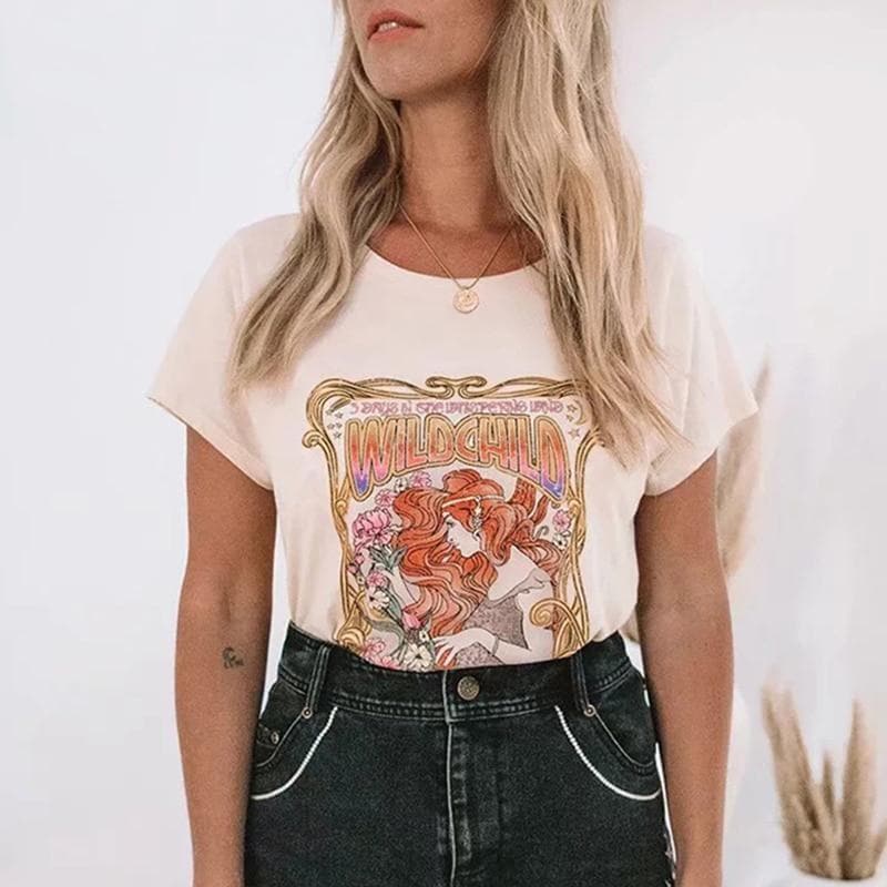
- Make sure your shirts are printed with water-based & discharge inks. While water-based and discharge screen printing is the method of choice for any t-shirt project here at Real Thread, it’s particularly important to use when aiming for a vintage, distressed look and feel. Since the ink literally soaks into and dyes the fabric of the t-shirt, rather than sitting on top, the print is going to naturally have an incredibly soft, worn in feel right away, like a t-shirt you’ve had for years.
- Enhance your design with textures. Though printing on poly/cotton and tri-blend t-shirts is the most natural way to create a vintage looking t-shirt, there are things you can do to your design on the front end to achieve that look, regardless of the shirt material.
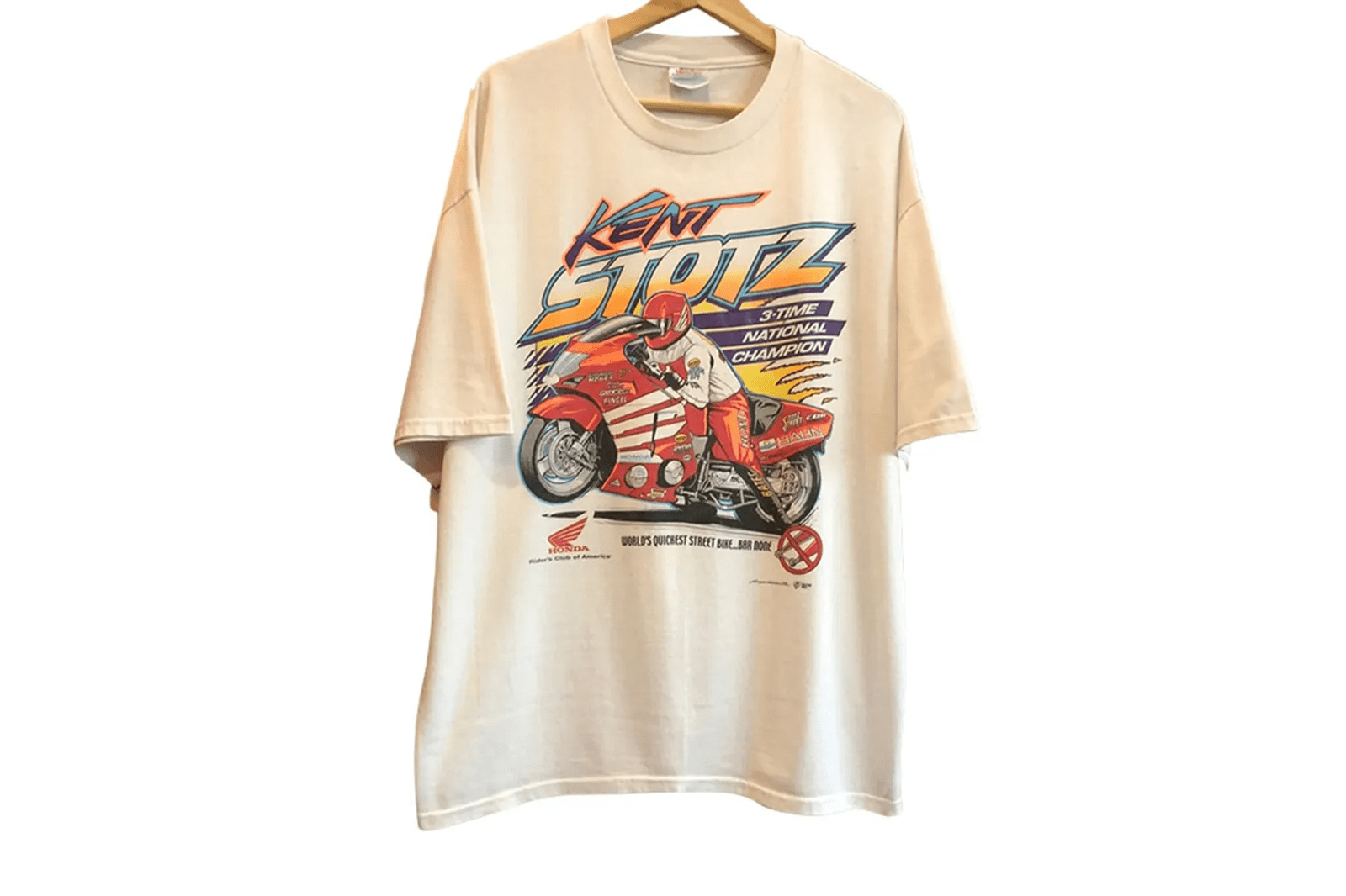
One way to create a vintage style shirt is to overlay your t-shirt design with a texture. Textures are a great way to add an extra dimension to your design, and ensure that your print has a faded, vintage look, regardless of the t-shirt fabric.
The vintage tee comeback started in the early 2000s when celebrities like Britney Spears and Justin Timberlake started rocking them. This sparked a renewed interest in vintage fashion and, of course, vintage t-shirts. Today, fashionistas and celebrities alike covet vintage t-shirts. They offer a unique style you can’t find in today’s mass-produced fashion. Because they’re from a different era, they have a certain cool factor that is very appealing. It’s also because people are now more interested in wearing clothes with a story behind them.
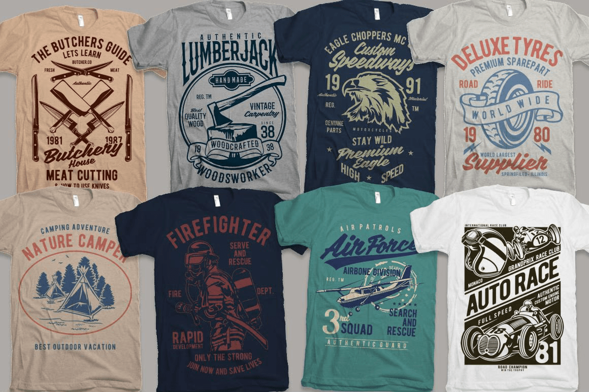
Vintage t-shirts often have cool retro designs or logos, which can be a great way to show your personality or make a statement. Here at ByPeople we’ve got you covered for you to design amazing vintage t-shirts with the all new bundle featuring 200 illustrations that you can start using on your shop’s products straight out of the box!
Interior Design
Vintage interior design is for treasure hunters, lovers of unique pieces and patient collectors. It is said that the only restriction in vintage interior design is only your imagination. The vintage style now reigns in the homes of half the world, it is a new look at the retro style. Weathered steel, old or historic buildings take us back in time, but now with a modern loft look. The spirit of industrialism is combined with the warmth of natural materials.
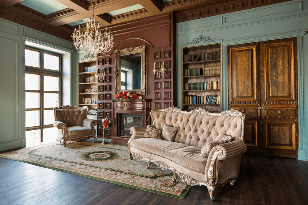
Vintage interior design is an elegant and romantic style. Use discreet colors like the palette of neutrals, grays, beige, sand and cream. Some light pink, pale blue, pale lilac shades are appropriate. In vintage style, it gives rise to the creation of a range of a single color, bright, noble and calm. Vintage interior design is old and elegant. It implies the use of old or aged furniture and accessories.
To achieve a vintage-style interior design, use natural materials such as wood, small details in stone, wrought iron and natural elements. The interior should look as if it had been decorated several decades ago, it should reflect the trends in interior design of the last decades. Vintage interior design is characterized by soft and flowing lines, carefully selected or inherited furniture and decorative accessories.
Graphic Design
Graphic design, like other disciplines, presents numerous trends that change over time, although there are some that remain unchanged and never go out of style. Characterized by using elements and techniques from past decades, vintage design is present in all areas in which graphic design is used: advertising, marketing, posters, illustration, etc.
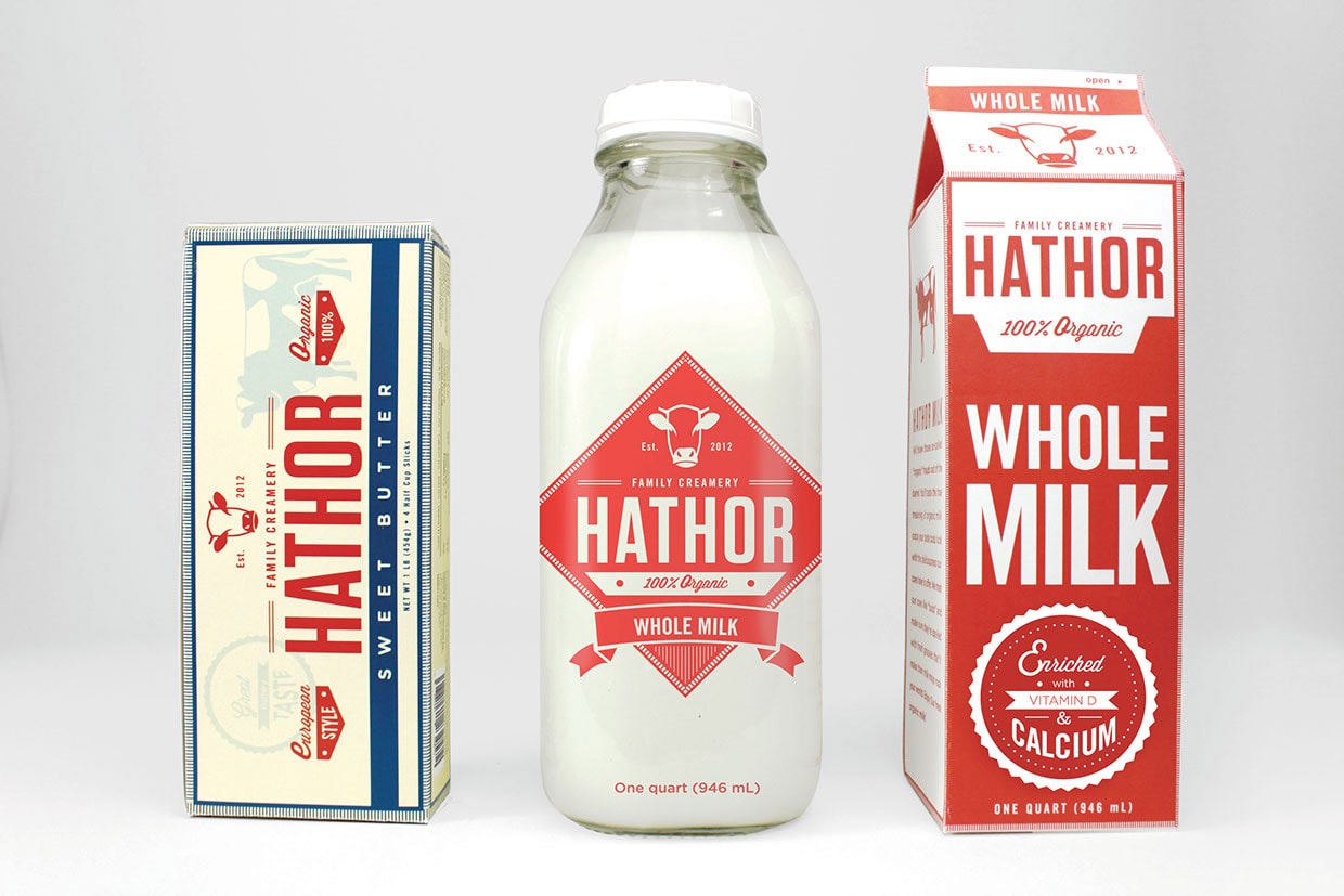
Also, vintage design is not only used by professionals or big brands. It is a trend to use it for more everyday graphics, such as invitations, business cards, and even signatures!
A few features that are being brought back are:
- Vivid colors with “happy” and bright tones (yellows, blues, oranges, reds).
- Flat elements and designs, without extras that disturb the shape.
- Geometric figures with thick strokes.
- Squiggles or abstract doodles.
- Themes based on early video games, pixel illustrations.
- Neon style, from the colors to the imitation of neon lights.
- Typography that imitates titles of video games, movies or television.
- Simple animations without much speed and that jump a bit.
- Abstract illustrations of people but not faces.
- Musical themes with cassettes, boom box, turntables.
- Custom typeface with bubble style, block serifs.
- The audiovisual (photographs or videos) is not used much.
So Why go with a Vintage Design?
The primary reason to go with a vintage-inspired design is to evoke nostalgia. When consumers are familiar with a product and fondly look back on their relationship with it, a vintage design is a way to capitalize on that relationship.
A vintage design can also highlight a specific feature of the product—like how a product is made using an older recipe or manufacturing method. Vintage designs are popular with artisan and handcrafted products for this reason.
Vintage-inspired branding can also communicate that you’re established in your industry. When a brand reaches a certain level of industry clout, changing its branding can undermine its popularity.
There’s a lot of validity to the phrase “don’t mess with success,” and that’s the thought-process that keeps certain brands using the same designs for decades. For these brands, using vintage designs wasn’t a conscious choice; rather, it came out of the choice not to change their designs and allowing the designs to age alongside them.
We live in an uncertain world where technology and culture advance at a faster rate than it ever has before. Looking at vintage imagery feels comforting. The past might not have actually been simpler or safer—the world is safer now than it’s ever been before—but that doesn’t matter here.
Successful marketing burrows into the consumer’s mind, so you’ve got to meet consumers inside their heads. That’s the gateway to their hearts and guts, which are the end of your journey. To many, the past feels safe because there’s no uncertainty. Like watching a movie you’ve seen 100 times before, replaying the past in your head is comforting because you know how the story ends. A design can put viewers into a state of mind where they’re walking through their favorite parts of the past, creating a positive association between your product and the consumer. Vintage designs can be a lot of fun! They’re a refreshing contrast against our digital, minimalist, modern world.
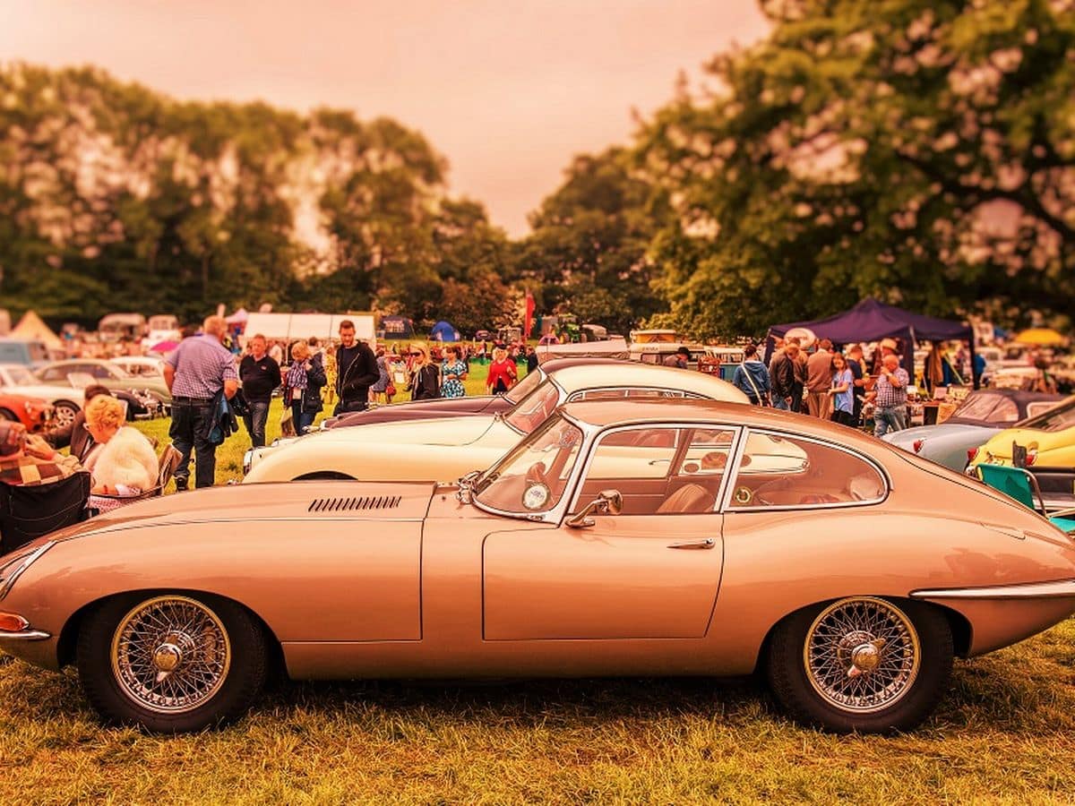
Have you ever bought a product or downloaded an app simply because it reminded you of a positive experience when you were younger? We’d all like to say no, but whether it’s a choker necklace, a pair of Adidas Originals, or Pokémon Go, it’s very difficult to resist the pull of nostalgia marketing — especially when goods get packaged as something shiny and new.
Nostalgia marketing is nothing new, but it has particular power over the millennial market. In a digital age of virtual relationships and all-encompassing work schedules, nostalgia facilitates social bonding. Casting your mind back to long summers spent on Rollerblades or listening to the Backstreet Boys is not only a fun way to bond with friends and colleagues from a similar generation, it’s also a strong incentive to buy products that trigger that same powerful, nostalgic feeling.
This emotional hook gets channelled by some of the biggest brands in their marketing campaigns, and visual design plays a huge part in triggering an emotional response in the consumer. The point-of-sale rests on making the consumer feel happy, secure, and even childlike, transporting them back to an earlier time, a simpler time they can view through rose-tinted glasses.
Juan Pablo Sarmiento
System engineer from the National University of Colombia, with special interest over entrepreneurship, marketing, productivity and well-being.
Several projects and startups launched in over 20 years of experience.
Best Seller Deals
Check out time-limited deals on software and designs packs
